The best "shifting left" examples
Shifting left can take on all kinds of forms, and the smartest companies are getting creative with it. Here are some examples:
- 1 Interactive Demos: A hands-on preview of your product that says, "Go ahead, take me for a spin—no strings attached."
- 2 Ungated Onboarding: Letting users dive into your product without holding their email hostage—just pure, frictionless exploration.
- 3 Avoiding the Empty State: Kicking users off with a blank screen? Nah, we prefer to show them the ropes right from the start.
- 4 Template Gallery: The ultimate cheat sheet—pre-built templates that do the heavy lifting so your users don’t have to.
Whether it’s letting users play around in interactive demos, skipping the whole sign-up dance, or avoiding the empty-state void, let's look at how companies are showing us how it’s done.

Weekly advice to make your product stick 💌
Be the first to get the latest product best practices and resources
Interactive Demos
How many times have you dreaded sitting through a sales call when all you wanted was to try the product? These companies leveraging interactive demos get it—they give users a hands-on taste without the awkward small talk:
Unbounce
Unbounce gives you the freedom to dive right into their landing page builder. With instant access to drag-and-drop features, you can see exactly how it feels to work within their builder.

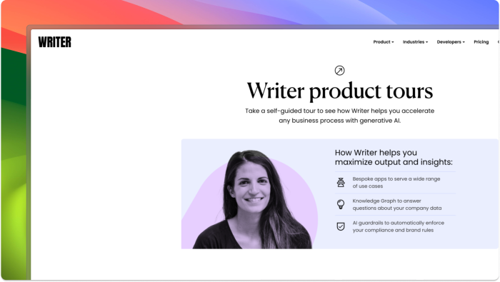
Writer
Writer’s interactive demo library lets you skip long, boring help docs. Whether you want to explore AI tools or specific writing features, every demo guides you through exactly how to solve problems within the platform.
Lokalise
Lokalise ditches the endless FAQ sections for an entire library of ungated interactive demos. Each demo walks you through different product scenarios, making it easy to learn by doing instead of reading lengthy guides.

Did you know Chameleon is launching interactive demos?
Create a free Chameleon account and we'll let you know when you're in the Beta.
Ungated Onboarding
Who has time for sign-ups before the fun begins? Ungated onboarding is still rare, but scrappier companies are leading the charge. They let users dive straight into the product without the friction of sign-ups. It’s great for casting a wide net and reaching more users fast. But as companies mature—especially in B2B—they add "good friction" to gather leads and filter out tire-kickers.
A few companies, like Notion, Airtable, and Webflow, used to have ungated onboarding but have moved to gated models as they've grown, showing how priorities shift from broad user appeal to more targeted lead generation. Here are a few keeping it open:
Rows
Rows flipped the script by turning their product onboarding into a social experience, engaging users through platforms like Reddit.

Colossyan
Colossyan offers ungated AI-powered video creation tools, allowing users to jump right into the process.

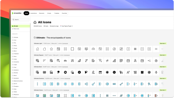
Streamline
Streamline provides direct access to its massive icon library, allowing users to download and explore without sign-up.
Photoroom
Photoroom allows users to access the app without logging in.

Avoiding the empty-state
Blank screens are a one-way ticket to user confusion. These companies know that an empty state is a wasted opportunity, so they’re getting creative with how to avoid it. It’s like in media res for product design—users are dropped straight into the action, skipping the blank start, and shown exactly how to engage right from the start:
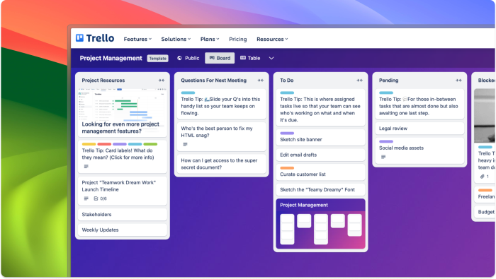
Trello
Trello avoids blank boards by kicking things off with sample boards that show you exactly how to get started, making it easy to see the tool in action.
Chameleon
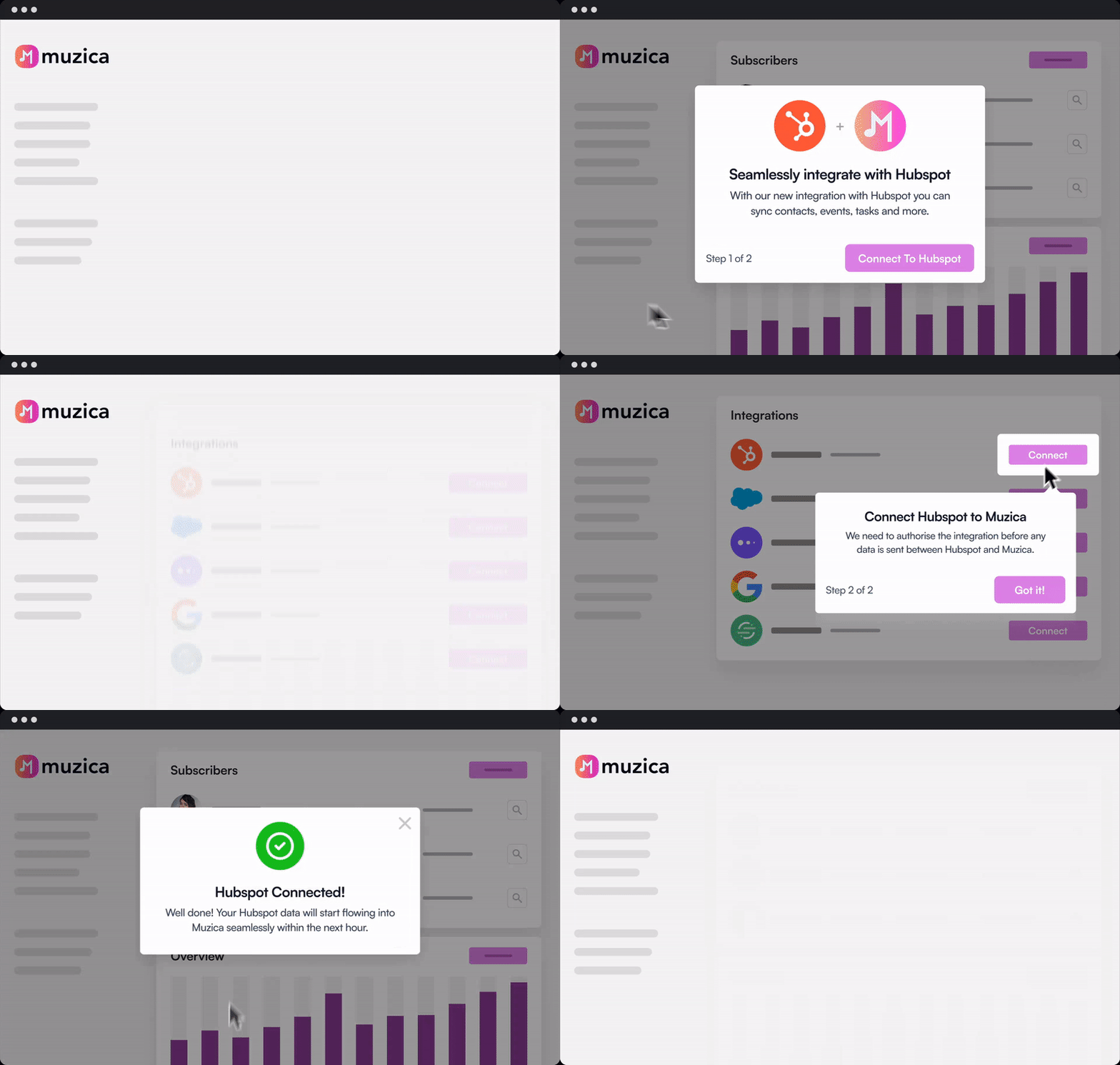
Chameleon’s sandbox environment lets you try out all our features within a fake product—so you don’t need to go through an API setup before testing.

Try our no-code builder for in-product experiences
Save time and money by building user experiences all without any dev resources required.
Fathom
Fathom’s video recording software helps users “learn by doing” with a pre-recorded fake video call, letting users explore the product without setting up a real call.

Template Gallery
Templates are like cheat codes for getting users started fast, tailored to specific use cases so no one feels lost. Even better? They’re showcased on pre-signup pages, acting as the bridge between browsing and getting started, helping users see value right away. These companies make getting started a breeze:
Canva
Canva gives users many ready-made templates for everything from social media graphics to presentations, so you can start creating without the design stress.

Notion
Notion knows no one wants to stare at a blank page, so they hit users with pre-built templates and helpful hints right from the start.

Squarespace
Squarespace hits users with beautiful, customizable website templates, making it super easy to jump in and start building a professional site.

Typeform
Typeform offers pre-built forms, surveys, and quizzes, so users can quickly create engaging, interactive content without starting from scratch.
