After months of development, we're finally excited to ship some great improvements to Chameleon's product; read on for the highlights so you can benefit from these improvements straight away!
To access the new Chameleon Builder you must have the Chrome Extension installed.
1. Faster building with in-line Panels
All the hidden configurations in the "Topbar" have now been replaced by much more intuitive panels, where you can add Components, set the Location & Position of an Experience, and enable Actions.

This will help you discover more of the deep customization available, make your configuration more obvious (if you return later,) and speed-up your building time.
"Creating tours is MUCH EASIER" - Delan (a customer that participated in the beta)
These changes also provide the groundwork for us to add other types of components and actions, and more flexibility on placement, that will be tackled down the road.
2. Easier to test, with less context-switching
We've simplified how and when the Chameleon Builder shows: it will only show when you specifically "Enter" the Builder (via the web dashboard or Chrome Extension.) It will not open up by default when you load your app in a new tab, nor will it remain open once you close the tab.

This means you can be in the Builder in one tab, and use your app as normal, or test as an end-user in another.
Now when you "Exit" the Builder (which you can do quickly from the "Sidebar" or "Topbar" or Extension) you will no longer see the little green tab; you will immediately be treated like an end-user, and will be able to see any live Experiences. This will make it much quicker and easier to build and test, and also navigate your own app.
"I like the elimination of the Pop In/Pop Out of the browser extension, and the ability to exit the tool and restart it by X'ing out of the builder and clicking on the extension" - Kurt Waeschle, Modifi
This comes alongside a revamped Chrome Extension, with a slimmer design, and does mean you will be required to have the Chrome Extension installed to access the Builder. Download it from the Chrome Web Store here.
Meet the new Chameleon Builder: 7 things we're pumped about
Three-click review 🙌
If you are excited about these changes, we'd really appreciate you taking 5 seconds to give us a rating; simply visit the store page here, click on 'Reviews', scroll to the bottom and click the stars -- that's it! 🙏
Meet the new Chameleon Builder: 7 things we're pumped about
3. Launchers get an upgrade

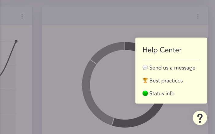
Launchers are becoming more popular as users prefer self-serve learning rather than typical onboarding Tours. We've seen many companies employ a go-to Launcher widget that often contains:
links to the knowledge base/help center,
option to chat with support,
link to the status page,
option to give feedback or report a bug,
option to take an introductory/overview tour,
etc.
You can do all of this with a Chameleon Launcher, and what's more, you now have a better UX and more configuration options when creating a Launcher. We've also tightened up the padding/margins/spacing to let your Launchers be more compact.
For example, you can now remove the Title section complete, add dividers between Items (rows), configure text styling separately, remove descriptions, adjust the checkmark color, and more! If you're using a Launcher, go try it out today.
If you're not using a Launcher today, we strongly recommend you add this to your suite of in-product Experiences. Learn more about the top use cases Launchers enable here.
4. Step component improvements
A lot of you have asked for more flexibility in adding text and images, and while more is on the way, you can now:
Add two separate text sections, styled differently (e.g. a title, followed by an image, followed by the body)
Designate the media (image/video) to appear to the left, right, above or below the body section
Better control the overall height of the Step

5. New web application
This one may not look or feel different, but we've built a brand new React web application (what you know as the dashboard). This is the beginning of our new focus on the dashboard, and includes an updated design library, and big plans in providing you more functionality, such as: Experience management (e.g. scheduling); Experience organization (e.g. folders); clearer analytics; easier integration configuration; and more.
We are also iterating on our design guide, and are adapting our colors to pass WCAG 2.0 level AA standards, and be recognized even with color-blindness.
We have brought our Setup flow into this new web application and we're especially excited about one aspect: the Playground. This is where new users on your team can go to learn the basics of Chameleon, in their own sandbox environment.

We will use this to introduce new patterns and teach best practices so that everyone on your team can easily and quickly get up to speed.
6. Secure Identity Verification
Security has always been extremely important to us; we introduced a bug bounty program within the first year of our launch, our GDPR compliance documentation has been copied by other startups, and we leverage the best web security standards in our applications.
We now offer Secure Identity Verification as part of your JS installation of Chameleon. This means you can more securely send user data to us, without risk of a malicious third-party pretending to be one of your users and gaining access to user data.

This option is in beta as we work with a small group of customers willing to make changes to their installation. We recommend this change strongly, so read more about it here and email us if you'd like to be part of the beta.
Meet the new Chameleon Builder: 7 things we're pumped about
7. New infrastructure, faster performance
Another enormous upgrade is with a brand new infrastructure that leads to faster Chameleon Experiences. Some of the key changes include:
- New CDN network (this is how information is cached and served from lots of points around the world, rather than a single center where our application and data is contained). We will now be serving Chameleon from hundreds of points around the world, meaning that requests will be substantially faster (and even more so if you are making requests from far flung places, relative to the US)
- New API routing to reuse a single SSL connection thus decreasing the overhead Chameleon requires on the page and improving the total round trip time to our servers.
- Chameleon now waits for the
window.onloadevent to be completed before starting to download resources. While the Chameleon snippet previously loaded asynchronously (to prevent blocking other items loading,) this change means your pages will become interactive much earlier. This improves "Time to Interactive" (TTI), which is a key measure when assessing page performance. - We now break up the assets we load into multiple smaller files, which also means that some of the assets Chameleon requires are downloaded only when needed, and with greater cacheability, again improving the overall performance of the Chameleon code snippet.
The good news is that all of this has changed under the hood, so you don't need to make any changes to your snippet or installation.
Lots more in the works...
We know we have a long way to go in making Chameleon the product that we know it can become. Some key improvements scheduled for the upcoming months include:
New APIs (including a REST API to programmatically download Microsurvey responses)
Native Zapier integration, improvements to our Mixpanel and Slack integrations; webhooks (to send data out)
Better management and categorization of existing Tours/Experiences
Moving Tour/Experience configuration into the dashboard (away from the "Sidebar")
Better analytics pages and views, including lists of users part of any target audience
We're excited to continue to partner with you and help drive "Product Success" for you and your users. We're very open to feedback and would love to hear your thoughts; feel free to grab 15 mins on my calendar here.
Meet the new Chameleon Builder: 7 things we're pumped about
On-demand webinar
To see the new Builder in action and hear from our co-founder, Pulkit, on the key changes, watch this insider webinar:


