


Tooltips are among the UI patterns that we've become most familiar with. Tooltips are layered over a product to display in-app messages, typically for product tours or feature releases, and provide contextual guidance or information to users with minimal disruption.
Unlike their friends, pop-ups and modals, tooltips serve as less intrusive interruptions to the user experience. They offer a gentle nudge toward an important feature or provide discreet guidance to help users find success while navigating an app.
If you want users to find their ”aha!” moment quickly, achieve success using your product, and adopt it, you need great tooltips that help them unlock important features or perform critical actions.
Now, you might ask: what makes a tooltip great?
It's contextual to the user journey, providing information relevant to where they are
It's succinct and actionable, providing guidance that can help users unlock more wins
It's well-positioned to serve as visual guidance while not completely disrupting the navigation
A bad tooltip, on the other hand, appears out of context, is packed with way too much information, and offers input that isn't relevant to the user journey.
Creating tooltips that appear where and when they're supposed to and that engage users with well-crafted design can have UX designers scratching their heads and keep product teams waiting for production and release cycles.
But before we take an in-depth look into these tooltip plugins, here’s a quick table for you scanners out there.
Tooltip plugin | Features | Main pro | Main con | Effort level | Github rating |
Tooltipster |
| Lightweight, meaning it won’t slow down page performance | Compared to other tooltips, there’s limited community support | Medium effort: Js configuration required | ⭐️2.8k |
Floating UI |
| Anchor floating elements to avoid collisions | Slightly steeper learning curve than other tooltip plugins | Medium effort: Js configuration required | ⭐️ 80 |
Tippy.js |
|
| Complex API might be difficult for beginners | Medium effort: Js configuration required | ⭐️ 12.1k |
Shepherd.js |
| Supports touch options and responsive design | Cannot handle tours across multiple pages without extra logic | High effort: full integration needed | ⭐️ 13.1K |
Intro.js |
| Small file size and minimal dependencies | Many advanced features require a paid license | High effort: full integration needed | ⭐️ 22.9k |
Chameleon |
| Lets you create interactive tooltips without coding or designing | Suited mostly for companies with structured onboarding needs | Low effort: no-code | |
Tether |
| Features constraint-based placement | Not a complete tooltip system | Medium effort: Js configuration required | ⭐️8.5k |
Hint css |
| Directional classes for positioning | No collision detection | Medium effort: Js configuration required | |
Balloon css |
| Minimalist style for tooltips | Doesn’t have advanced positioning logic | Medium effort: Js configuration required | ⭐️ 5.5k |
Tipsy |
| Supports HTML content | No advanced collision handling | High effort: full integration needed | ⭐️ 3k |
jBox |
| Highly customizable | Unnecessary for simple use cases | High effort: full integration needed | ⭐️ 1.4k |
Microtip |
| Lightweight and easy to use | Minimal customization options | Medium effort: Js configuration required | ⭐️ 1k |
Html5tooltips.js |
| Smooth 3D animation available | No advanced positioning | High effort: full integration needed | ⭐️ 500 |
Powertip |
| Comprehensive documentation | Can be heavier than simple CSS solutions | High effort: full integration needed | ⭐️ 1.7k |
Toolbar.js |
| Interactive buttons and tooltips | Default toolbar style might clash with custom designs | High effort: full integration needed | ⭐️ 2.6k |
Protip |
| Supports interactive HTML content | Smaller community | High effort: full integration needed | ⭐️ 600 |
Here are 16 tooltips plugins that make it easy to build your product.
16 Best tooltip plugins for UI design
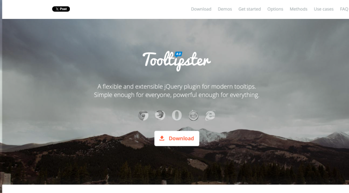
1. Tooltipster: Best for flexible tooltips
Effort level: Medium— Js configuration required
Tooltipster is a clean and lightweight jQuery tooltip plugin for creating flexible, HTML5-validated, touch-enabled tooltips on any DOM element. It's a very comprehensive library, including both JavaScript and CSS files to style tooltips and any HTML element within, set callback functions, and more.
Features summary:
jQuery plugin
Customizable: supports various content formats
Languages: JavaScript and CSS
Pros:
Allows for various customizations for tooltips
Simple-made API makes it easy to implement, even with basic jQuery knowledge
Lightweight, meaning it won’t slow down page performance
Cons:
Depends on jQuery, which can be an issue if you’re using a different Javascript framework
Compared to other tooltips, there’s limited community support
GitHub rating: ⭐️2.8k
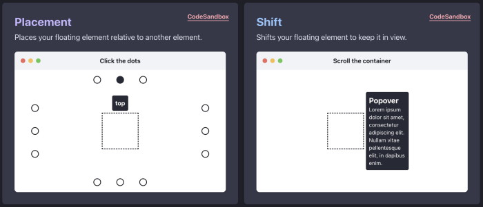
2. Floating UI: Best for tooltip positioning
Effort level: Medium— Js configuration required
Floating UI is a powerful Javascript library for positioning tooltips, dropdowns, popovers, and other floating elements. This library is especially notable because elements are responsive, adjusting correctly even with viewport changes like resizing and scrolling.
(Source)
Features summary:
Anchor floating elements to avoid collisions
Supports JavaScript, TypeScript, and CSS languages
Platform agnostic, and can be used across different environments
Pros:
Easy-to-use architecture for developer teams
A good variety of tooltip customization options
Lots of community support
Cons:
Doesn’t include tooltip UIs, but is for positioning
Slightly steeper learning curve than other tooltip plugins
GitHub rating: ⭐️ 80
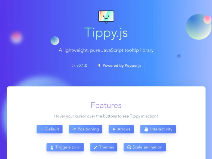
3. Tippy.js: Best for animated tooltips
Effort level: Medium— Js configuration required
Built by the same creator of Floating UI, this small yet highly customizable JavaScript library and WordPress tooltip plugin helps you create interactive, animated, accessible, and touch-friendly tooltips for any DOM element.
Features summary:
Compatible with Javascript, Typescript, and CSS
Works with frameworks like React, Vue, and Angular
Compatible with mouse, keyboard, and touch inputs
WordPress tooltips plugin works with shortcodes, widgets, and custom post types
Pros:
Lightweight and fast
Fully customizable with fine-tunable functionality and fully stylable with CSS
Supports interactive content like image tooltips, buttons, forms, and more
Cons:
Complex API might be difficult for beginners
Might be unnecessary for simple tooltips
GitHub rating: ⭐️ 12.1k
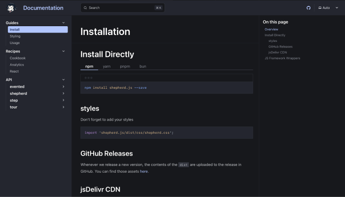
4. Shepherd.js: for responsive tooltips
Effort level: High—full integration needed
Shephard.js is a Javascript library that lets you easily create site tours. Leveraging Tippy.js, it also renders dialogues for each of your steps, making it a helpful plugin for user onboarding.
Features summary:
Uses React, Ember, Angular, Vue.js, ES Modules, or plain Javascript
Has full keyboard navigation support, focus trapping, and a11y compliance via aria attributes
Pro, paid version allows for customizable tour templates, analytics integration, and user behavior tracking
Pros:
Supports touch options and responsive design
Intuitive and easy to use
Highly customizable, giving you control over steps and styles
Cons:
Cannot handle tours across multiple pages without extra logic
Has minimal default styles, which requires CSS customization
GitHub rating: ⭐️ 13.1K
5. Intro.js: Best for simple setup
Effort level: High—full integration needed
Intro. Js is an open-sourced, vanilla Javascript / CSS library that lets you add step-by-step instructions and hints for your onboarding. It features a simple API and a lightweight design with no external dependencies.
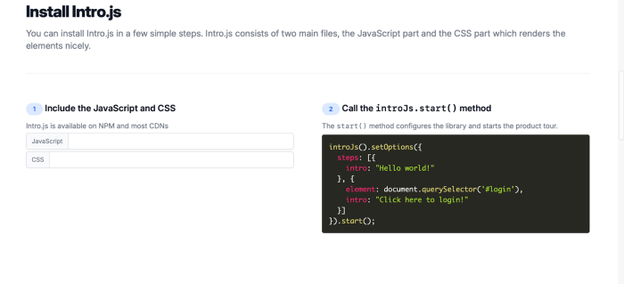
Features summary:
Provides various options to configure product onboarding and customize tour steps
Users can navigate steps using arrow keys
Supports custom themes, styles, and button texts
Pros:
Small file size and minimal dependencies
Active community and extensive documentation
Simple API and quick setup
Cons:
Many advanced features require a paid license
Not as flexible as other tooltip plugins
GitHub rating: ⭐️ 22.9k
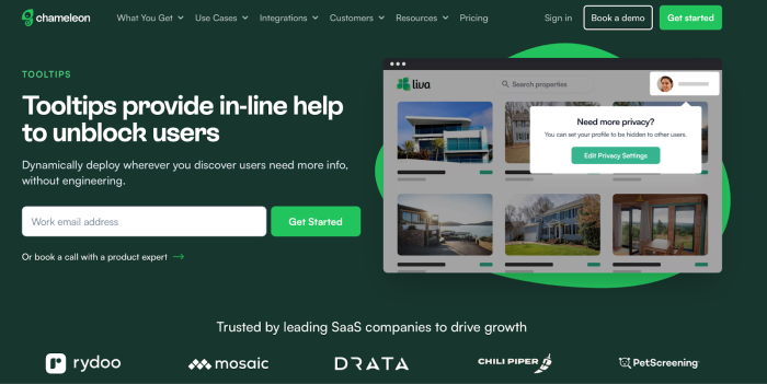
6. Chameleon: Best no-code solution
Effort level: Low—no code
Chameleon is a no-code solution that lets you implement beautiful, on-brand UIs like tooltips, tours, and microsurveys for your onboarding experience. With high customization, positioning, and native-looking elements, you can build a dynamic, in-product experience without spending time engineering.
Features summary:
Add a controllable UX layer over your product’s interface
Simple WYSIWYG helps you build, manage, and optimize tooltips
Dynamic editing options let you make changes to text, update, deploy, and tweak positioning
Pros:
Lets you create interactive tooltips without coding or designing
Analytics test your tooltip’s performance
Customize every element of your tooltips to look native
Cons:
Suited mostly for companies with structured onboarding needs
Chameleon makes building and deploying on-brand tooltips easy
Chameleon lets you create everything from tooltips to microsurveys to flawlessly guide your users toward product adoption
7. Tether: Best for tethering tooltips together
Effort level: Medium—Js configuration required
Similar to Floating UI, Tether is a JavaScript library for efficiently positioning elements like tooltips or dropdowns next to another element on the page. The target and tooltip can be tethered together in a variety of ways.
(Source)
Features summary:
Features constraint-based placement
Offers anchor and attachment points for tooltips
Framework agnostic
Pros:
Flexible option for tooltips, dropdowns, and modals
Adopted by major libraries
Cons:
Not a complete tooltip system
GitHub rating: ⭐️8.5k
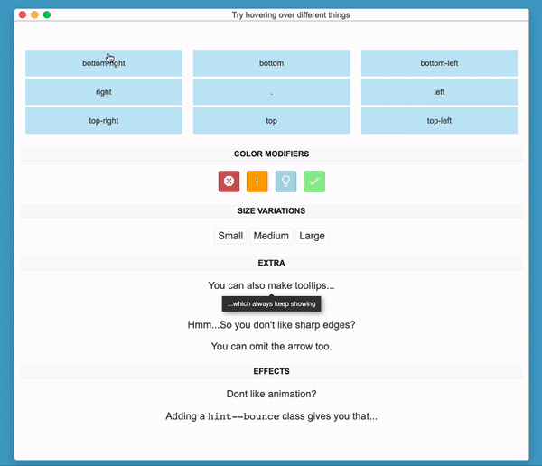
8. Hint.css: Best for Javascript independence
Effort level: Medium—Js configuration required
Hint css is a pure CSS resource to add tooltips on web apps and customize them flexibly; position them relative to page elements, select color modifiers and size variations, and add some cool extra design effects like animation.
(Source)
Features summary:
Pure CSS tooltips
Directional classes for positioning
Lightweight stylesheet
Pros:
Doesn’t have Javascript dependency
Easy to implement
Cons:
No collision detection
Can be generic, according to some users
GitHub rating: ⭐️ 8.2k
9. Balloon css: Best for tooltips using HTML5 data attributes
Effort level: Medium—Js configuration required
This lightweight pure CSS library helps you create animated tooltips for any DOM elements using HTML5 data attributes. It also includes presets for positioning and resizing tooltips, and for customizing colors, fonts, and other aspects of the design.
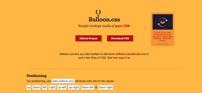
Features summary:
CSS-only tooltips
Includes multiple directional classes
Animated tooltips with DOM elements using HTML5 data attributes
Pros:
Lightweight and simple to use
No Javascript needed
Minimalist style for tooltips
Cons:
Not the best for highly interactive content
Doesn’t have advanced positioning logic
GitHub rating: ⭐️ 5.5k
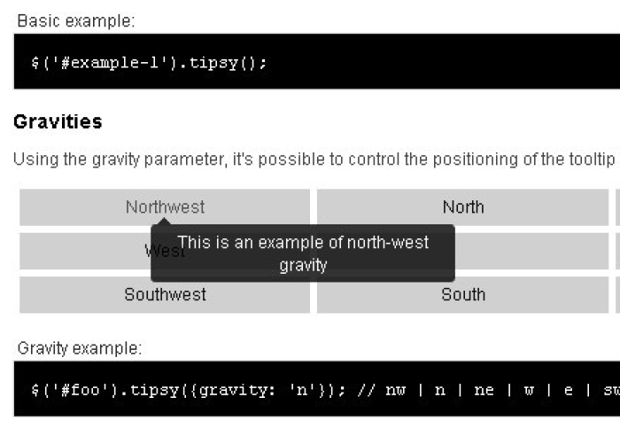
10. Tipsy: Best for Facebook-style tooltips
Effort level: Medium—Js configuration required
Tipsy is a simple jQuery plugin for generating "Facebook-style tooltips" based on an element's <title> attribute. It extracts content from any attribute, can include fade-in/out animations, supports HTML content, and has custom trigger events beyond the usual 'hover'. This library is popular amongst big tech names like Twitter, GitHub, and SlideShare.
(Source)
Features summary:
jQuery plugin for tooltips
Lets you configure positions
Custom trigger events
Pros:
Lightweight for jQuery-based apps
Supports HTML content
Tried-and-true amongst big tech teams
Cons:
Requires jQuery
No advanced collision handling
GitHub rating: ⭐️ 3k
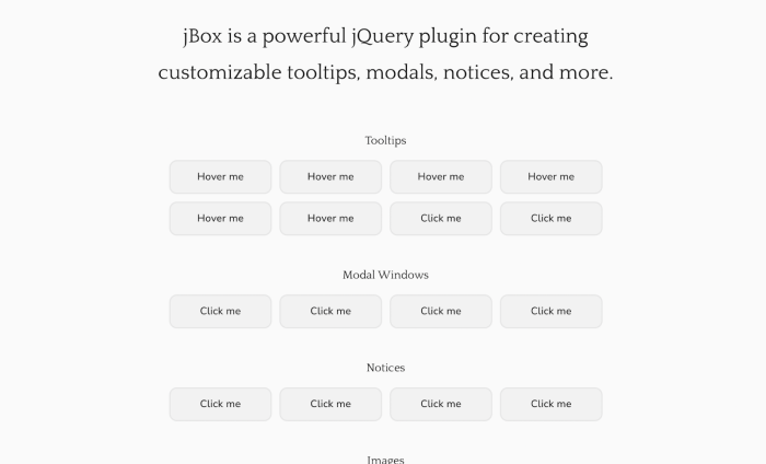
11. jBox: Best for various UI patterns
Effort level: High—full integration needed
This jQuery library includes a few different UI patterns besides tooltips, like modal windows and image galleries. The library gives you the script to animate and select where to position your tooltips, include dismiss buttons, or to make it follow mouse movement.
Features summary:
jQuery-based UI library
Provides users with tooltips, modals, and notifications
Extensive configuration options
Pros:
Many feature options for various UI needs
Highly customizable
Cons:
Dependent on jQuery
Unnecessary for simple use cases
GitHub rating: ⭐️ 1.4k
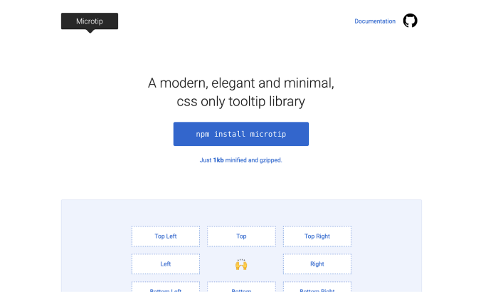
12. Microtip: Best for minimal, lightweight tooltips
Effort level: Medium—Js configuration required
Microtip is a lightweight CSS library used to create minimal and animated tooltips appending to any DOM element. It doesn't offer as much customization as previous examples, so it's ideal for simple tooltips that are well-positioned and have various lengths of text.
Features summary:
Pure CSS tooltips
Custom positions and data attributes
Minimal and animated tooltip options
Pros:
Lightweight and easy to use
No JS dependency
Easy integration
Cons:
Minimal customization options
No collision detection
GitHub rating: ⭐️ 1k
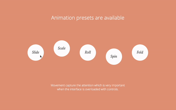
13. Html5tooltips.js: Best for smooth 3D tooltips
Effort level: High—full integration needed
Html5tooltips.js is an excellent tooltip plugin written in pure JavaScript, with smooth 3D animation implemented in CSS. It includes animation presets that add movement to the UX pattern, like sliding in, scaling, and folding when the user hovers over the element that the tooltip is anchored to.
 (Source)
Features summary:
Javascript-based tooltips
Configurable animations
Can include custom HTML content
Pros:
Great positioning logic for tooltips
Smooth 3D animation available
Cons:
No advanced positioning
Smaller community
GitHub rating: ⭐️ 500
14. Powertip: Best for hover tooltips
Effort level: High—full integration needed
Powertip is a jQuery plugin that creates hover tooltips and supports complex data, like timers, animations, multiple instances, and more. One of its unique features is that it checks for hover intent, so tooltips don't open the moment your cursor moves over an element, but only after the intent is clear.
Features summary:
jQuery based
Smart placement & collision detection
Multiple trigger modes
Pros:
Robust positioning logic
Hover intent feature reduces flickers
Comprehensive documentation
Cons:
Can be heavier than simple CSS solutions
jQuery dependency
GitHub rating: ⭐️ 1.7k
15. Toolbar.js: Best for customizable toolbars
Effort level: High—full integration needed
Toolbar.js is a toolbar plugin for Reveal.js that allows you to create tooltip-style toolbars for use in web applications and websites. The toolbar is easily customizable using Font Awesome icons, permitting a number of icons to be flexibly displayed.
Features summary:
Floating toolbar for actions
Configurable positions available
Hover and click triggers
Pros:
Interactive buttons and tooltips
Unique toolbar style
Easy to make UI enhancements
Cons:
Requires jQuery
Default toolbar style might clash with custom designs
GitHub rating: ⭐️ 2.6k
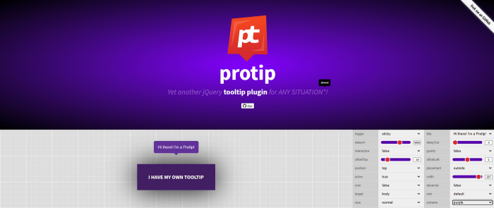
16. Protip: Best for fancy, customizable tooltips
Effort level: High—full integration needed
Protip is perhaps one of the most advanced plugins on the list. It’s a powerful jQuery, HTML5, and CSS3 tooltip plugin used to display interactive, heavily customizable tooltips with fancy CSS3 animations based on Animate.css. Plus, they have a cool website.
Features summary:
jQuery plugin for tooltips
Comes with multiple styles and animations
Data attribute API for configuration
Pros:
Easy to implement
Various themes
Supports interactive HTML content
Cons:
jQuery dependent
Smaller community
GitHub rating: ⭐️ 600
How to choose the right tooltip plugin
With so many tooltip plugins to choose from, you're spoiled for choice. There’s just one issue: How do you choose the right one? Selecting a suitable tooltip plugin is important because these modals play a notable role in your user’s onboarding experience.
The wrong plugin can limit design flexibility, portray an off-brand modal, or even cause pesky display bugs—not a good look.
That’s why we’ve included some tips for choosing the best plugins for flawless tooltips.
Technical requirements
First things first: Your tooltip needs to be fully compatible with your current tech stack.
For example, if you’re using jQuery, it follows that using a jQuery plugin will be more convenient. On the other hand, tech stacks with JavaScript frameworks like React or Vue go best with a plugin that’s framework-agnostic.
Make sure to check in with your developer team and get a comprehensive list of technical requirements. This will help you narrow down your choices.
Ease of use and customization
Some libraries are simple to implement. They offer plug-and-play configurations for quick and easy tooltips—perfect if you’re in a time crunch. Others excel because of their highly customizable APIs, letting you create interactive modals that match your brand.
Ideally, look for tooltip plugins that give you both easy implementation and freedom to create tooltips that let you maintain a consistent UI look and feel.
Support and documentation
Many teams overlook support and documentation. Look for libraries with clear examples and usage guides, frequent issue resolutions, and community forums.
After all, there’s nothing worse than getting stuck with a head-scratching library that puts a wrench in your developer efforts. The right documentation saves you time, effort, and a whole lot of headaches. This is especially important if you go with a plugin that has complex features, such as collision detection.
No-code options
If you need to deploy those new onboarding features like yesterday, then no-code solutions can save you lots of time. While they can’t turn back the clock, these nifty builders help you create in-app guidance consistent with your brand.
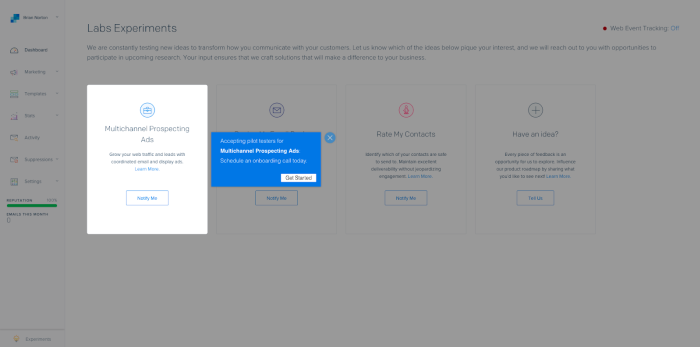
For example, Chameleon offers a range of templates, tours, and tooltips to nudge your users toward product adoption. Being no-code means they’re low lift, letting you create and deploy onboarding features fast.
For example, take a look at how SendGrip used Chameleon tooltips to upsell a newly released feature—all while staying true to their brand.
Implementing tooltip content effectively
Creating product-adoption-driving tooltips isn’t just about choosing the right plugin. To ensure your modals are helpful, here are a few best practices, use cases, and design tips to consider.
Best practices
How you use your tooltip box is just as important as the plugin you use. Some tried-and-true best practices for effective tooltip onboarding include:
Keeping content concise: Users don’t need an essay on how to use your new feature. Instead, use the minimum number of words to help the user complete their jobs-to-be-done in your tooltip content.
Making your tooltips accessible: Accessible Rich Internet Applications (ARIA) screen-reader-friendly text helps visually impaired users interact with your tooltips.
Avoid overuse: There’s a fine line between helping your users out and annoying them with tooltip boxes on every feature. Prioritize functions that need additional explanation while considering the overall user journey.
Use cases
That last bullet point—”avoid overuse”—might have you wondering: “When, exactly, should I use tooltips?” After all, you don’t want to risk distracting users from successfully interacting with your product. Here are some examples of when tooltips can be useful:
New user or feature onboarding steps: Guide users through their initial setup or key features. Here, time to value is of the essence and tooltips help you deliver that value quicker.
Hover explanations: If users are hovering over an icon, it’s a sign they’re confused. Giving them some extra context via a tooltip can help them decide what to do next.
Error fields: If users input invalid information, a quick tooltip can help them correct the mistake and move on with their sign-up process before they become frustrated.
Feature discovery: New features will likely need additional explanation before users adopt them. A tooltip can quickly provide context without getting in the way of exploration.
Design tips
The better your tooltips look, the better chance they have of helping your users. Some especially essential factors to consider are:
Avoid covering elements: Your tooltip should never cover the target element. Instead, place it above or to the side of the element so it doesn’t obstruct interaction.
Style consistently: Your UI elements, typography, and color choices should all match to ensure a consistent brand experience.
Use smooth animations and transitions: Gentle fades and slide transitions subtly draw attention without startling the user, while abrupt pop-ups and flickering can disrupt the experience
Introducing new tooltips with no-code solutions
With a list of 16 plugins, tips to choose the best one, and a crash course on implementing tooltips, you have all you need to introduce these helpful modals in your onboarding system.
While tooltip plugins can be incredible resources for engineers, making the process of adding tooltips to a website or product way easier, they don't do much for folks with little coding experience. In fact, the task of designing and deciding where to add tooltips can often fall on the end of a non-engineer, like a product manager or a UX designer.
If you have little to no coding experience or your engineering team is too overloaded to fit creating tooltips into their pipeline, even if using a plugin, consider no-code solutions that allow you to create tooltips and other UX patterns in minutes. If you are an engineer, using a no-code solution makes your job easier by helping you deploy onboarding tooltips quicker, letting you focus your efforts on other aspects of your product.
Chameleon (that's us!) puts user experience first when it comes to driving product adoption and engaging users with contextual and effective in-app messages.
Here's an example of a great series of tooltips that Degreed built using Chameleon to show users around a new product during a closed beta; this simple UX flow resulted in a 280% increase in beta platform opt-ins.
Want to try creating a tooltip on your own? Get started for free and enter Chameleon's Playground, where you can design on-brand, fully custom tooltips (and much more!) to help your users unlock success and get additional info right when and where they need it.


