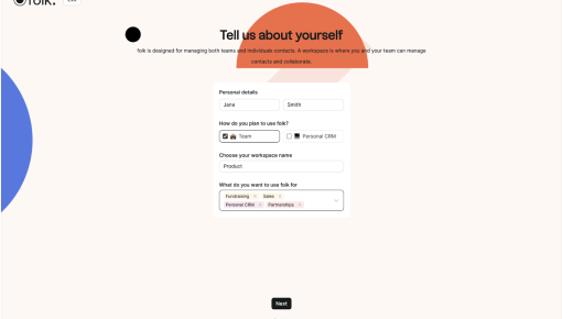
Folk's Onboarding Walkthrough
Ever signed up for a new tool and immediately questioned all your life choices? Nothing kills enthusiasm...
Existing customer? Sign in
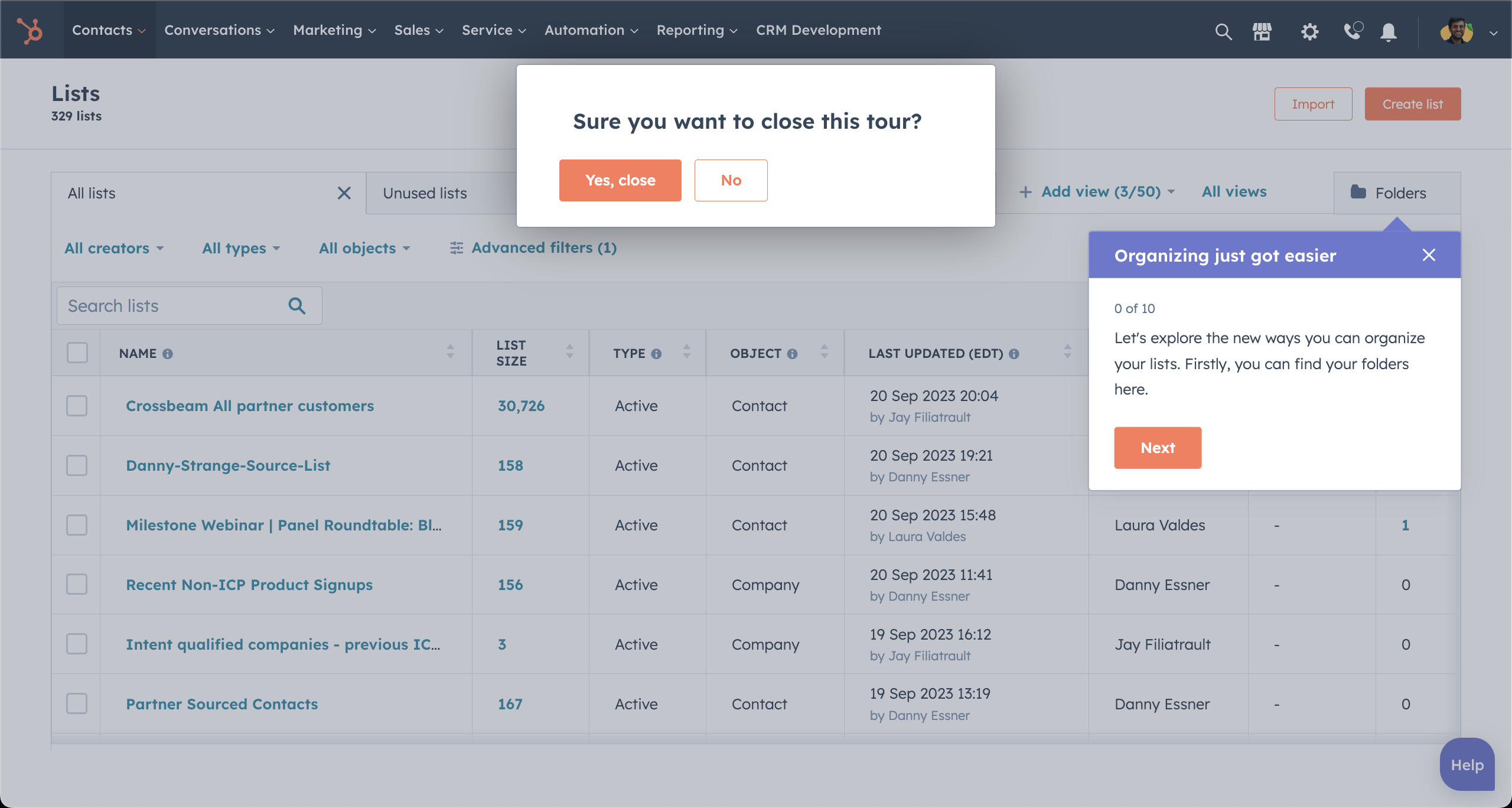
This UI showcases a subtle yet effective product tour experience. The prompt is split into two distinct layers: a guided tooltip walking users through the feature (right), and an exit confirmation modal (center). The balanced, non-intrusive design encourages users to stay engaged without overwhelming them. The clear language and distinct CTA buttons help maintain momentum while offering a graceful escape route if users feel confident enough to skip ahead. Pro tip: Adding a skip-and-revisit-later option could give even more user control.

More User Onboarding examples


Get started free in our sandbox or book a personalized call with our product experts