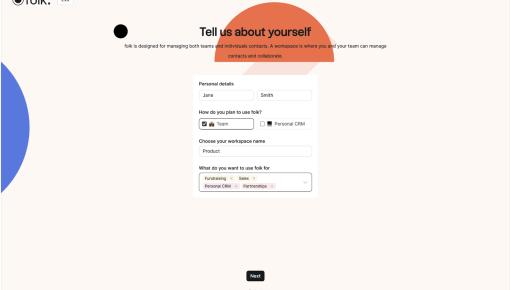
Folk's Onboarding Walkthrough
Ever signed up for a new tool and immediately questioned all your life choices? Nothing kills enthusiasm...
Existing customer? Sign in
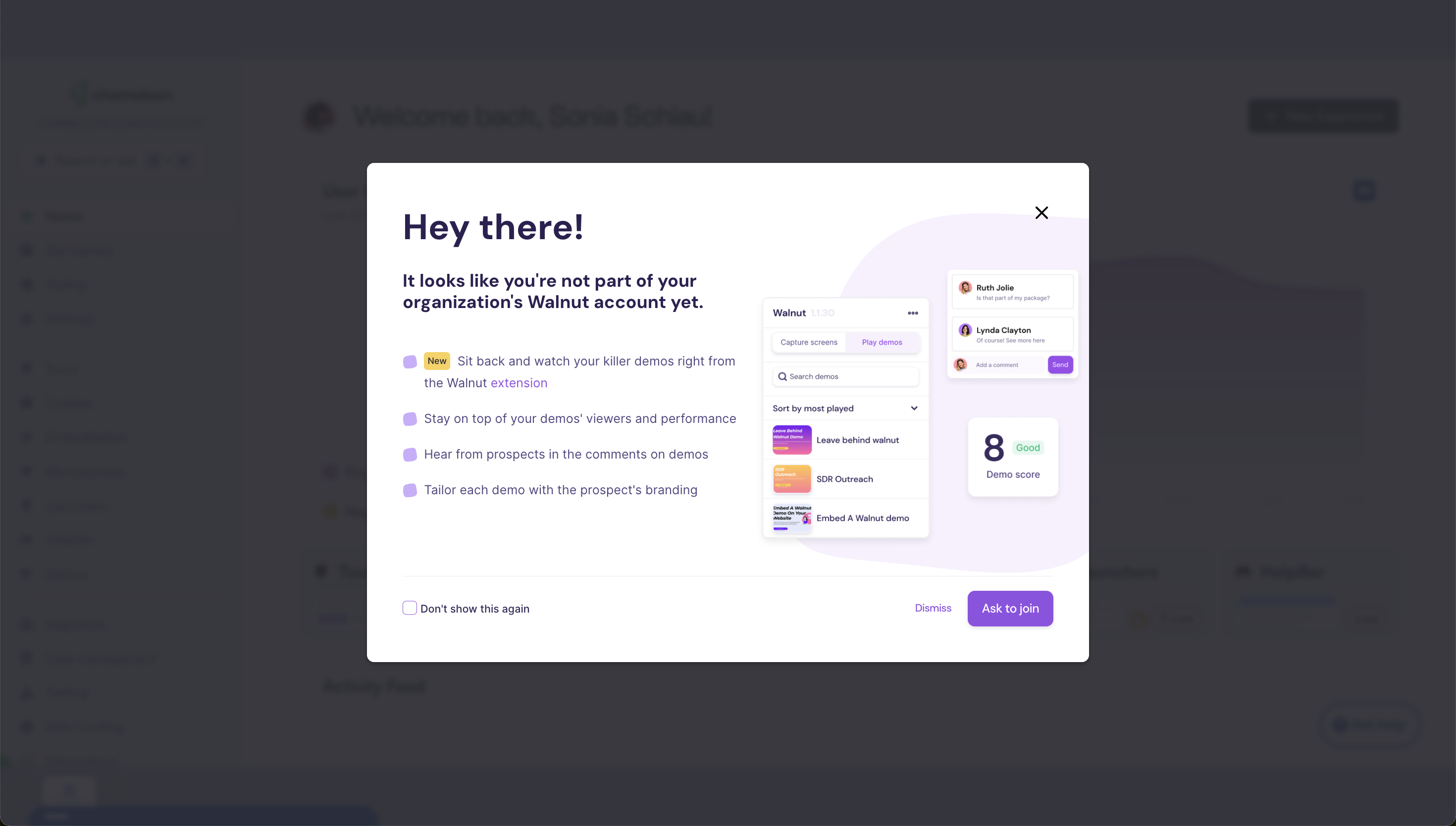
Walnut’s onboarding message gets straight to the point, making sure you're aware you're not yet part of your organization's account—no FOMO needed! It highlights key features like using the extension to view demos, tracking performance, and tailoring branding for each prospect. With a clear call-to-action to join, this flow is effective because it balances a sense of urgency with quick, digestible benefits. Plus, who wouldn’t want their demos to look that slick?
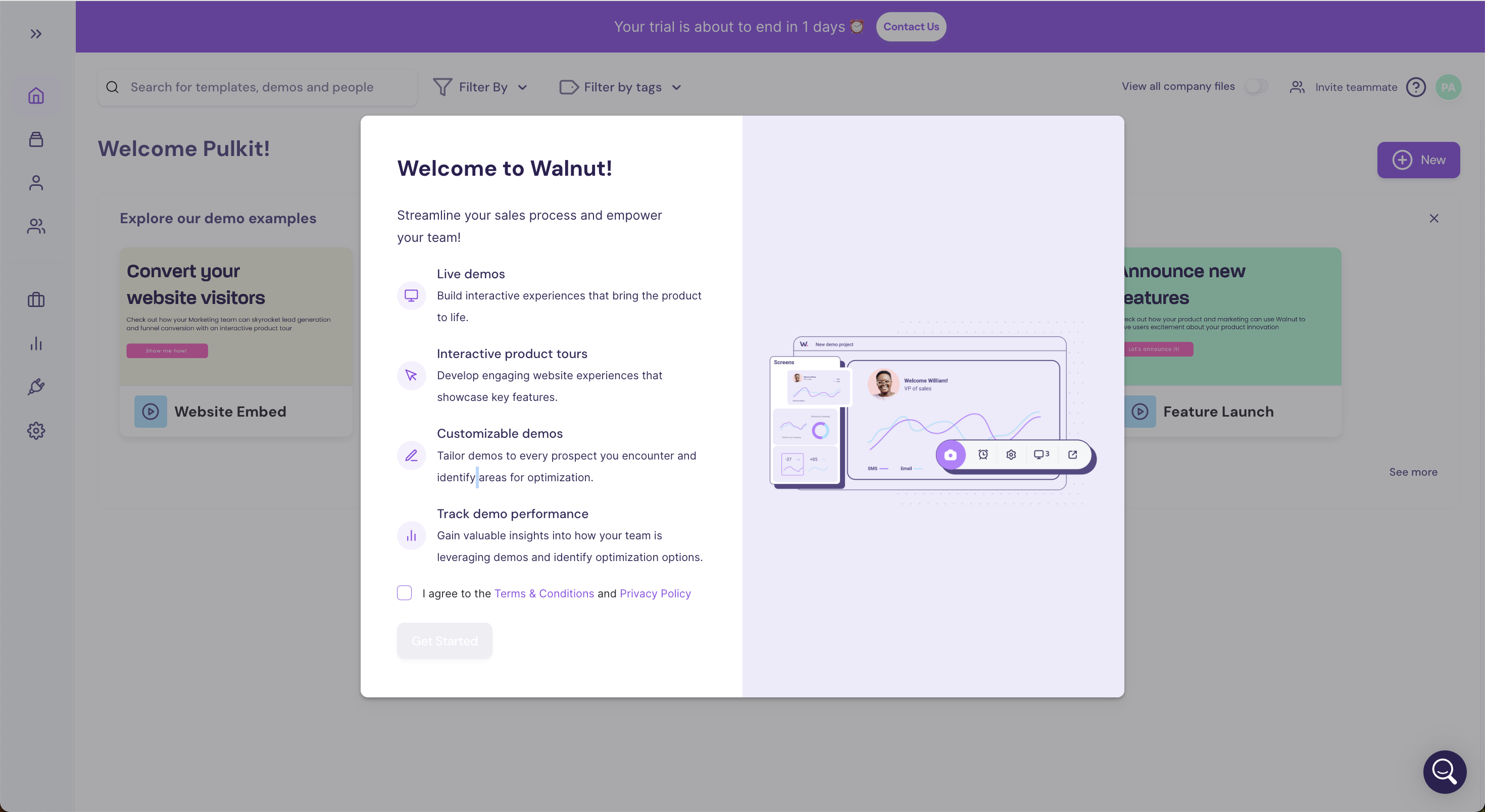
More User Onboarding, & Modal examples



Get started free in our sandbox or book a personalized call with our product experts