One minute, you’re launching what seems like a great feature, and the next, users are scrambling to find the exit button. Bad UX design can take many forms, from complicated user flows to poor user interface design that frustrates or even overwhelms users.
It’s not that your intentions were bad—far from it. But clunky navigation, slow page transitions, confusing forms, and a lack of mobile responsiveness can quickly turn your product from user-friendly to frustrating. For mobile users, this experience can be especially challenging if unnecessarily complicated password requirements disrupt the login flow.
The worst part? You might not even know these issues exist until it’s too late. But don’t worry, we’ve got you covered.
In this guide, we dive into ten of the most common UX design mistakes silently driving your users away. We also show you how to fix them, so you can turn your product into one users love coming back to.
Bad UX design is non-intuitive, slow, and non-inclusive, making it difficult for users to achieve their goals.
This leads to churn, decreased conversions, negative brand perception, increased support costs, and lower search engine rankings.
Common UX failures include clashing color palettes, irrelevant pop-ups, complicated user flows, unclear navigation, and cluttered layouts.
We look at ten real-world examples of bad UX with tips on how to improve them.
Finally, we leave you with some best practices to help improve your UX design.
What is bad user experience (UX) design?
Bad UX design occurs when a product or interface makes it difficult for people to interact with it and accomplish their tasks. It leaves users feeling frustrated, lost, or overwhelmed, creating unnecessary friction during their journey.
Bad UX design often happens when design decisions don’t put user needs first, leading to a frustrating, clunky experience that makes people want to leave.
Some key characteristics of bad UX design include:
Designs that are not intuitive or easy to navigate, requiring users to figure out how to use the product through trial and error rather than having it feel natural
Overwhelming users with too much information, too many choices, or a cluttered interface. Good UX design prioritizes simplicity and clarity.
Slow page transitions frustrate users and degrade the experience
Ignoring accessibility needs, resulting in designs that are not inclusive
Focusing too much on aesthetics at the expense of usability and functionality
🦎Tip: Want to see what great UX looks like? Check out our inspiration gallery.
We will cover each of these characteristics in detail later. Now, let’s look at how bad UX design affects your business.
How bad UX impacts your business
Bad UX design directly hits your bottom line. Let’s break down exactly why this happens:
Increased support costs: bad UX often leads to confusion, causing users to reach out to customer support for help with tasks they should be able to perform easily. This increases operational costs as your support team has to handle unnecessary queries, which could have been avoided with a better design.
Loss of customers: when users see confusing layouts or slow load times, they quickly leave your site or app. This results in a higher bounce rate, meaning potential customers leave before converting. Fewer conversions = fewer sales.
Negative brand perception: a frustrating experience doesn’t just cost you a one-time customer. It damages your brand’s reputation. When users struggle with your product, they associate that frustration with your brand. Word spreads quickly through online reviews and social media. Bad UX can lead to negative reviews, which influence how potential customers view your brand.
Lower search engine rankings: search engines like Google consider user experience factors like load speed and mobile-friendliness when ranking websites. A poorly designed site will have higher bounce rates and lower engagement, both of which will hurt your SEO performance. Lower rankings mean fewer visitors, which directly affects revenue.
To understand how to avoid these costly pitfalls, it’s important to recognize what makes UX bad in the first place. Let’s look at some specific factors that make UX bad and how to avoid them.
What makes a UX bad?

Bad UX happens when customer flows are confusing, usability or accessibility is poor, or design principles are ignored.
Let’s take a look at some of the biggest contributors to UX fails.
1. Clashing color palettes
Ever visited a website that made your eyes hurt? When colors don’t play nice together, it’s like trying to read a neon sign in broad daylight—painful and confusing–especially for users prone to sensory overload. Clashing colors can trigger anxiety, stress, and, in some cases, physical discomfort.
How to fix it:
|
2. Irrelevant pop-ups
Imagine being stopped at a restaurant's door and asked to join its loyalty program before you even see the menu. This is a classic example of irrelevant pop-ups.
They interrupt users at the worst possible moment, often before they’ve even had a chance to get value from your content. Whether it’s a pop-up asking for a newsletter subscription the moment someone lands on your page, or a full-screen ad blocking your view of an article, these missteps make users more likely to leave than to convert.
How to fix it:
|
3. Complicated user flows
When a process is overly complex, it forces users to think harder than necessary, increasing cognitive load. This leads to mistakes as users struggle to navigate through unnecessary steps or unclear choices.
The result? Longer task completion times that sap their patience. Worse yet, these flows can drive users to abandon the process entirely, especially if they feel overwhelmed or see the task as too time-consuming for its perceived value.
How to fix it:
|
4. Unclear navigation
If your navigation menu is buried behind an unfamiliar icon or scattered across multiple levels with no clear organization, users won’t know where to go next. When navigation labels are unclear, users may end up clicking the wrong links, wasting time, and growing increasingly annoyed.5. Cluttered layouts
How to fix it:
|
5. Cluttered layouts
When too many elements compete for attention on a page, users struggle to focus, making it hard to find what they’re looking for. A cluttered layout typically lacks hierarchy, has too much text, excessive images, buttons, ads, or all of the above packed into one small space.
This overloads the user, leading to confusion and decision fatigue. Users may feel lost, unsure where to click next, or unable to distinguish between primary and secondary information.
How to fix it:
|
6. Undiscoverable features
When features are buried deep within menus, poorly labeled, or hidden behind non-intuitive icons, users miss out on the full value of your product. Why is this a problem? Your users are left guessing, clicking around aimlessly, or giving up entirely. This wastes their time and leads to the perception that your product is incomplete or poorly designed.
How to fix it:
|
7. Not following relevant psychology principles
In UX design, mental models are the internal expectations users have about how a system should work, shaped by their past experiences with similar products.
This alignment reduces the cognitive effort required to interact with a product, making it more user-friendly. Ignoring these psychological principles can lead to a frustrating and overwhelming experience for users.
For example, Hick’s Law tells us that too many choices slow down decision-making. In bad UX, this often looks like an interface cluttered with endless options like buttons, links, and menus that overwhelm users instead of guiding them.
With no clear path forward, users struggle to make a decision, increasing frustration and causing them to either abandon the task or make mistakes. It's like a complex menu with dozens of similar items and not knowing where to start, causing decision paralysis.
How to fix it:
|
10 bad UX examples and how to improve them
Now that we’ve covered what warrants bad UX, let’s get into some real-life bad UX examples. Even the best among the best can sometimes fail to deliver an exceptional experience.
Here, we’ll explain why these examples are bad and how each can be improved.
1. Apple Music’s confusing navigation

Apple Music’s 2024 design is visually sleek and feature-rich but causes some considerable frustration amongst users due to both navigation and its complex and cluttered navigation system.
What makes it bad: Essential features (like personalized playlists, curated content, and library management) are buried under multiple menus. Plus, features like collaborative playlists or advanced search functions are not immediately obvious. This leads to users missing out on the full capabilities of the app.
How to improve: Apple Music could benefit from cleaner navigation. Placing core features like playlists and library management front and center would reduce the need for users to dig through menus. Improving consistency between iOS and macOS layouts would make the overall experience better with an intuitive and user-friendly interface across platforms.
2. Spotify’s premium upsell pop-ups
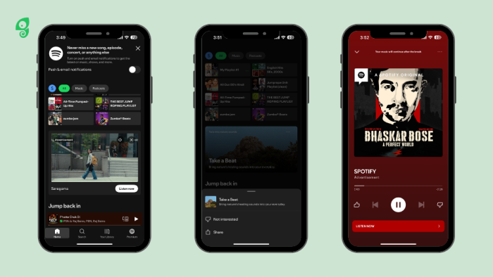
Spotify uses in-app messaging to promote its premium subscription. When users on the free plan reach their song-skip limit, they receive pop-ups encouraging them to upgrade. While this strategy aims to convert free users into paying subscribers, these pop-ups often interrupt user interactions—like when they try to change settings or select songs.
What makes it bad: The timing feels intrusive and creates a sense of pressure to upgrade, turning what could be helpful suggestions into unwelcome interruptions. This constant push, especially when users are already restricted by limits, can result in negative associations with the app rather than encouraging conversion
How to improve: Spotify could improve these messages by displaying them at more appropriate times, like after a listening session, rather than mid-interaction. Personalized banners or subtle notifications could replace full-screen pop-ups to reduce disruption.
Offering small incentives—such as limited ad-free periods or bonus skips—would allow users to experience premium benefits firsthand, increasing the chance of conversion without making users feel forced.
3. USPS confusing form

There are a couple of principles that UX professionals highlight—color psychology, the F-shaped pattern, and the 3-click rule are some of them. Another important one is the Gestalt principles of design.
Gestalt principles help the brain process visuals more easily by making assumptions based on grouping and proximity. There are six Gestalt UX principles to understand—similarity, continuation, closure, proximity, figure/ground, and symmetry. Each of these can affect user experience. However, when a design—like the USPS form—goes against these principles, it leads to a confusing user experience.
What makes it bad: The form goes against Gestalt principles, especially proximity. Fields c. and d. are positioned near the wrong boxes, making users believe the information belongs there—when in fact, it goes in the boxes above. This mismatch causes unnecessary confusion and slows down the process.
How to improve: The form’s layout should follow Gestalt principles more closely, particularly proximity, by positioning text labels directly next to the correct input fields. This simple adjustment would align user expectations with the form's design, making the experience smoother and more intuitive.
4. Popupsmart’s blocking modal
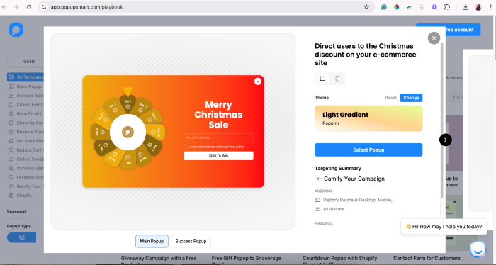
Pop-ups can be really helpful. They can also be really annoying. Striking a balance between the two and delivering well-timed, necessary pop-ups is essential for successful user onboarding.
Whether users are learning to use a new feature or taking the first explorative steps on your website—they don’t want to be confronted with a pop-up in the first five seconds unless it’s absolutely necessary. There’s a time and a place.
What makes it bad: In this example, we see a pop-up model that appears in the middle of the screen soon after a website visitor starts scrolling through the Showcase page, looking through examples. The modal blocks the page and prevents a viewer from performing any further actions before closing it. Plus, there’s a “cookie” notification at the bottom left, adding to the noise on the page.
The fact that this example comes from Popupsmart, a pop-up builder, only makes it more difficult to understand why they didn’t apply pop-up best practices.
Another unfortunate issue here is the irrelevant copy. The text within the modal calls the visitors to read the blog, emphasizing a “collection of budget decoration ideas” which is completely unrelated to the topics from Popupsmart’s blog—with topics on building and crafting pop-ups that work.
The modal pops up before you’ve even had the chance to scroll down and consider if you want to stay. Using a pop-up in such a manner is off-putting and disruptive. Also, it uses a color palette similar to the background colors, so it doesn’t stand out.
How to improve: This one could perform better as a banner or another type of notification with relevant, compelling copy. To avoid this mistake, understand your users’ jobs-to-be-done to better serve their needs. A pop-up at the right time can be a life-saver—every bit of UX matters. Understanding users also helps identify where you can further improve your UX.
5. Booking’s date picker – form over function
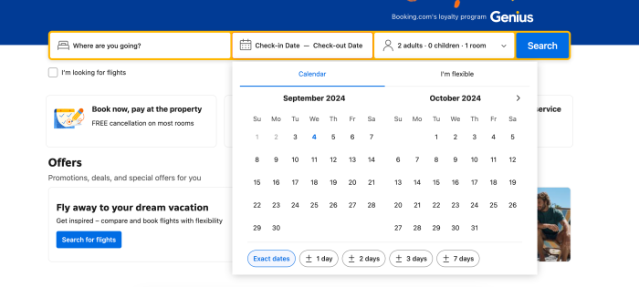
Date pickers are a crucial element in booking platforms, helping users select travel dates easily and efficiently. A well-designed date picker should be intuitive and accessible for all users, including those with disabilities. However, designs prioritizing aesthetics over usability can lead to frustrating experiences that hinder user interaction.
What makes it bad: Booking’s drop-down travel date calendar is inaccessible to screen reader software, which many people use to navigate the online world.
We spoke to Dale Reardon, CEO and Founder at Travel for All, to learn more about accessible UX.
“As a blind person, I use a screen reader to surf the internet, read the computer screen, navigate websites, and more. But many websites have inaccessible booking forms. Typically, it’s caused by an inaccessible calendar as part of the form—a so-called date picker. A web designer tries to make it look fancy, but it often ends up breaking the built-in accessibility that exists for standard form fields.”
– Dale Reardon, CEO and Founder at Travel for All
This means Dale has to resort to calling to make booking arrangements, with some contact forms also failing on the accessibility front.
How to improve: This example could be more effective by adding the numerical date format into the form field to accompany the date picker and make it readable by screen readers. UX isn’t just about design and creativity, it’s about accessibility and quality of experience, too.
6. Netflix auto-play feature
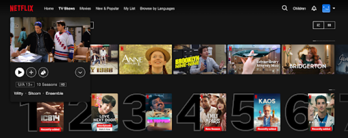
As soon as you hover over a thumbnail, a trailer or clip starts playing automatically, often with loud audio. This feature breaks a key UX principle: giving users control over their experience.
What makes it bad: Instead of allowing users to choose when to engage with content, autoplay forces interaction, often leading to frustration, especially in environments where loud audio is intrusive. It also adds unnecessary cognitive load by constantly shifting the user's attention away from their browsing to manage these unrequested previews.
How to improve: Netflix could easily fix the autoplay issue by giving users control over whether they want previews to play. A simple toggle in the settings to turn off the hover autoplay would give users the power to choose. Additionally, muting the trailers by default, as many other platforms do, would make browsing smoother and less disruptive.
7. Ryanair’s booking platform and buried feature
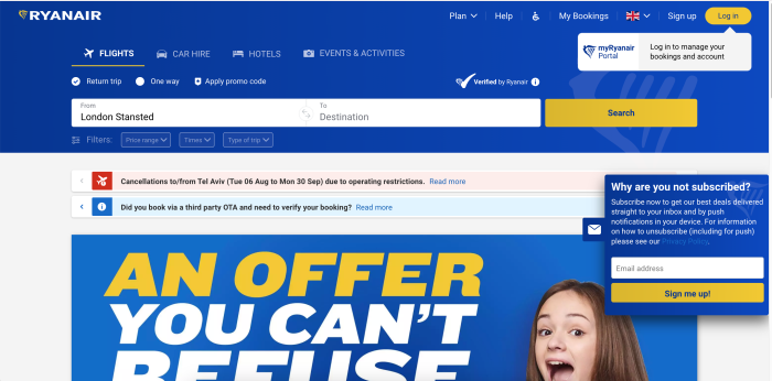
A major complaint from users is that Ryanair key features, such as declining travel insurance, are buried deep within unrelated menus, making them difficult to find. For instance, the option to opt out of insurance is often placed within a dropdown of countries, which is not where users would typically expect to find it. This design creates unnecessary confusion and leads to errors, as users are tricked into selecting add-ons they don't need or want.
What makes it bad: This bad UX example complicates tasks in a way that benefits the business rather than the user. Ryanair's platform not only frustrates users but also damages trust.
How to improve: The solution here is simple: Ryanair should prioritize transparency. Essential options like declining insurance should be easily accessible and clearly labeled, without being hidden in unrelated menus. By placing these features front and center, users can make informed decisions, reducing frustration and improving the overall user experience.
8. WhatApp’s delete message option
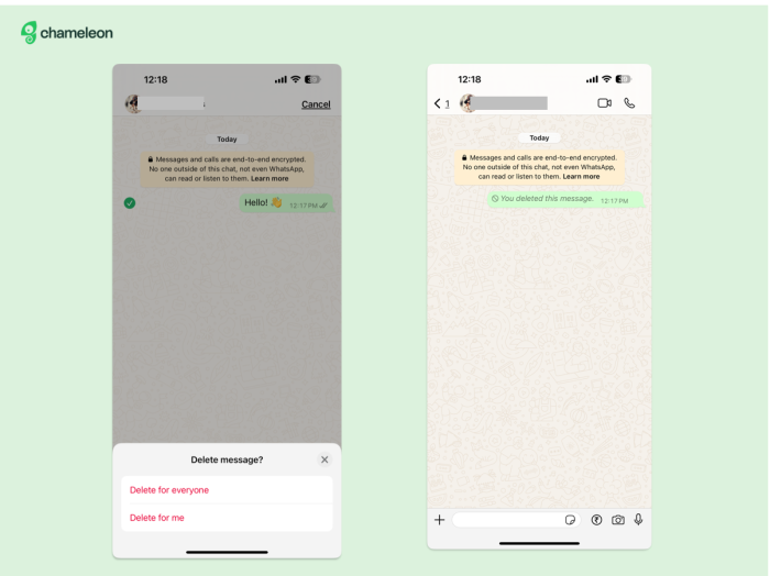
WhatsApp’s ‘Delete for Everyone’ feature sounds useful at first glance, but it actually creates more problems than it solves. Instead of fully removing a message from a conversation, it leaves a placeholder saying, "You deleted this message."
This notification can raise suspicion and lead to awkward conversations (and silences), completely defeating the purpose of trying to delete a message in the first place. The feature creates unnecessary attention around a mistake rather than discreetly fixing it.
What makes it bad: This feature doesn’t align with users' expectations. When they hit delete, they expect the message to disappear without a trace, not leave a glaring sign that something was removed. It takes away user control by forcing them to engage in further conversation about a message they intended to remove quietly.
How to improve: A better approach would be to completely remove the message without notifying the recipient, similar to how Gmail offers a short grace period to unsend emails. Alternatively, WhatsApp could provide users with a limited window to undo the message before it’s delivered to the recipient, giving them full control over their mistakes without raising suspicion.
9. Ebay’s confusing navigation
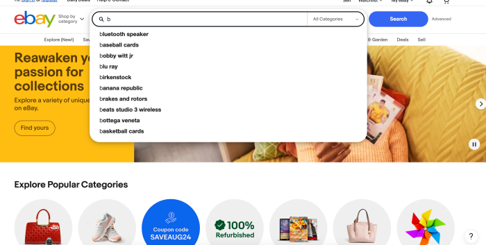
Ebay’s key features like listing items for sale or searching for specific products can feel disjointed and unintuitive. For example, the "List item" button redirects users to payment methods rather than posting the listing directly, which deviates from user expectations and interrupts the workflow.
The dynamic auto-fill feature in the search bar also disrupts the user’s task flow by leading to unrelated pages, causing confusion and frustration. Plus, the homepage for sellers is cluttered with irrelevant content, making it difficult to find essential tools and information.
What makes it bad: Inconsistent visual design, including varied text sizes, color schemes, and poor use of white space, contributes to a disorganized appearance. As a result, users often turn to more user-friendly competitors like Amazon.
How to improve it: eBay should focus on reducing visual clutter and creating a more consistent design across the platform. Rather than redirecting users to payment methods, the "List item" button should immediately take users to the listing page, aligning with their expectations.
Plus, improving the search bar's dynamic auto-fill feature by ensuring it presents relevant results would help maintain a smoother user flow. Addressing these navigation issues would make the platform more intuitive and less frustrating for both buyers and sellers.
10. CNN’s poor loading time
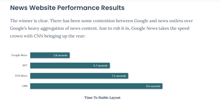
According to a 2023 analysis by Request Metrics, CNN was one of the slowest loading major news websites tested. Ideally, websites aim for a load time under two seconds. If a page takes longer than two seconds to finish loading, that’s an issue. It could be due to factors like server delays, too many embedded elements, or heavy content such as videos or ads.
What makes it bad: Instead of getting to the content they want, users often have to wait for ads and videos to finish loading, which can cause them to leave the site. Slow load times also make the site hard to use on both mobile and desktop, leading to a poor experience overall.
How to improve it: CNN can improve this by cutting down on autoplay videos and reducing the number of ads per page. They should also compress images and videos to make them smaller and faster to load. Using "lazy loading" would help too—this means loading only what’s visible on the screen, and then loading more as the user scrolls.
How to detect and eliminate bad UX in your product
So how do you spot bad UX before it does real damage? Look for these signs:
User complaints: if users are constantly raising issues about confusing navigation or slow load times, it's a clear red flag. Solution: actively monitor user feedback channels, respond quickly, and prioritize fixing recurring problems through design tweaks or improved performance.
High drop-off rates: analytics showing users abandoning your product at specific points signal trouble spots. Solution: use heatmaps and session recordings to understand why users drop off. Simplify the journey, reduce friction, and ensure a logical flow through the product.
Long task completion times: if users are taking too long to complete basic tasks, your design may be too complicated or unintuitive. Solution: conduct usability tests to observe where users struggle and streamline processes, making them quicker and easier to navigate.
Inconsistent user behavior: if some features are underused or skipped entirely, it could mean they aren’t easy to find or use. Solution: simplify the design, ensuring that important features are accessible and visually prominent. A/B testing can help optimize placement.
UX best practices: 5 tips for outstanding UX
Fixing issues with user experience requires changing up your approach—here are a couple of ways to go about it.
1. Use consistent design elements and avoid overwhelm
Inconsistent design,where buttons, menus, and layouts change from one screen to the next—leaves users confused and unsure of what to do next.
At Chameleon, one common complaint we hear is when elements or onboarding tours overlap, creating a messy interface where users don’t know where to go. That’s why we offer rate limiting. This feature helps control the timing of when onboarding tours or pop-ups appear so they don’t overwhelm users by showing up too quickly or stacking on top of each other.
This way, users can focus on one interaction at a time, allowing for a much smoother and more guided experience. It keeps the interface clean and reduces distractions.
Here’s a sneak peek into how rate limiting works 👇
2. Provide relevant product tours
The first step for improving the user experience is to provide guidance from the offset. The onboarding experience is a huge part of the users’ experience with your product. So big, in fact, that 86% of people say they’d be more likely to stay loyal to a business that invests in onboarding content that welcomes and educates them.
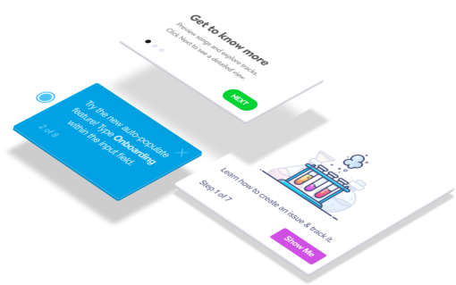
Use banners, modals, hotspots, and more to guide your users through your product and its features. Identify user personas to personalize the onboarding experience for each user. You want your tour to be a one-stop shop for new users—where they finish with a strong understanding and first impression of your product.
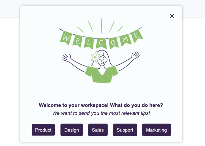
Here’s an example of an attractive and welcoming onboarding tour.
3. Prioritize responsive design
A responsive design ensures your site looks good and works well no matter the screen size—phone, tablet, or desktop. Without it, users may face awkward layouts, hard-to-read text, or navigation that doesn’t work on smaller screens, leading to frustration and abandonment.
Starting July 5, 2024, Google has stopped indexing websites that are not mobile-friendly. This means that if your site doesn’t work on mobile devices, it will no longer show up in Google’s search results. With mobile traffic accounting for over 60% of global web usage, this shift emphasizes the importance of mobile optimization. Failing to make your site responsive could drastically impact your visibility and overall business performance.
4. Offer tooltips at key points
Once you’ve identified where users are encountering issues—be that with rage clicks, cursor thrashing, or any other display of frustration—you need to provide guidance. This will help you reduce abandonment rates and give a simpler experience to users.
For example, if users are repeatedly getting stuck when searching for something within your product, add a tooltip that provides guidance on what to do. That way, if they encounter issues and the solution is right in front of them there’s no need for frustration.
👉 Check out this interactive demo on creating Chameleon Tooltips that delight.
5. Run in-product surveys for instant feedback
You always want to be learning from your users, whether that’s what they love or what they can’t stand. The best way to do this is to ask them.
Getting customer feedback doesn’t need to be treacherous or long-winded. That’s a thing of the past. Instead, create contextual, targeted in-product surveys to build continuous feedback loops from your product users.
Once you’ve implemented the changes based on the feedback insights,, you can then look back and benchmark it against previous data. This helps you identify the UX/UI patterns that are most effective with your users, and continue building a more intuitive design.
Wrapping up: Lessons from bad UX examples
That concludes our walkthrough of the bad UX/UI design examples, so now you know the mistakes you don’t want to make.
User experience is unique for each user, and a deeper understanding of user psychology is sure to help create comprehensive UX design patterns. Make sure you’re personalizing the experience to create a bespoke UX for all your users.
Lastly, prioritize simplicity and clarity in your UX. Dig deeper into your user personas to understand exactly what people want and need from your product, and how you can deliver and communicate it effectively.
Build in-app guides to retain users
Chameleon makes it easy for product teams to create product tours, tooltips, onboarding checklists, and in-app surveys without code.


