


A bad help menu creates more support tickets. A good one drives adoption. So how do you create a help menu design that’s clear, intuitive, and actually useful?
This guide breaks it down—best practices, top menu designs, navigation tips, and design strategies that make sense for real users. Let’s get started!
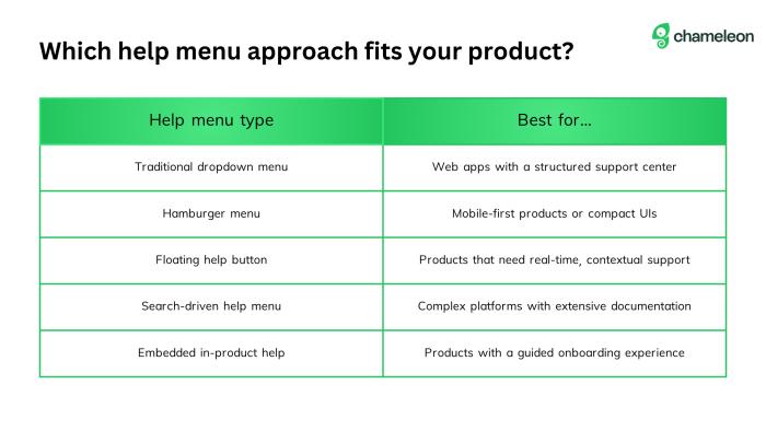
What is a help menu in a product?
A help menu is an in-product support system that gives users quick access to important links, guides, and troubleshooting resources. Instead of forcing users to leave the app or dig through a separate help page, it provides answers right where they need them.
Most in-product help menus live at the top of a product’s UI, and are often displayed as a hamburger icon, a question mark icon, or a labeled help button. Depending on the help menu design, it might include:
FAQs and help page examples for common questions
In-product messaging or chat support for real-time help
Navigation menus linking to user guides, tutorials, or product updates
Search bars to quickly find solutions
Onboarding user flow assistance to help new users get started
Key elements of a user-friendly in-product help menu
If you do nothing else, make sure your help menu is:
✅ Accessible: Easy to find and navigate across devices.
✅ On-brand: Consistent with your product’s UI and tone.
✅ Searchable: Equipped with a search bar so users can quickly find answers.
A help menu should feel like a natural part of your product or website menu, not an afterthought. Here’s what makes a help menu design truly effective:
Clear menu navigation: Users should instantly understand where to go. Keep menu items well-labeled, avoid vague link labels, and ensure key resources aren’t buried in submenus. On mobile devices, a hamburger menu or tab bar keeps navigation simple.
Logical resource organization: A cluttered help menu is just as bad as no help at all. Group related content (e.g., FAQs, troubleshooting, onboarding guides), highlight the most important links, and use a responsive menu that adjusts to smaller screens.
Contextual in-product messaging: Sometimes, users don’t even think to check the help menu. Use in-product messaging like tooltips or embedded help links to guide them without disrupting their workflow.
Now that we’ve covered what makes a user-friendly help menu, let’s talk about how to build one.
How to design your help menu for a self-service product experience: 6 best practices and examples
Creating a user-centric help menu design isn’t as easy as it sounds. You’ll have to juggle many factors to create an impactful design.
1. Keep it on brand
If your product is sleek and modern, but your help menu design looks like a clunky FAQ page from the early 2000s, that’s a problem.
Here’s how to make sure your in-product help menu fits right in:
✅ Make it feel native: If your product has a minimalist UI, don’t clutter the help menu with unnecessary borders, mismatched fonts, or outdated icons. It should look like it belongs—whether it's a hamburger menu, tab bar, or menu bar.
✅ Keep the tone on point: If your product speaks like a human, your menu items and help text should, too. Avoid jargon, robotic phrasing, or overly formal instructions. Users should feel like they’re getting guidance, not reading a manual.
✅ Use on-brand patterns: Ensure your help menu aligns with your brand's naming conventions and structure. If your product groups feature by tool or service, your help content should mirror that. Whether you call it 'Support,' ‘Help Center,' or 'Knowledge Hub,' use language and organization that feels familiar to your users.
2. Make it easy to find
If users can’t spot your help menu, they can’t use it. Keep it in a consistent, visible location, like a main menu bar, sidebar, or the upper right-hand corner—where many users naturally look.
The widespread adoption of the hamburger menu (☰) trains users to expect navigation in these zones. Similarly, persistent question mark (?) icons in bottom corners guide users to help resources. Avoid hiding your help menu in drop-down menus or using vague labels.
Chameleon's Launcher solves this by sitting in the bottom-left corner as a CTA button labeled “Useful Resources.” Instead of making users dig for help, it provides direct access to training videos, feature updates, and insights from the rest of the team. It also includes a “Get Help” button for live chat, giving users the option to escalate issues when needed.
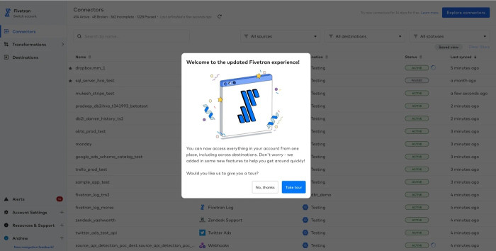
Another help menu example—from a company making help easy to find—is this one from Fivetran. They turned to Chameleon’s Launcher to provide a visible, always-accessible help menu that offers quick access to product tours, feature updates, and support options.
The results?
Increased user engagement with product tours
Identified 15 critical bugs during beta testing
Collected actionable user feedback to refine product updates before launch
“Launchers were a pleasant surprise! We didn't have these in our old tool and we never used anything like it to help users understand the value of different functionalities during their onboarding experience. We'll continue to experiment with Launchers and hope to see them help with nudging users to take specific actions.”
3. Ensure accessibility
Your help menu should be easy to find and use for all users, including those with disabilities or different browsing preferences.
To make your help menu design accessible, use high-contrast colors, readable fonts, and clear link labels so users know exactly where they’re going. Navigation should be smooth, whether using a mouse, keyboard, or mobile touchscreen.
A responsive menu is also critical—on mobile devices, a tiny hamburger icon or cluttered drop-down menu makes tapping difficult. Buttons should be large enough to easily tap, and important support links should never be buried behind too many clicks.
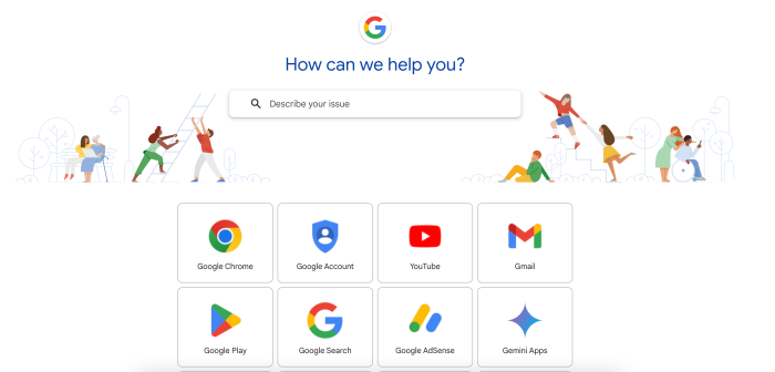
A great example of accessibility in action is Google’s Help Center homepage. It follows Web Content Accessibility Guidelines (WCAG) to ensure all users can navigate the menu using keyboard shortcuts and screen readers. This means users who rely on assistive technologies can still access important resources without frustration. Google also prioritizes high-contrast text, making information easier to read for those with visual impairments.
4. Provide a search functionality
A search functionality in a help menu allows users to type in a query and instantly find relevant support resources.
A well-designed help menu search improves the self-service product experience by:
Reducing the number of clicks needed to find answers
Offering real-time search suggestions as users type
Supporting natural language queries for better usability
Keeping users within the product instead of redirecting them to external help centers
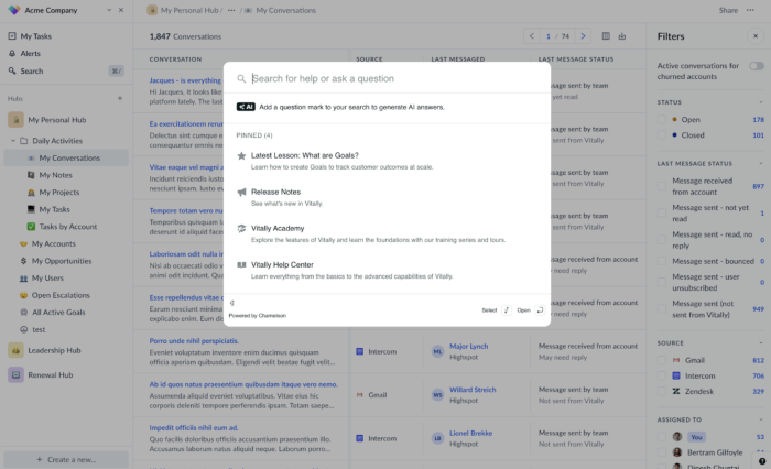
Vitally implemented Chameleon’s HelpBar to create an in-app search tool that puts support resources at users’ fingertips. Instead of forcing users to dig through a menu bar or search outside the product, HelpBar provides instant access to documentation, training videos, and best practices—all without breaking the workflow.
The impact was immediate: Vitally saw a huge increase in users accessing HelpBar instead of their external help center, leading to fewer support tickets and a 55% tour completion rate as more users self-served their learning.
“We’ve seen a huge increase in the number of users who went to the HelpBar versus our help center, which is kind of hidden under a couple of layers of navigation.”
5. Use user-centered design
A help menu should be built around how users think and behave—not just what looks good on a product roadmap. The easier it is for users to find answers, the more likely they are to stay engaged, solve problems independently, and adopt your product.
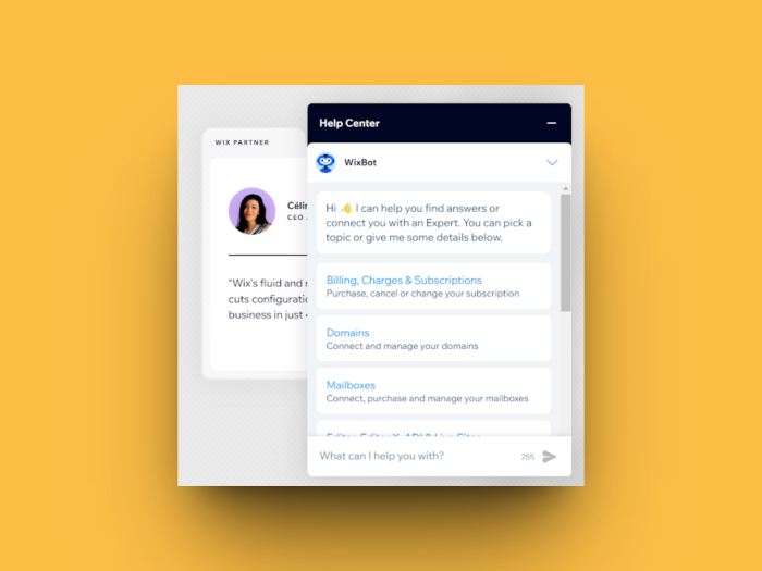
A great example of this is Wix’s help menu, which blends an FAQ-based system with an AI-powered chatbot. Instead of making users manually search through loads of articles, Wix allows them to either select a help category or type in a few keywords to get the most relevant support resources instantly. This chatbot functions as a search engine and a self-service product assistant, helping users navigate the menu options efficiently.
Beyond convenience, Wix’s help bot reinforces the brand’s tone and customer experience with its messaging style. It makes the help menu design feel conversational, reducing the frustration that often comes with traditional support systems.
6. Leverage visual aids
Text-heavy help menus can feel overwhelming, especially when users are searching for quick answers. Visual aids—such as images, icons, GIFs, and videos—make information easier to digest and improve comprehension.
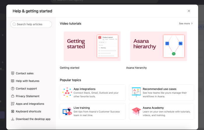
This help menu example from Asana shows how visual elements can enhance the self-service product experience. Instead of relying solely on text, Asana incorporates icons, video tutorials, and illustrations to make support resources more engaging and easier to navigate.
Users can quickly access video tutorials for getting started and understanding product features. The ‘Popular topics’ section uses icons and visuals to highlight key categories like app integrations, recommended use cases, live training, and Asana Academy. This makes it clear what each section offers without requiring users to read through long descriptions.
Measuring help menu success: increasing user adoption rate
So, how do you know if your help menu design is working? Here are some key metrics to measure to help assess and optimize user adoption:
Help menu engagement rate: Measures how many users open the help menu. A low rate may indicate poor visibility or lack of perceived value.
Click-through rate (CTR) on menu items: Tracks which menu options users engage with the most. If critical links are ignored, the layout or labels may need adjustments.
Search behavior: Identifies common queries and whether users find relevant answers. Frequent searches for the same topic suggest that content should be surfaced more prominently.
Time spent in the help menu: Determines if users are quickly finding solutions or struggling to navigate.
Mobile vs. desktop usage: Helps assess whether the menu navigation works equally well across different devices.
Support ticket deflection rate: Tracks whether users find answers in the help menu instead of contacting support. A rising deflection rate signals successful self-service adoption.
Use Chameleon to create a help menu that truly helps
A help menu should actively guide users, provide relevant answers, and encourage self-service support. With Chameleon, you can build custom, in-product help menus that feel native to your product—without a line of code.
Companies using Chameleon see a 20% reduction in support tickets and a 35% increase in self-service engagement—here’s how.
Fivetran improved onboarding and reduced support strain by using Chameleon’s Launcher to create an always-accessible help menu. This provided quick access to product tours, feature updates, and support resources, leading to 15 critical bugs being identified during beta testing.
Vitally boosted self-service adoption by implementing Chameleon’s HelpBar, allowing users to search for answers without leaving the product. This resulted in a 55% increase in tour completion rates and fewer support tickets.
Plus, with Chameleon’s no-code customization, real-time analytics, and deep integrations, you can track how users engage with your help menu, refine content based on real behavior, and continuously optimize the experience.
Not sure where to start? Try Chameleon’s Launcher to see how to amp up your user experience with meaningful support.


