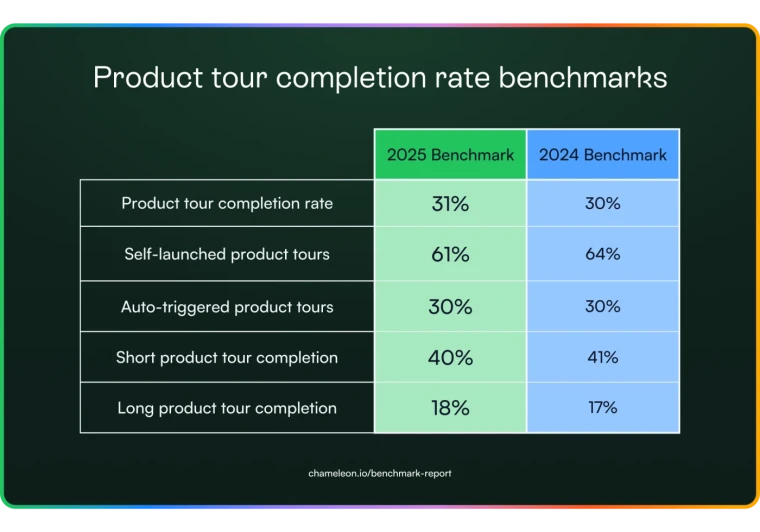
Let’s say you’ve prepared the most exhaustive knowledge base with heaps of categories and articles to help users troubleshoot problems and answer questions independently; that’s great! The sad news? A knowledge base on its own isn’t enough; new users are still churning.
Users need just-in-time help while they're exploring your product. Instead of detouring to your knowledge base, using the right keywords, and finding the answer they’re looking for. Users need contextual help embedded within their product experience.
Contextual help guides users through your product's functionality and interfaces with minimal disruption to the user experience.
In this guide, we’ll cover the concept of contextual help in UX design and reveal eight UX patterns to deliver contextual help seamlessly.
Contextual UX help enables users to resolve their queries before they realize they have them
You can deliver it proactively by understanding users’ questions and problem areas while they explore your app, especially for the first time
You can use different UI patterns to provide contextual help: tooltips, product walkthroughs, modal pop-ups, help menus, and more
When designing contextual help, keep your content and design specific to product features, relevant for where users are in their product journeys, and simple to understand
What is contextual help in web apps?
Contextual help aims to proactively guide users through different aspects of your product to eliminate friction from their user experience. Also known as context-sensitive help, this UX technique offers immediate assistance without interrupting the user flow.
For example, you can use tooltips to inform new and existing users about features they haven't tried yet. It's a form of in-app help, explaining the different functions of a product to help users get the best value from it.
Contextual help is delivered subtly so that it doesn't disrupt the user experience. It’s integrated into the user flow and reduces the need to visit a knowledge base or raise a support ticket.
You can create contextual help UX in different ways. Let's understand the two main types of contextual help in-app and how to deliver each format.
Proactive vs. Reactive help
Proactive help offers a tip or suggestion before users encounter a problem, or have not spotted an opportunity. Reactive support is designed to help users resolve specific issues once they happen.
Reactive help covers the standard educational self-serve channels, like software documentation, topic tutorials, FAQ pages, and more. This is meant to help users troubleshoot issues with the product and find relevant answers.
On the other hand, proactive help guides new users through different features and shows existing users new ones they can try. It can be provided in tooltips, product tours, interactive walkthroughs, onboarding checklists, and other formats.
You can integrate proactive help within your web app in two ways: with push and pull revelations. Let’s take a closer look at each.
Push vs. Pull revelations
Push revelations are irrelevant tips that aren’t necessarily related to the users’ actions. These are contextual suggestions related to a product feature that you may or may not try.
On the flip side, pull revelations are highly relevant tips that teach users how to use different product features while trying them.
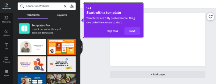
For example, Canva’s product walkthrough for new users shows them exactly how they can create stellar designs with the tool—step by step.
Now that you know the two main ways you can offer contextual help, let's answer the bigger question—which one should your product team go for?
Be proactive: Offer help before users ask for it
Proactive support delivers meaningful help and suggestions before users realize they need help. It's a strategic approach to user support, staying a step ahead of your users and answering their questions, minimizing the need for seeking help.
Here’s how proactive help goes beyond self-serve support to benefit your team and users alike:
Minimize customer support requests and ticket volumes by 20-30%
Improve activation by helping users understand and internalize the product value faster
Meet user needs effectively and win their loyalty, effectively decreasing churn
Increase customer lifetime value as a result of higher satisfaction and adoption
Creating a self-support channel is just the first step. You want to deliver that information contextually as a user explores your product to ensure they return for more. The proactive approach can shorten the learning curve for new users and increase user delight.
Let's look at eight UX patterns you can use to deliver contextually embedded help proactively.
Top 8 UX patterns you can use for contextual help
Contextual help = convenience. It simplifies your product for the end-users and saves them time fully understanding the interface. Here are eight ways to implement contextual help in your app and keep your users happy.
1. Inline instructions
Use this for introducing existing users to features they haven’t tried yet.
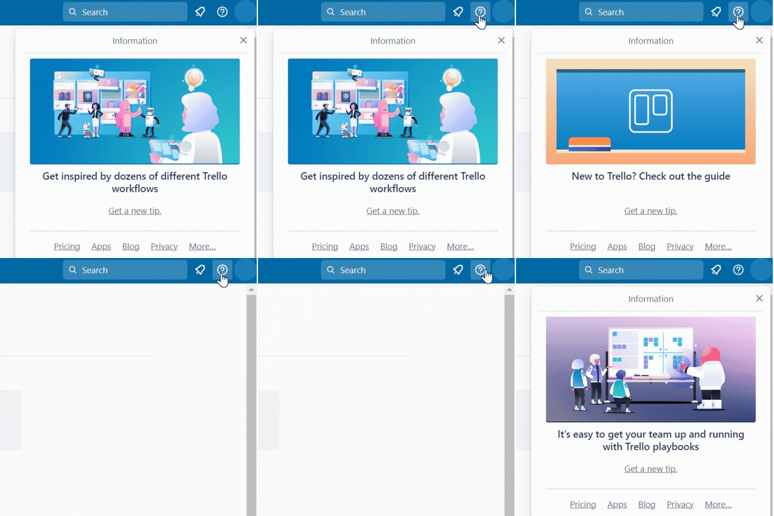
Inline instructions are short and specific pointers are added as a question mark next to buttons a user is likely to click. An inline instruction—usually under 150-200 characters—shares quick insights that users might miss out on while using your product.
These inline tips are transient and deliver value quickly. That means users only need to read this information once to understand what to do with a feature and are a click away from better understanding a feature. If they already know what’s going on, this question mark won’t interrupt their flow.
Trello offers a set of inline instructions on its main user dashboard, informing users about different features they can explore.
2. Trigger-based tooltips
Use this for guiding new users through the essential features for completing their activation milestones.
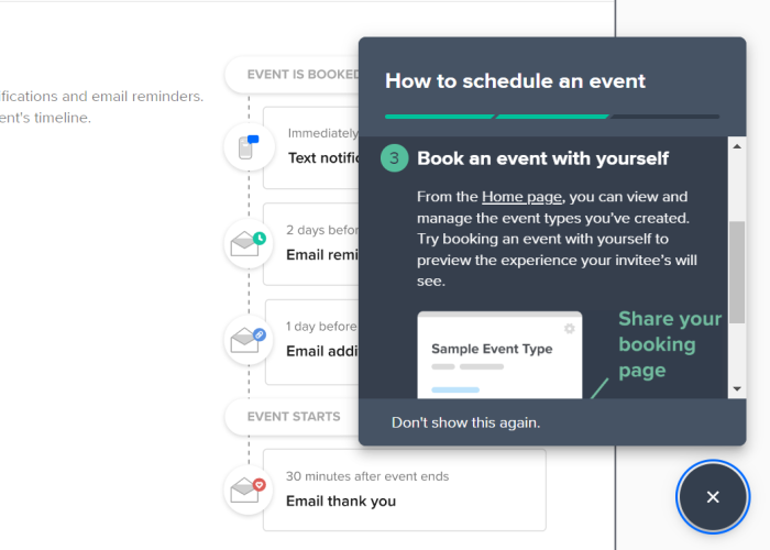
Tooltips are bite-sized tips that appear in a short dialog box or appear when you hover your mouse over an icon. These tips convey clear instructions to acquaint users with different aspects of your product interface.
You can create interactive tooltips to pop up only when users hover over or click on an icon. Or you can add trigger-based tooltip boxes that pop up if users take the defined action.
Calendly uses tooltips to familiarize new users with basic features to accelerate activation and drive product adoption.
Remember: Use plain language to ensure tooltips offer real help to the users instead of confusing them and creating friction. Make use of interactive micro-copy to give users the best advice quickly.
Write all your tips in an active voice and cut down on adjectives or fluff to keep it crisp. More importantly, avoid using jargon that might confuse users rather than help them.
3. Modal pop-ups
Use this for offering proactive help for new features and showing current users how to use them or to introduce the product to new users.
Modal pop-ups, or window overlays, are like (almost) screen-wide notifications. Since these pop-ups cover most of the screen, they capture the user’s attention and draw their focus to the modal’s content.
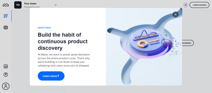
Modal screens are great for showing new sign-ups the next steps in their onboarding process. Alternatively, you can use modal pop-ups to announce new features, adding some rich content like animation or a clickable demo to help them learn more, like Maze.
Maze uses a modal pop-up to talk about its Live Suite feature with a crisp copy and a “learn more” redirecting users to the feature demo.
Keep in mind: Adding too many pop-up modals can frustrate a user if they want to finish a task quickly. Use these in moderation, only for your most important announcements.
4. Help menus
Use this for giving quick access to your help docs for just-in-time query resolution.
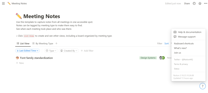
Help menus are in-app widgets embedded within the product interface to let users quickly access your help documentation. While some apps have a chatbot to redirect users to the right help docs, others have a help widget with a question mark icon—like Notion.
Notion's help widget lets you jump to its help center or get in touch with the support team. It's minimal and tells users exactly what they should do to access self-serve support.
Chameleon Tip: Launchers are a powerful solution to integrate such a help menu in your product interface. You can plug relevant resources in the help menu and give users quick access to your product videos, tutorials, community forums, and other resources.
5. Onboarding checklists
Use this for onboarding users seamlessly by showing them the steps to complete for setting up their account.
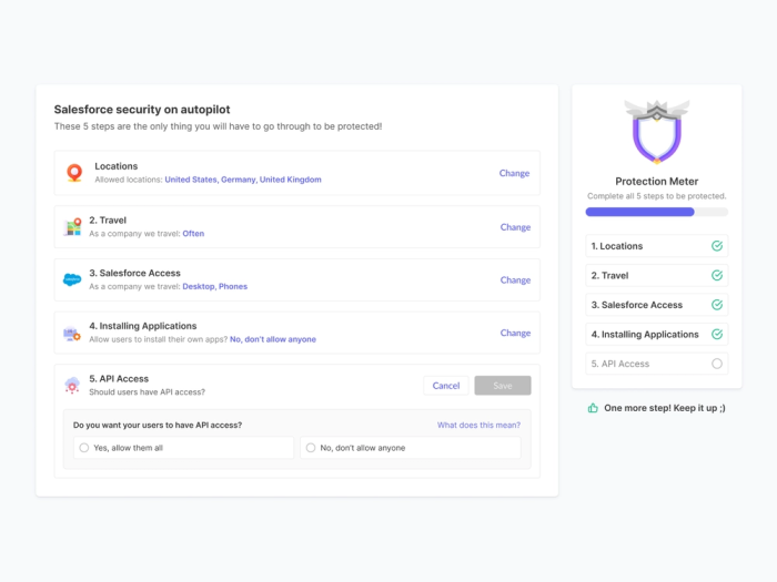
Onboarding checklists proactively assist new users while they explore your product. These checklists include a list of action items they need to complete to reach activation and eventually become power users of your product.
Here's a checklist example that contextually guides users through the core product features. It displays the features a user has completed and what's pending for them to finish the onboarding flow.
6. Guided tours
Use this for giving new users a complete product walkthrough.
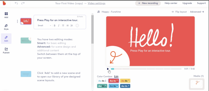
Product tours or walkthroughs are a series of tooltips explaining how to use your product's basic features. These guided tours can also be in the form of video tutorials explaining every specific element on the page and its functionality.
Users should have the choice to complete the entire tour or skip it mid-way. This is important to avoid friction if a user doesn't want to see the complete walkthrough. Give them the option to come back later.
Biteable’s guided tour is neatly embedded within its product and tells users how to get started with the tool.
7. Lightbox pop-ups
Use this for capturing users' attention and highlighting an important feature or helpful resources.
A lightbox pop-up is an overlay screen that covers a part of the screen, keeping the focus on the pop-up and graying or blurring the background.
Brands use this primarily for offering discounts or announcing company news. However, SaaS companies can create contextual help using lightbox pop-ups—similar to modal pop-ups.
You can highlight a product demo video or redirect users to your help documentation to answer any queries.
8. Banners
Use this for announcing updates or sharing crucial information that users might’ve missed out on.
Banners convey short messages at the top of your product interface. These in-app messages provide much-needed assistance to improve UX and remove friction for the users.
You can use banners to announce a feature update, nudging users to learn more about this feature. Or you can tell users something about their accounts, like a reminder to renew their subscription.
Don’t stop there: Make your whole knowledge base searchable
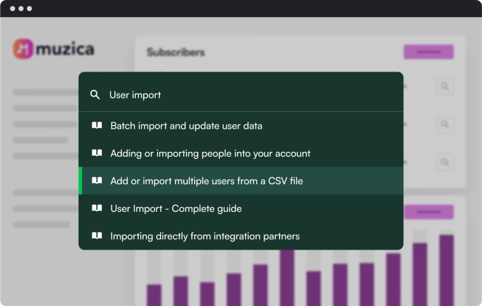
If you want to go the extra mile and help a user understand your product contextually, you can improve your knowledge base’s search functionality with Chameleon’s HelpBar.
HelpBar is designed to:
Help users find relevant answers within the product, exactly when they need help
Create “sticky highlights” for the most popularly searched resources
Analyze users’ search behavior and discover gaps in your customer education resources
Improve conversion rates for trials and reduce support tickets
Here’s an example of the HelpBar in action.
A product team’s in-app contextual help manifesto
You’re all set to follow these contextual help examples and add proactive support within your app. To ensure you’re hitting the right chord with your users, remember these golden rules of contextual help UX:
Useful: Thoroughly research and understand the user flows for various personas to design helpful context support elements that speak to different personas. You need to be aware of potential problems a user might face and solve those problems through these UI elements.
Relevant: Your approach to contextual help can fall flat if you don't identify friction areas in the product experience. You want to pull users deeper into the product and maximize usage through relevant and meaningful help support.
Specific: Remember to keep your contextual help specific to a product feature or a persona’s pain point or job-to-be-done. Since these are brief resources, focus on covering particular features instead of going too broad with your tips.
Understandable: Use plain language and short phrases to help users understand your tips quickly and effortlessly. Test different elements of your contextual help interface to check if users can easily grasp the tips you’re sending their way.
Unintrusive: Contextual help shouldn’t disrupt the user experience. Make it subtle and so well-blended in the user flow that users don’t see your interruptions as distractions.
Keep these parameters in mind to nail your in-app help efforts and boost product adoption rates.
Double down on proactive contextual help
Context-sensitive help can do wonders for your users. It can become a differentiator for your brand by reducing inbound requests, maximizing product usage, and boosting customer retention.
To deliver contextual help in-app, you need to map your users' journey to understand how they interact with your app after signing up. Use this journey map to identify points of friction where they face a problem, or find undiscovered opportunities to make their lives easier. Then add a contextual UX element to answer their concerns immediately.
Use contextual support to deliver targeted messaging that delights customers and turns into a lever for more meaningful user experiences.
Design a seamless UX for happy users
Follow the key UX principles and create effective product Tours, Tooltips, Microsurveys, and various in-app widgets quickly with Chameleon. Start for free by playing around in our sandbox environment or book a personalized call with our product expert.


