


We analyzed over 550 million data points across hundreds of in-app experiences to uncover what actually works in a product tour or user onboarding. The verdict? Clicks beat delays. Personalization beats one-size-fits-all. And your 10-step onboarding flow? It needs an intervention. Users want more control, fewer interruptions—and yes, they’ll opt in if you stop trying so hard.
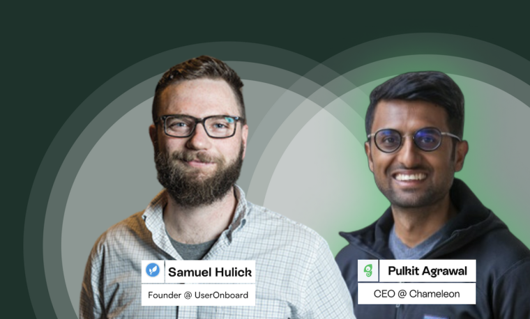
These insights come straight from a deep dive into Chameleon’s 2025 Benchmark Report, led by our CEO Pulkit Agrawal and Product Lead Harrison Johnson. Between them, they’ve seen what hundreds of teams get wrong (and right) about onboarding—and they’re not afraid to say the quiet part out loud.
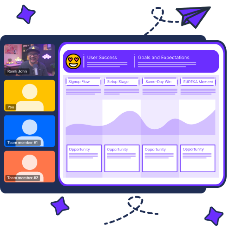
Recap: What is a product tour?
At its best, a product tour is your product’s “first handshake”—a guided experience that walks new users through core features and helps them understand how to get value, fast.
It's a set of in-app experiences (often tooltips, modals, highlights etc.) that guide a user through a product feature or workflow.
Think of it as a lightweight companion, not a lecture. Most product tours are made up of short, interactive steps that layer in context, reduce friction, and help users start doing (not just watching). The goal? To get users to their “aha” moment with minimal guesswork or wasted clicks.
The importance of a product tour
Let’s be real: most users don’t read docs. So your product tour needs to do some heavy lifting—and do it well. Here’s why it matters:
Quick Start for New Users: A great product tour reduces friction and time-to-value. It shows users exactly where to go and what to do—before they get frustrated or bounce.
Personalized Onboarding: Smart tours adapt to the user’s goals, context, or role. The best ones feel more like a helpful guide, less like a forced tutorial.
Better Retention + Activation: Show the right value at the right time, and users stick around. Collecting user feedback helps tailor the experience to meet user needs effectively.
Lighter Support Load: A well-crafted tour prevents support tickets before they’re written. It’s proactive product education that scales.
Actionable Insights: Collect user feedback through methods like microsurveys and qualitative questions to enhance the onboarding experience and understand user engagement with product tours.
🧐 Hot take: Product tours fail when they act like sales decks
You’ve seen them.
That bloated onboarding tour that parades every shiny feature like a keynote presentation—except your user didn’t ask for a pitch. They just want to get stuff done.
Pulkit, Chameleon’s CEO, calls it out: “No-one really wants to sit through a presentation before they play with the product.” And surprise: the data agrees.
So… what actually works?
This is where the fun begins. We combed through more than half a billion onboarding interactions to identify what separates “meh” product tours from those that actually convert. Below are the top patterns that emerged—backed by benchmarks, quotes, and hard truths from the field.
Let’s get into it.
1. Click-triggered tours: because context is everything
Let users opt in, and they’ll surprise you—in the best way.
Click-triggered product tours have a 67% completion rate, the highest of any trigger type. Compare that to a sad 31% for tours triggered after a set delay.

"Click-triggered tours have a higher completion rate… you’re reacting to their immediate context."
In other words: users don’t hate tours. They hate being interrupted. A click means intent. That intent is your green light to guide them—with context and consent. Meanwhile, set-delay tours are the UX equivalent of yelling “Need help?!” at someone who just opened the app. Timing is everything.
✅ Try this
Trigger product tours when users:
Click a “New report” or “Create” button
Open a lesser-used feature or section
Select an item from a checklist or launcher
Not ready to set up clicks everywhere? Smart Delay tours (which wait for inactivity) outperform default time-based triggers by 21%. Small change, big difference.
2. The optimal onboarding tour length is four steps. Yes, four.
We thought shorter would win. But the data shows a different sweet spot.
🎯 3-step tours = 72% completion rate
🎯 4-step tours = 74%
⚠️ 7+ steps? Only 16% make it to the end
Why four? It’s just enough to be useful, without overstaying its welcome.
So if your tour is pushing past six steps or branching like a choose-your-own-adventure, hit pause. Instead of cramming everything into one flow, break it up:
Awareness? Use an embeddable banner or modal.
Activation? Deliver a product tour or an interactive demo.
Expansion? Trigger a checklist or secondary tour later.
Tours shouldn’t try to solve every problem at once. Be selective. Be strategic.
3. Product managers, beware of scope creep in onboarding
You wouldn’t ship a bloated MVP. So why are you shipping bloated onboarding?
Here’s the PM trap: once you open your no-code builder, it’s easy to get... ambitious.
“Could it also explain this setting?
“What if we branch based on their role?”
“Let’s walk them through everything just in case.”
Stop.

"Being really homed in on that problem is the best way to make sure you’re hitting the right level of completion."
Your onboarding tour isn’t a knowledge base. It’s a runway. Focus on takeoff—not the entire flight plan.
4. The secret weapon PMs aren’t using enough: personalized checklists
Checklists are underrated. They look simple, but they convert.
According to our benchmark data:
Users who engage with a checklist complete 5 items per session
Tours launched from checklists hit a 67% completion rate
Want even more engagement? Add a welcome state. A short intro with a CTA can boost checklist interaction by 10–20%.
"You don’t have to just use checklists for onboarding. Use them as a side quest for advanced features."
Onboard by persona. Deepen feature adoption. Personalize like a marketer, but ship like a PM.
5. Embeddables > modals, and it’s not even close
We’re not here to cancel modals. But let’s not pretend they’re subtle.
📉 Modals see dismiss rates of nearly 50%
📈 Embeddables (cards, banners, CTAs) see significantly higher CTRs
“It’s like blaring an overhead speaker in an airport. You will get attention. But people will start tuning it out.”
Embeddables blend in. They look native. They don’t interrupt. And users engage with them on their own terms.
Used correctly, they’re:
Perfect for feature announcements
Ideal for upsell nudges
Great for surfacing tours or demos when relevant
And pro tip: images > videos. Why? Because no one wants to sit through a video when they’re ready to act.
"I really recommend against doing videos that teach people multi-step workflows… it’s cognitively heavy."
6. How to build a better product tour (according to data and common sense)
By now, we’ve seen what works—and what doesn't. But what does it take to actually build a product tour that’s useful, respectful, and, you know… not annoying?
Personalize or perish
Users expect onboarding to meet them where they are. The best-performing tours are personalized by role, stage, or behavior.
"Personalization makes users feel understood—and when people feel understood, they engage."
Use behavioral triggers and segments to avoid subjecting everyone to the same flow.
Use interactive elements (consistently)
Interactive product tours and walkthroughs are essential for a seamless onboarding process. Tooltips, hotspots, and launchers provide context without crowding the experience.
Use consistent UI patterns like progress bars and embedded guides to reduce cognitive load and build trust.
"When someone clicks to explore, they’re telling you they’re ready. Don’t waste that moment."
Measure and optimize (then measure again)
Use metrics like:
Activation rate
Time to value
Feature adoption
CSAT & free-text feedback
Customer Effort Score (CES)
Review analytics regularly. Ship updates based on what works. Then test again.
7. The future of onboarding is shifting left (and clicking less)
We’re entering the era of pre-onboarding onboarding—where users want to experience your product before they even create an account.
That’s why interactive demos are having a moment. They're not just for sales pages anymore—they’re embedded throughout onboarding flows, marketing sites, and even help docs.
"I call it the commercials of SaaS. This is how software will be advertised going forward."
But the shift isn’t just about timing. It’s about how onboarding shows up:
More native (embeds > modals)
More predictive (AI-triggered flows)
More automated (onboarding that does the work for you)
With Chameleon’s new Automations, you can literally execute multi-step actions—like campaign setup or workspace configuration—on behalf of the user. Just trigger it from a modal or launcher, and watch it go.
"It’s not just about showing. It’s about doing on behalf of the user."
That’s onboarding without the busywork. And it’s where things are headed, fast.
8. NPS is fine. But you can do better.
Let’s be honest: in-app NPS often tells you more about timing than loyalty.
"Most of those zero scores are probably people thinking: this is really annoying. I just want to use the product."
That’s why teams are turning to micro surveys instead—short, focused, and relevant.
The benchmark data says it all:
NPS survey completion rate: 9%
CSAT (emoji-style): 20%
Drop-down surveys: 26%
Multi-button surveys: 32%
And here’s the real gem: 86% of users who take a survey leave a free-text comment.
"Maybe we’re just more comfortable talking to robots now."
Pair that with AI-powered summaries, and you’ve got a direct line to what users want—without overwhelming them (or your team).
✅ Quick wins PMs can ship today
Steal these. They work.
✅ Change your product tour trigger to a user action (not a delay)
✅ Cap onboarding tours at 4 steps—split the rest
✅ Allow users to engage at their own pace via checklists or demos
✅ Replace your next modal with an embeddable
✅ Use feature-specific checklists as “side quests”
✅ Swap your NPS pop-up for a 3-button CSAT survey
✅ Embed an interactive demo on your homepage or pricing page
✅ Record and deploy an Automation to skip early friction
Respect the user's time
The smartest teams in SaaS aren’t adding more onboarding. They’re making onboarding smarter.
So next time you're mapping out a product tour or onboarding tour, ask yourself:
Did the user ask for this?
Does this interrupt them?
Am I teaching, or just showing off?
If you’re ready to build onboarding your users will actually appreciate, check out Chameleon’s 2025 Benchmark Report. You might not need 550 million data points to tell you that. But hey—it helps.


