


When users land on your product welcome page, the hard work is over. You're confident about your product, and you're positive they are going to see the value right away. So sit back, relax, and count new users— the job is done. Good for you!
Nope. Sorry to interrupt, but your work is far from over. It’s actually only just beginning.
Just because you’ve got someone to your product, it doesn’t mean to say they’re going to hang around. Most of us are all too familiar with crippling churn rates. What’s more, there’s no grace period customers give a new product, so hacking down time to value (TTV) is a top priority. From the moment someone steps into your app, they want things to work as expected, to understand how to make things happen, and they want it all to be easy.
If your product welcome page design doesn’t do its job, those users are bolting out of that door (or gate) faster than you can say "customer retention."
That's why we’re about to explore everything you need to know about building healthy, happy welcome pages. The kind that power user adoption by guiding them to where they want to go—even if they don’t know it themselves. 😉

What is a welcome page?
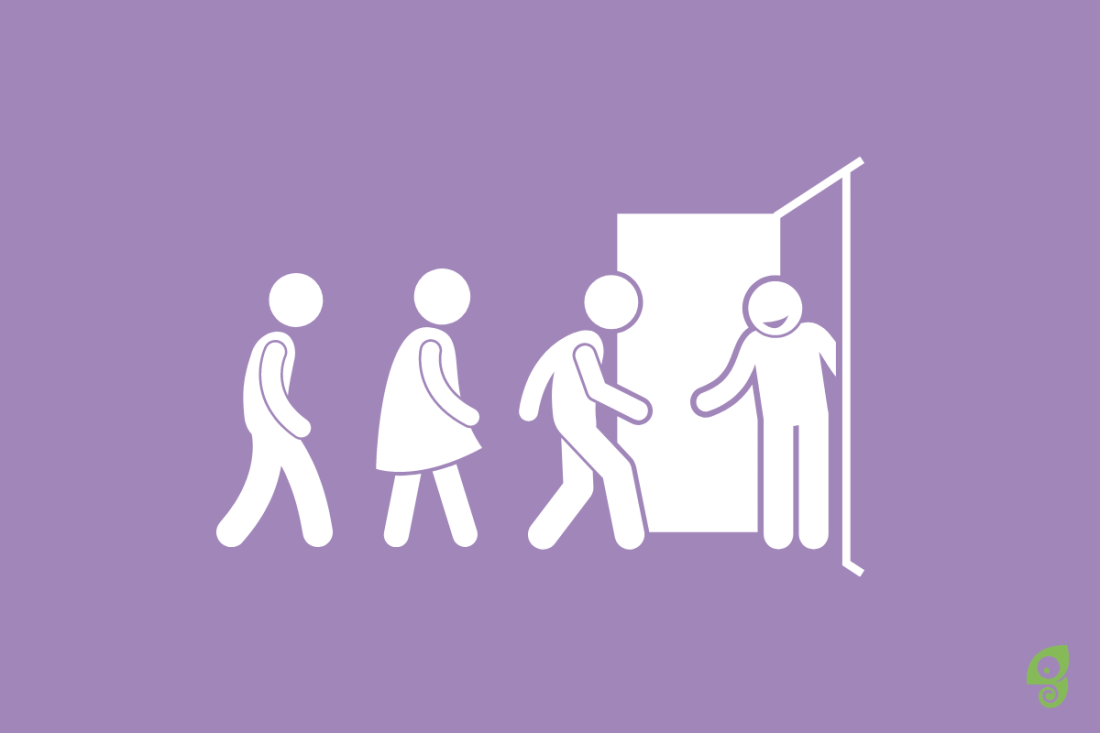
In the product world, a welcome page is the first page someone sees when they enter your app for the first time. A product welcome page can be a singular page or modal overlay, sort of like a pop-up. Or it can consist of multiple pages. A welcome page aims to orient new users and introduce them to the platform or app.
Despite any product demos, nurture journeys, or sales calls a user may have had with you, a product welcome page is your platform’s first true handshake with a user. This means it needs to do a few things. 👇
Why you need to impress with a welcome page
Why is a welcome page design so important for your SaaS users, your business MRR, and customer churn rates? What’s so special about welcome page designs over other services and areas of your product?
The truth is, it’s the UX design starting point for product-led growth. So, let’s build that project proposal with some of the things a welcome page needs to get woos.
Brand reflection
As with any other stage in your customer journey, your welcome page is an opportunity to reflect your brand and reiterate your value proposition.
This first in-product experience is almost a reintroduction to your customers. It’s their first step into the next chapter of their experience with you. If the brand is reflected in this first welcome page and gives people a taste of what they can expect from your product experience, it will build stronger customer loyalty and trust.

The welcome pages get a lot of attention
As much as we hate to say it, users churn pretty quickly. And they can churn in various pain points of your product, and for many different reasons. But they all start from the same spot — your welcome page.
The obvious conclusion is that this landing page gets more clicks, screen time, and user attention. That's why it needs to make the biggest impact and retain as many users as possible.
Lay the foundations for success
Whether your welcome page is the kick-off to your onboarding flow or is a welcome message, it’s your chance to pave the pathway to success.
If you hit your goal of successfully welcoming someone to your product, you’re setting every other process up on the right foot for hitting customer retention metrics. However, if you miss the mark, users may go into onboarding and product exploration feeling frustrated, confused, and alone, eventually churning and leaving you for greener pastures — or better welcome pages.
Reassure users they’re in the right place
Users accessing your app for the first time leaped in faith with it. Even though they are not paid customers yet, they've already invested in one of the more valuable currencies there is today — their time and trust.
This first landing page needs to reassure them that this is where they belong. Welcome pages need to make them feel that, even though they haven't find value in your product yet, they are on the right path to do it.
How to create a delightful welcome page
A welcome should be short, sweet, and inspire success. If you drag out the first hello, your users will head for the exit tour button. Here are four steps for creating a brilliant welcome page modal.
1. Know who you're talking to
You know the cliche, "if you're speaking to everyone, you're speaking to no one". Keep that in mind for your first in-product welcome message. Consider what data you're collecting in the signup flow; do you know what team they work on, what they want to do, their knowledge level? Use this information to drive forward your welcome page messaging.
2. Build your welcome modal
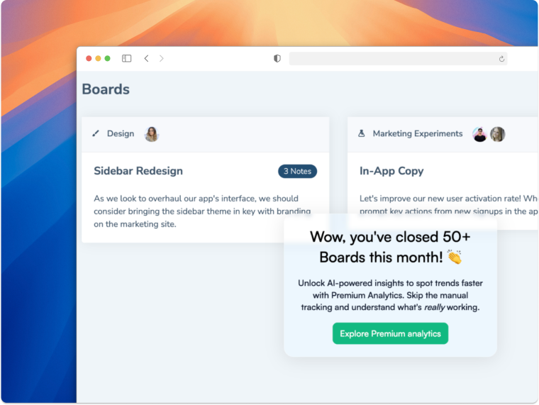
At Chameleon, we did a survey and found that 92% of people had exited a welcome tour straightaway – yikes! But it's not all doom and gloom. With Chameleon, you can build impactful welcome page modals with zero-coding, and these welcome tours have a 66% completion rate!
Using our simple WYSIWYG builder, you can launch welcome pages in minutes and run an A/B test to figure out what works – and what doesn't.

Create impactful welcome flows with Chameleon
Get started free and build a welcome page that inspires users to take their next steps
3. Keep it simple
Roll out the red carpet, but keep it short. We don't need a welcome page flow as long as the Met Ball's red carpet. Think through what you want to achieve; do you want to direct users to their first feature, do you need them to fill out account details, or do you want to greet them with a photo of your company mascot?
Four best practices for welcome pages
Some of the best welcome page examples are using some particular tactics to be successful, and there is a lot to learn from them. Your product welcome page needs to be different from your welcome email content. It needs to be interactive and actionable. We’re showing, not telling. Here, you’re delivering someone information in real-time—it’s important to keep them hooked from hello.
Here are some of our welcome page best practices to ensure that your “hello” is everything a user needs and more.
Make it personal
People use products differently. Despite working for the same company, or even on the same team, everyone has different working styles and preferences. It’s important to let customers know product onboarding and the overall product experience tailored to their needs.
For example, Quartzy—a laboratory management and supply ordering platform—wanted to tailor customer onboarding for different people’s internal workflows. Their welcome page design is needed to assure people that their product experience will be unique to them. The product team implemented a simple message with their welcome page modal overlay to communicate their personalization efforts.
“Welcome to your lab!”

This platform is not the paying company’s; it is not even your team’s. It’s yours. This simple message tackles making the reader feel welcome by assuring them that their product experience is personalized to fit their specific needs.
Stay on brand, stay on mission
Use your welcome page to affirm your brand voice and start building positive brand sentiment and loyalty. We want to be creating app promoters for when that NPS survey gets sent around from day one. It all starts right here.
At the same time, stay true to your company’s mission and vision—it’s a huge factor in why a customer got on your boat and not someone else’s.
For example, Slack does an incredible job with its welcome page(s). They’ve managed to keep it clean and concise, prompting people to complete the sign-up process while reminding users why they’re here.
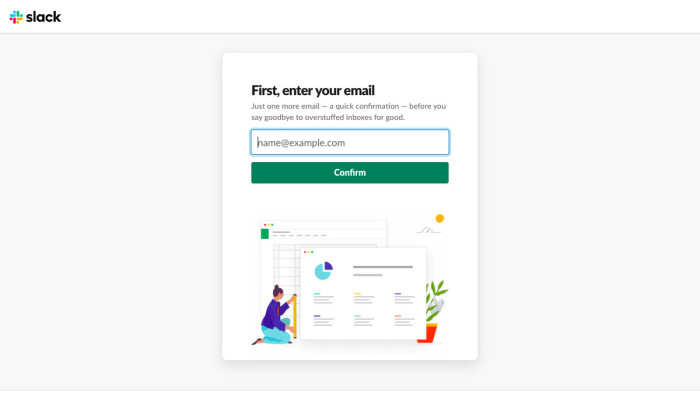
It’s a great welcome page example because Slack manages to stay on-brand with their tone of voice, giving someone that firm handshake and (charming) smile as they complete their product sign-up process.

Lastly, Slack greets new users with an in-product welcome page and onboarding kick-off. Even here, they remind users of their product benefits while keeping the loveable, iconic tone that we all know and recognize as Slack.

Get users inspired from the welcome
One of the important reasons you need to get a welcome page right is to lay the foundations for success. But, how do you do this? A lot of it comes down to inspiration—there’s nothing more daunting than a blank canvas. So, fill that canvas a little. Use your welcome page to give prompts or product success examples and inspire users to complete their onboarding; becoming active users.
For example, Voxox, a cloud communication service leader, managed to reduce customer churn by implementing friction points in their onboarding flow. Voxox found that users were not activating because most of the platform had done the set-up for them, which meant customers were skipping important features they needed to learn.
Voxox slowed down their onboarding flow with product walkthroughs. It’s a risky move, but it paid off. Why? Because they inspired users on their welcome page. The product team showed examples of how a user can succeed with the tool from “hello.”
Remember that someone may have signed-up for your tool a while back and has only just found the time to onboard it. This welcome page design tactic reminds users why they’re here, what they can use the product for, and assures them that a slightly lengthy onboarding will be well worth it in the end.
Acclimatize users to your UI
No matter how simple and user-friendly it is, any user interface can seem pretty intimidating, especially when someone is entirely new to it.
Use a modal overlay to allow first-time-visitors to orientate themselves with your platform’s user interface subconsciously. By directing someone’s attention to a welcome note, the first experience doesn’t seem as daunting as throwing them headfirst into your product—baby steps.
For example, The Motley Fool, an online investing service, introduces users to their product interface subconsciously. Their online stocks platform displays quite a bit of data, which can be overwhelming if you’re not familiar with it. It’s a great welcome page example because the team uses a modal overlay to direct attention to the friendly faces that will guide them through the platform, rather than making users anxious that they’re now on their own.

Using welcome pages to reach the “aha!” moment
The one thing that all of our above examples have in common? They nudge people towards an "aha!" moment. A good welcome page is there to help you retain new users and minimize those worrying churn rates. One of the quickest and simplest ways to do this is to enable users to understand your value proposition.
No matter the information you need to display on your welcome page, what’s crucial is that the page brings your new users one step closer toward activation or value discovery. A few tactics you can use to bring these important touchpoints forward on your welcome page(s) are:
Product tours: The perfect way to introduce someone to your product and show them around. Integrate other apps and data points to personalize tours and give someone the specific insights they need to make them feel welcome.
Keep the number of steps in your product tour in mind as you build. Be conscious of your users’ time and patience.

Tooltips: Introduce a UX layer over your product interface that gives users hints and suggestions as they explore the welcome page and the rest of the platform.
.gif)
Launchers: Friendly in-product widgets to pop-up and help users check their way through onboarding. These help users reach activation sooner and make sure they don’t miss a trick.

No matter the tactic you use to introduce users to your product, it’s essential your welcome page provides a one-click option to get them on their way.
Welcome pages + Chameleon = customer love
We’ve done the math, and it all adds up. Introducing Chameleon tools into your welcome page strategy results in happy users. Chameleon helps drive product success, and that success begins with stellar onboarding.
Nail your welcome page and every step of your onboarding after that to beat customer churn and retain customers. In doing so, you’ll up MRR, CLTV, NPS feedback results, and user adoption rates. Plus, you’ll be giving your product the showcase it deserves from the beginning.
Ready to reintroduce yourselves?

Boost Product-Led Growth 🚀
Convert users with targeted experiences, built without engineering


