Out of all of the automated emails you send, your welcome email stands out as one of the best opportunities to push new signups towards activation and build relationships early.
Why? Because welcome emails are a time-tested pattern that have great potential to drive action.
In fact, welcome emails often have the highest open rates of all - up to 60% since they are expected by a new user. It makes them feel responded to, and not in the dark about what to do next. In a survey by Blue Hornet, it was found that 75% of customers expect a welcome email when they sign up.
They're obviously critical, but with their high engagement rate comes responsibility. How are you going to leverage that to make the best first impression, continue onboarding, and lead users towards activation?
Here we look at some great examples and best practices from the SaaS world, and what you can learn from them.
Set tone of the relationship with your user
Your user is already midway through a journey towards conversion – reading content, watching back a webinar on YouTube, requesting a demo, signing up to the product – but the welcome email marks the milestone where the focus shifts from signup to activation.
The first user/provider handshake should set the tone of what's to come, while giving clear next steps.
Focus on clean design, on-brand fonts and stripped-back visuals that get your user's attention right on the product. Instead of writing text-heavy emails, try using a simple format with plenty of space and easy calls-to-action (CTA).
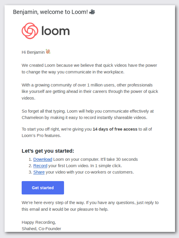
Why this example works
- Straight away, Loom communicates its product vision - "to change the way you communicate in the workplace" - and anchors that with solid reasons why
- The email's tone is professional, but personable and caring - "We're here every step of the way"
- Loom reiterates product benefits and features to account for a user forgetting and revisiting the email
- The email signature is from Loom's co-founder – giving the welcome email a more personal feel
Personalize content by persona (or at least by name)
Personalization could be as simple as addressing the reader by name or as targeted as offering an entirely different email for their persona.
Campaign Monitor research claims that emails with personalized subject lines are 26% more likely to be opened, and marketers see 760% increase in email revenue from segmented campaigns. What that means is that by working to increase relevancy of your messaging at scale, you get the highest-converting message to the exact right user.
Products with multiple core personas could welcome admins and regular users in different ways, or leverage the size of the company to make a best guess at what that user's needs are.
In the case of this example from Crayon, the email is customized based on which plan the user starts with. A new user on the free plan gets the email below, which is specific to the features they can and can't access:
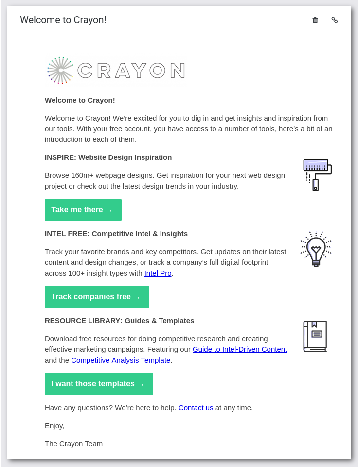
Why this example works
- It acknowledges what the user can do with their current plan and what they need to pay for. By doing this, it combines relevant info with an upsell prompt
- Crayon offers onboarding and inspiration first and foremost. As a flexible product, it needs the user to be proactive and know their goals
- It recognizes that a freemium lead isn't necessarily qualified to buy, and still needs to be nurtured. The third CTA is content that will support the user as they explore
⚠️ One suggested improvement for Crayon is to use name and company as variables in the email body. A tool like this could even go as far to analyze email address' domain and preemptively offer competitive insights, like it does post-activation.
Limit links to a few key actions
As a user, having a range of choices seems like a great thing. As a marketer, you know it isn't. Forcing a user to comprehend the meaning of every CTA can cause decision fatigue and lead to complete inaction.
A famous study into this found that consumers are 6x more likely to buy from a set of 6 options vs. a set of 24. And, it's been internalized into common marketing wisdom countless times.
Decide what you want to achieve from the email - drawing from your product's activation metrics and just focus on that. Some examples are:
- Watch demo
- Complete account setup
- Read a getting started guide
- Install app
With this in mind, an obvious one is: don’t send emails without links. Adding links to your campaign helps to engage your audience and drive traffic back to your product, which is the ultimate aim.
Keeping to a minimal number of links also better helps you understand the performance and impact of the email on your product KPIs. An email with 10 different links will dilute clicks across those destinations and make testing the impact of those clicks harder.
Take a look at this short and no-fuss email by Trello. It gets users to what they want in an instant, so we’re guessing the click through rates for this email are pretty good!
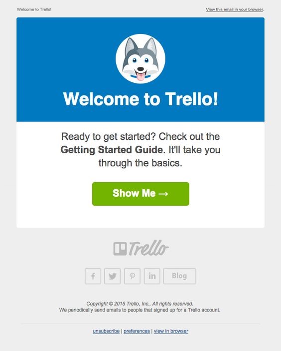
Why this example works
- Even though there are about a dozen options (including social links, etc), only one stands out - the one Trello wants you to visit to get onboarded
- Taco, Trello's brand husky, communicates a playfulness not usually associated with business software
- The email uses a highly-recognizable subject line format - "Welcome to
company name!" - to signal to users what this email actually is
Optimize for open rate
The user is most likely to open the email if it has a catchy subject line and preview text. There are a ton of studies that prove this, and it's marketing common knowledge.
A higher open rate means more users see your CTA, so tweaking the parts of your welcome email that are visible in the inbox can have a big impact on the success of that campaign. Remember that only the first 4 or 5 words of preview text will appear on mobile devices!
Plus, you’ll have to make sure that your email isn’t going to spam. So, ensure your emails follow designated email authentication protocols.

Here are some examples of welcome emails with great subject lines:
-
company name's compliance checklist. Gusto's welcome email is positioned as a handy personalized resource. - [New Relic] Next steps for setting up your account. This makes it obvious you have an unfinished task to complete
- Eager to help you get your team onboard Buffer! This reads like a personal message, not a transactional email. It demonstrates the emotion of a human which is a key part of Buffer's brand and a way to hook users that mentally filter away automated emails
Follow email regulations
Since it's all but replaced physical mail, it makes sense there are laws to protect recipients from bad actors. SaaS companies should be aware of what those are, to stay compliant, avoid fines, and treat users with respect.
For instance, in many countries, sending emails with a no-reply address is not allowed. And as per the latest GDPR law in the EU, it’s required that your customer gives an active consent to receive emails from you and is not tricked into receiving emails through pre-checked boxes. A few more rules for email include:
- Making it easy to opt-out of your emails
- A recognizable sender name
- No misleading subject lines
- Adding your postal address in email to build trust and comply with CAN-SPAM
Learn more about regulations and laws that govern emails such as CAN-SPAM Act and GDPR, and steps you should take towards compliance.
TIP: Use tools like MailHippo, NeoCertified, Virtru, or others for an easy way to securely send HIPAA compliant email.
Show your product delivers on its marketing hype
The path from new signup to engaged user isn't always a simple journey with a few pre-planned milestones. A user reading your welcome email could be opening it a week later, having completely forgotten what the service is. Or, they could be opening it immediately, expecting to be directed to the next key action.
That's why good welcome email examples match both of those use cases' needs. For this purpose, it makes sense to reiterate product benefits in the email, remind users what they signed up for, and hint at the value to come.
A great example of this is the welcome email from GoodReads, a company that helps people find and share books. Here, they educate the subscriber on how to make most of the tool while reminding them what they can do:
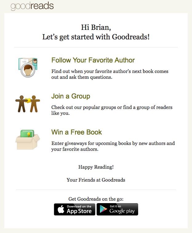
Why this example works
- With clear icons and actionable copy, Goodreads lays out its product's core features and nudges the user towards engagement and retention
- The attention of mobile users is leveraged to increase app downloads, with links to app store listings for Android and iOS
- Goodreads shows its friendly and personable brand voice by using the user's first name and using an inclusive tone ("Let's", "Your Friends").
Consider mobile: responsive content, different goals?
A great welcome email is not just actionable and relevant; it's considerate of the user's device. Ugly design or unreadable copy will have users closing the email quickly, and pushing actions that are only relevant on desktop might not result in driving action for every user.
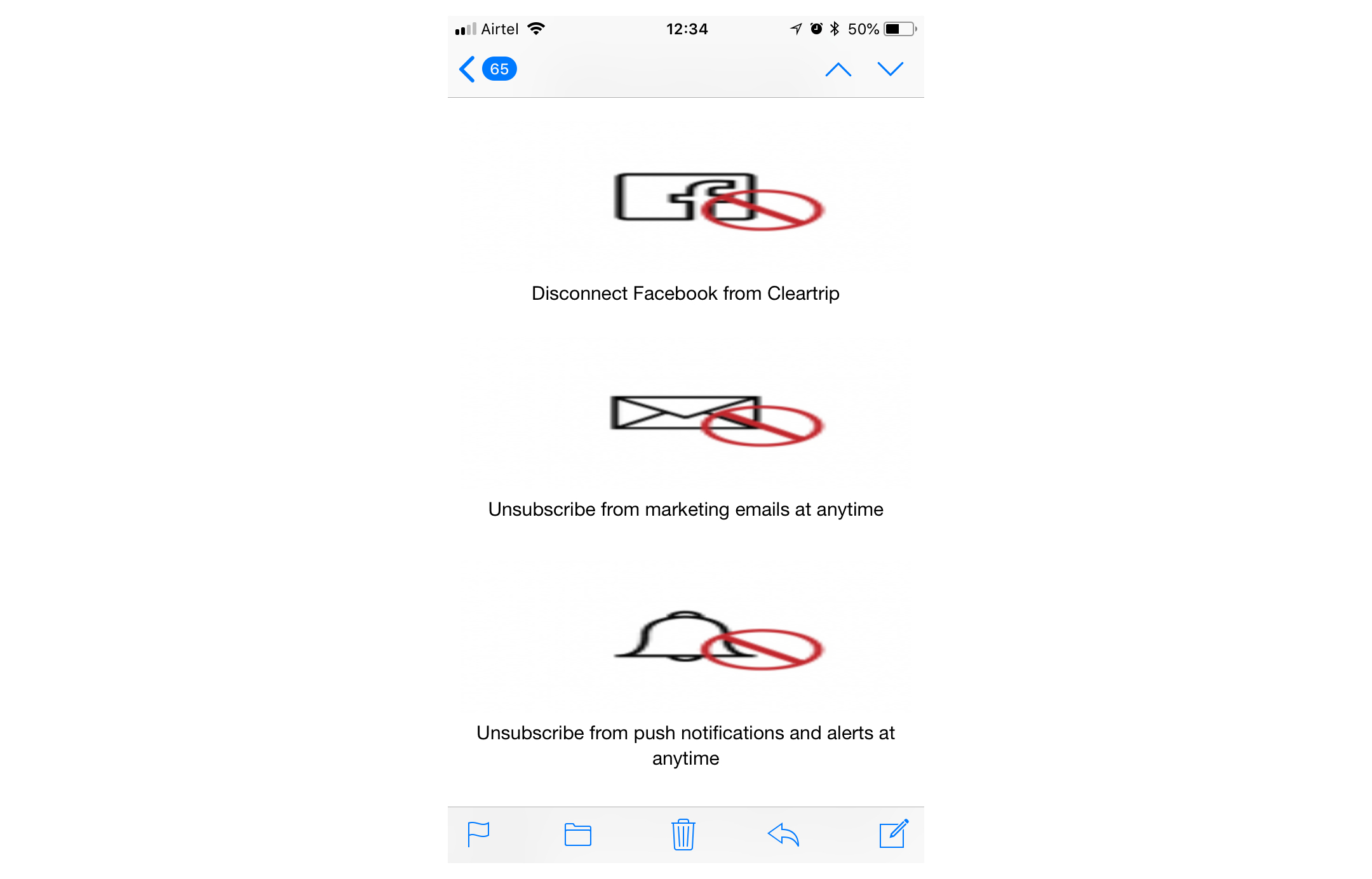
This email was not optimized for mobile readers, and none of the icons or text are clickable. 😱
Avoid:
- Emails with uncompressed images; these can be slow to load show up as blank emails when opened
- Call to action buttons that are small and click-unfriendly; think about taps as opposed to mouse clicks
- Cramped up content that’s hard to read – use one or maximum 2 columns in your mobile email layout
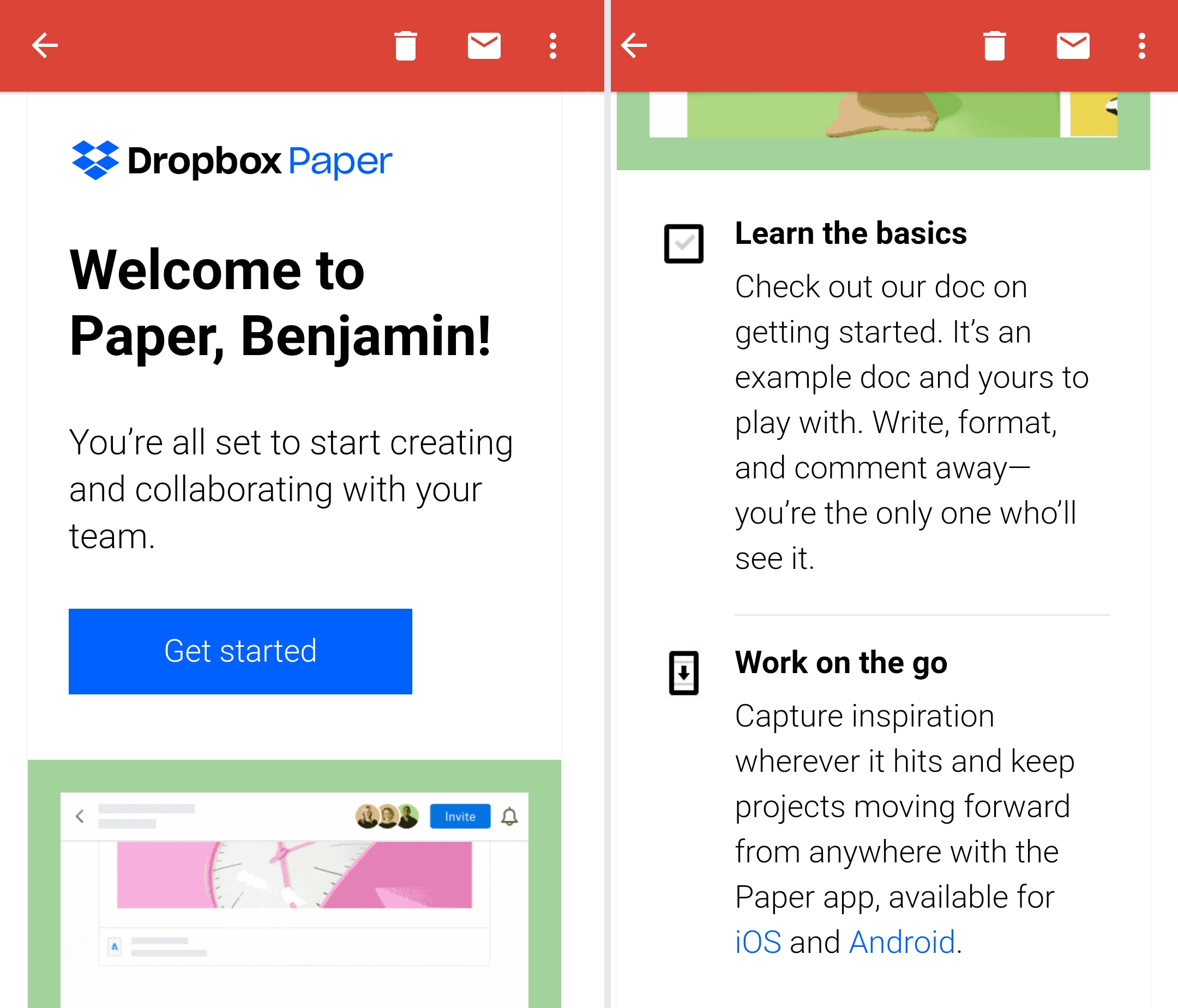
The example below from Dropbox Paper displays well on mobile, loads quickly despite having a descriptive gif, and makes a play to deepen the user's enagement with the product by encouraging them to download the mobile app:
Send contextually, not in bulk
Marketing messages work best when they're set in the context of something a user has just done. You want a combination of:
- the right message (a welcome email)
- sent to the right user (a user who has just signed up)
- at the right time (as soon as they've signed up)
A study by Experian proves the importance of timing in welcome emails:
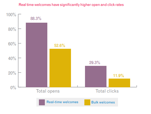
This is where choosing the right email delivery service that can deliver your emails speedily to the inbox plays a crucial role. You might find this article on how to choose the right ESP helpful.
This is a guest contribution from Sakshie Pathak, marketer at Pepipost


