There are many ways you can create customer satisfaction surveys, and various channels you can use to distribute them.
For example, you can run a survey on a website page, send a long-form questionnaire via email, or use an in-app survey to discover how satisfied users are with your product right then and there, while they use it.
For the most effective results, we recommend using in-app surveys. In fact, our Benchmark Report shows that the average Microsurvey has a 60% completion rate, while for the four-option Microsurveys the completion rate goes up to an astonishing 96%! To find out more about product survey benchmarks, download the full report 👇

Download the In-Product Experiences Benchmark Report
Improve your in-app messaging and scale self-serve success with data and insights from 300 million user interactions with Chameleon Experiences. We'll send the Report to your inbox!
In this chapter
How to build an effective in-app CSAT survey
Let’s take a look at the steps to help you design, build, and deploy on-brand surveys that will resonate with your customers and help you gain useful insights.
Choose a survey tool
First and foremost, you'll need to choose a user feedback tool. The tool you use for surveys will depend on the channel of survey distribution. For example, if you want to attach a longer-form survey to a website landing page, you can do so with tools like Typeform, SurveyMonkey, Google Forms, or other solutions.
If you want to build an in-app microsurvey, the best way to do it is by using a tool specified for in-product survey creation. This is where Chameleon can come in handy. Not only does Chameleon offer robust building features, but you can also use it to define who will see the survey, when, where, and how often. The Microsurvey configuration process in the Chameleon Builder has a few simple steps, and it looks like this:
Once you start collecting user feedback, you can then analyze the results and track users by their unique ID to capture the changes in their sentiment over time.
Customize your survey and make it on-brand
Within the tool of your choice, the next step is to ensure that the survey you are building can be easily aligned with your brand style. This means that you'll need an option to customize colors, buttons, sizes, animated effects, or add custom CSS if needed.
Why is this so important? Because if you run a survey that doesn’t look and feel like it’s coming from your company, you risk confusing users and getting only a small percentage of useful responses.
With Chameleon, you can use the Builder to easily adjust everything you need and quickly move on to defining the target audience for your survey.
Here’s an example of what a CSAT survey design could look like, built with Chameleon.
You can create as many different designs as you want, save them as a template, and come back to them whenever you want to run a new survey. This will save you a ton of time and additional resources. Plus, you’d have all the data from your previous surveys available in one dashboard. Pretty convenient, right!?
Segment your users
One of the biggest mistakes you can make regarding survey distribution is to show the same survey to every person who visits your website, signs up for a free trial, upgrade from a basic to a premium plan, or cancel the subscription and decide to leave.
A single survey asking, for example, “How satisfied are you with our product”, would be completely out of context in many of the above-mentioned scenarios.
Someone who just interacted with your product for the first time still doesn’t have sufficient information and experience to define their level of satisfaction. At this point, you could be more specific and ask “Has everything up to this point been clear to you?”. Then, if the answer is “No”, that could trigger an additional step where you’d offer personalized guidance or a link to your self-serve knowledge base.
On the other hand, if someone’s just about to cancel, the chances are they weren’t exactly satisfied with your product, so a much more appropriate question at this point would be “Can you tell us your reason for leaving?”.
That’s why it’s so important to segment your customers. You can segment by their unique user IDs, browsers they use, survey steps they already took, in-product tasks and milestones they completed, time of the task completion, and many other variables.
You can take the segmentation to the next level by integrating your survey tool with product analytics tools. For example, you could integrate Chameleon with Mixpanel, Segment, or Heap for a deeper targeting and broader overview of surveys’ performance.
This will help you trigger the surveys at the right time to deliver each of them to the right user within the right context.
Align your survey with its use case
One more important step of building an effective customer satisfaction survey is to clearly define the use case for each of your surveys, and then align the style, format, question type, and your brand voice and tone with the end goal.
The use case (and the goal) you set for your survey will depend on the purpose of your research, whether you want to collect quantitative or qualitative data, which customer segment you want to reach with it, at what stage of their customer journey are they, what metrics you want to track, and other criteria.
Run a trigger-based survey
The best way to run in-app CSAT surveys is to trigger them by a specific event. The event can be any task or a predefined milestone completed by your users.
This way, you’ll get the data needed to accurately evaluate the results for specific onboarding flow moments, new features you announce, or any significant updates within your product.
Don’t overwhelm users
Pop-up fatigue is real. So, instead of contributing to it by having many pop-up screens, modals, tour steps, and surveys showing one after another – spare your users from such frustration and make sure to only show one modal or a survey pop-up at a time.
Following the previous steps that we outlined here will help you segment your audience the right way, display the right survey to the right people, create an effective in-product microsurvey that is simple and quick to complete, and from which you’ll gain meaningful feedback.
Now, let’s take a look at how top brands have been applying the survey best practices in their real-life campaigns.
Top 5 customer satisfaction survey examples
Example #1: PayPal Satisfaction Surveys

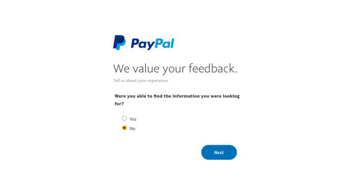
In this example from PayPal, the survey is prompted when a user reads the PayPal help documentation. Here, PayPal used both CES and NPS types of surveys in one form, asking several multiple-choice questions in a row. First, they ask customers what the reason for their visit to the PayPal Community is. Then, whether the customers have found what they were looking for, and, if not, what they will do next. The last one is an NPS question on how likely they are to recommend PayPal to a friend or a colleague.
Why this is good: Even though there are several questions in one survey, PayPal did a good job of informing users upfront how long it will take them to complete the survey. Also, keeping the “We value your feedback” statement visible in all steps gives customers a sense of the importance of their contributions.
Example #2: YouTube CSAT Survey
The purpose of this CSAT survey from YouTube was to collect feedback for customers after they introduced live streaming as a new feature. It has one question with a simple emoji-based answer scale, which enables YouTube to collect feedback on a new feature.
Why this is good: This survey appears in the right place (while users are within their profile settings) and within the right context (at the moment when they are looking into the streaming dashboard). Also, the pop-up modal is non-intrusive and the survey only takes one click to complete.
Example #3: PeopleGrove Emergency Feedback Survey

In this example from PeopleGrove, we see a two-button Microsurvey built with Chameleon. It was deployed to capture feedback for product direction amidst the COVID-19 pandemic. The survey included a thoughtful message, along with a yes/no option, followed by an open-ended question where users could add their opinion.
Why this is good: Since PeopleGrove is a platform that brings together students and mentors in personalized communities, this survey was well-timed to offer help and guidance in a sensitive moment of uncertainty. Its simple form and compelling message are additional pluses.
Example #4: Google Calendar Feedback Survey
This Google Calendar survey is an example of a freeform feedback survey delivered via a support widget in the top menu bar. As it isn’t a classic rating scale survey, this one would land in the category of flexible microsurveys. By simply asking if a user has feedback to share and offering the way to do it, Google is checking the pulse of customer satisfaction.
Why this is good: Providing users with an option to include a screenshot of their current issue is an excellent added touch. It makes the feedback process a lot easier for the user. Also, clear and informative copy aligns well with Google’s brand. And, overall, the survey modal is well-structured with a contextual prompt.
Example #5: Delighted’s Cancellation Survey
This in-app survey from Delighted is an example of a survey aimed at collecting feedback during the cancellation flow. It was shown to the customers at the beginning of the COVID-19 pandemic, so its main purpose wasn’t to ask why users might be unsatisfied with the product, but to acknowledge the hard times and try to retain users by offering to “ease their billing concerns”.
Why this is good: Even though there’s more text than a usual survey would contain, acknowledging the current state of events in a caring message and offering several options that might help users to reconsider their decision is the strongest point of this survey. A single “Send us a message” button adds to its effectiveness.


