


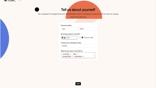
Folk's Onboarding Walkthrough
Ever signed up for a new tool and immediately questioned all your life choices? Nothing kills enthusiasm...
Existing customer? Sign in
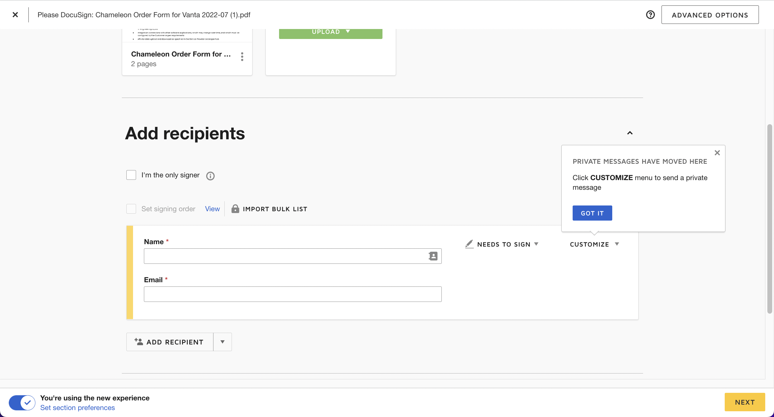
DocuSign’s onboarding for their updated interface combines coachmarks with a subtle banner to guide users through recent changes. The welcome overlay emphasizes faster sending, while in-context tips like “Private Messages have moved here” offer clarity precisely when needed. It’s a seamless transition strategy, making sure users adapt without breaking their flow.


Get started free in our sandbox or book a personalized call with our product experts