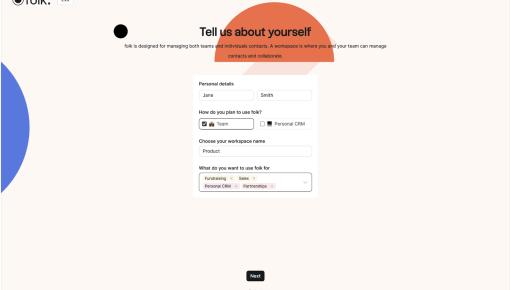
Back To Inspiration

Figma

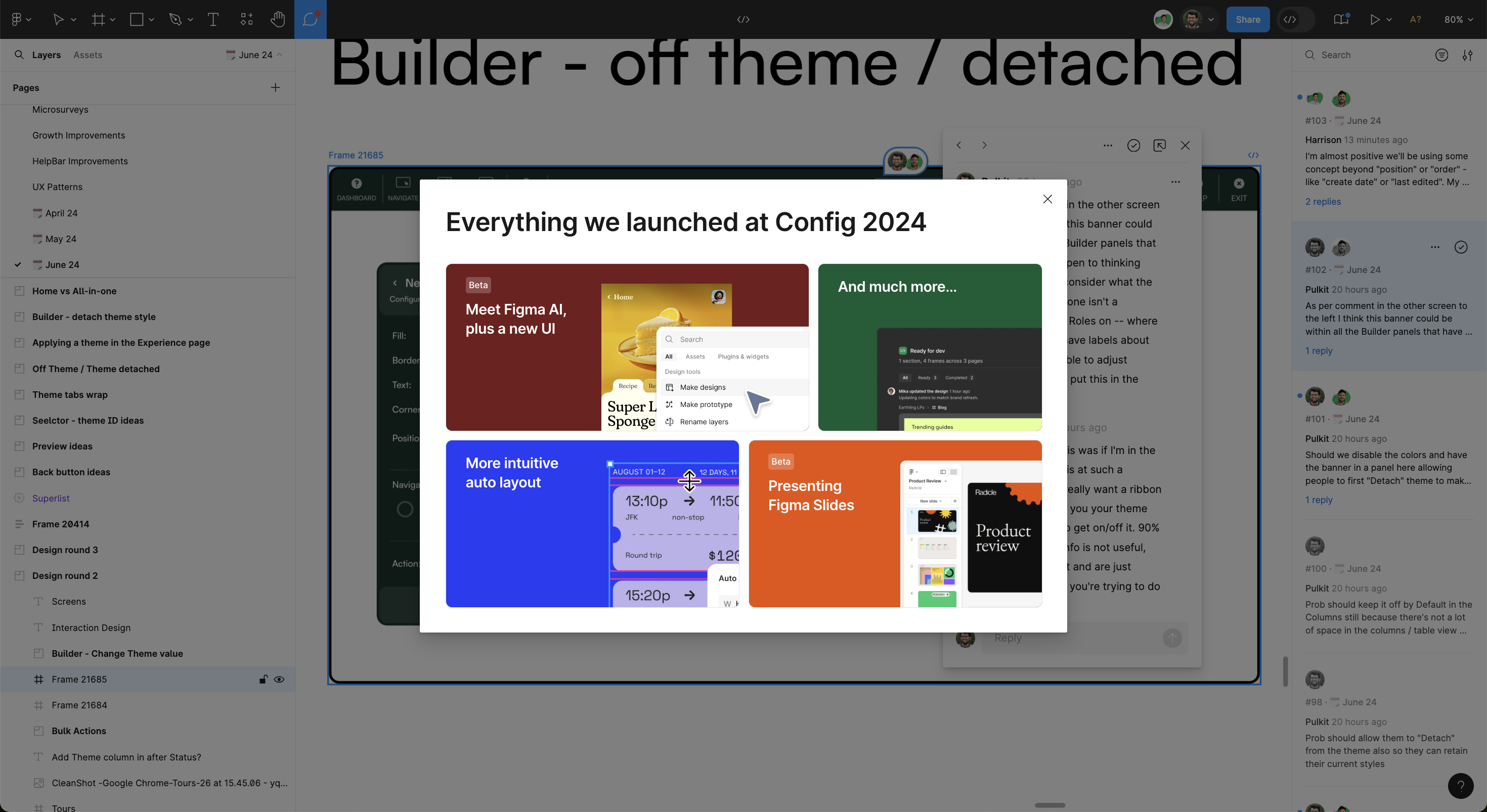
This Figma modal goes big and bold with its feature announcements from Config 2024. It's a visual feast, giving each product update its own color-coded block, which draws your eye and helps quickly identify what’s new. From the much-hyped Figma AI to the slick new UI, the layout feels more like flipping through an interactive magazine than reading through an update. The mix of vibrant colors and straightforward copy makes the content feel exciting and digestible, even if you're just here for a quick overview. It’s a modern, design-centric way to keep users up to speed.

From this tour

Feature introduction: clear entry point

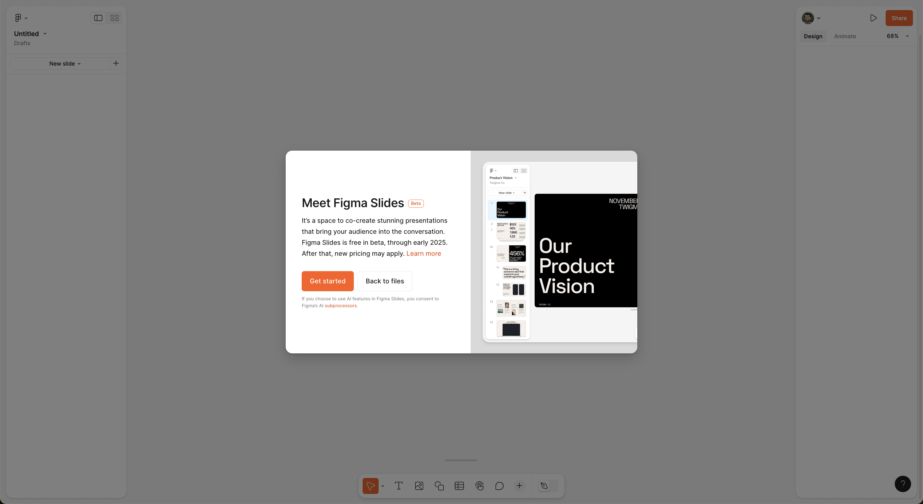
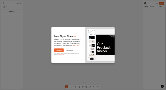
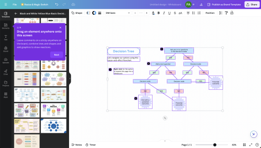
Figma introduces Figma Slides with a modal overlay, explaining what the feature does and prompting users to take action.

  • Clear value proposition: The copy immediately explains why this feature matters—“a space to co-create stunning presentations.”
  • Low commitment CTA: The two-button approach—"Get Started" vs. "Back to Files"—gives users control without forcing adoption.
  • Minimal disruption: Unlike a full-screen takeover, the modal sits lightly on the interface, allowing users to opt-in or opt-out without losing context.
Feature introduction: clear entry point

Interactive walkthrough: nudging users to explore

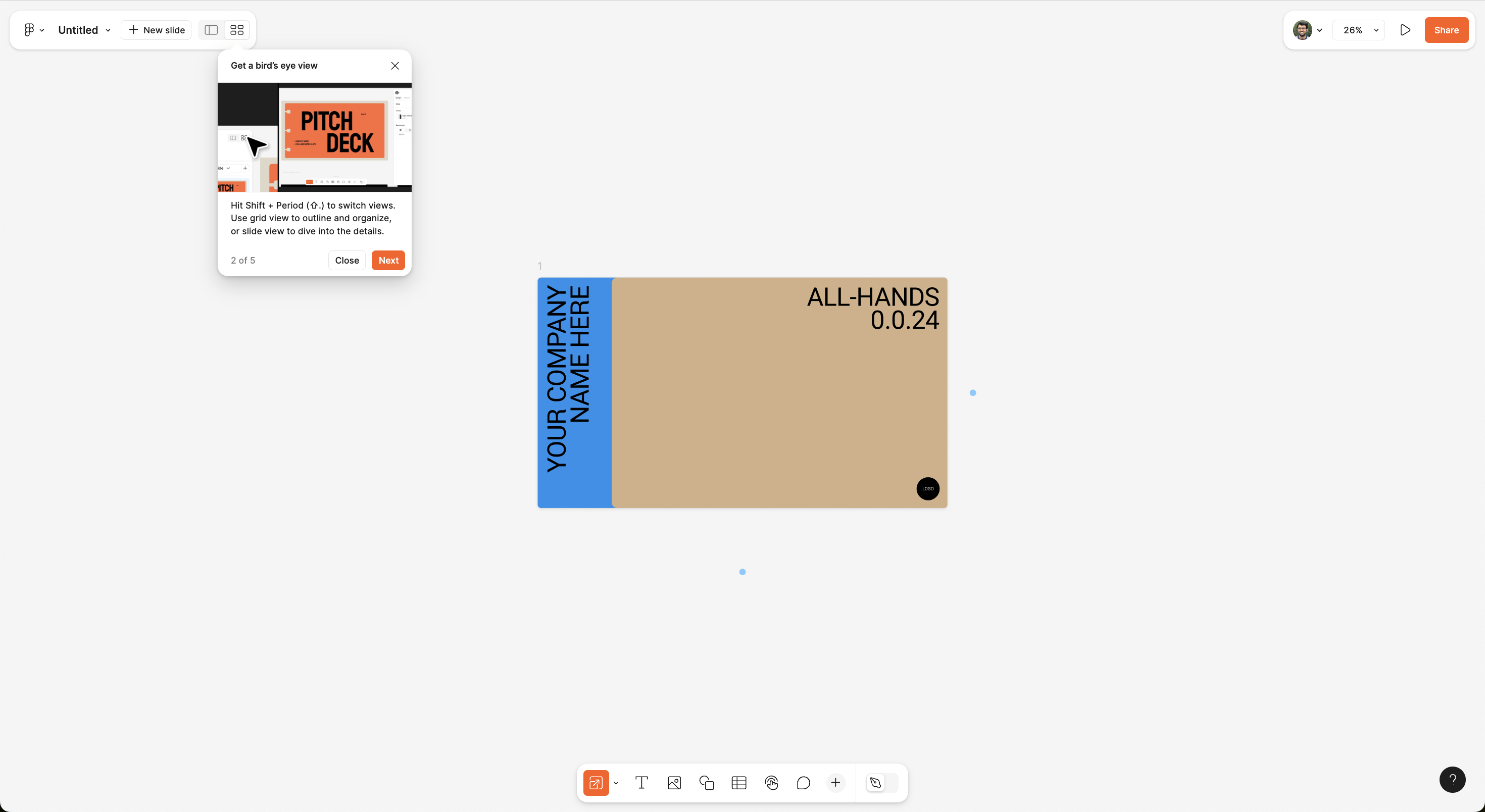
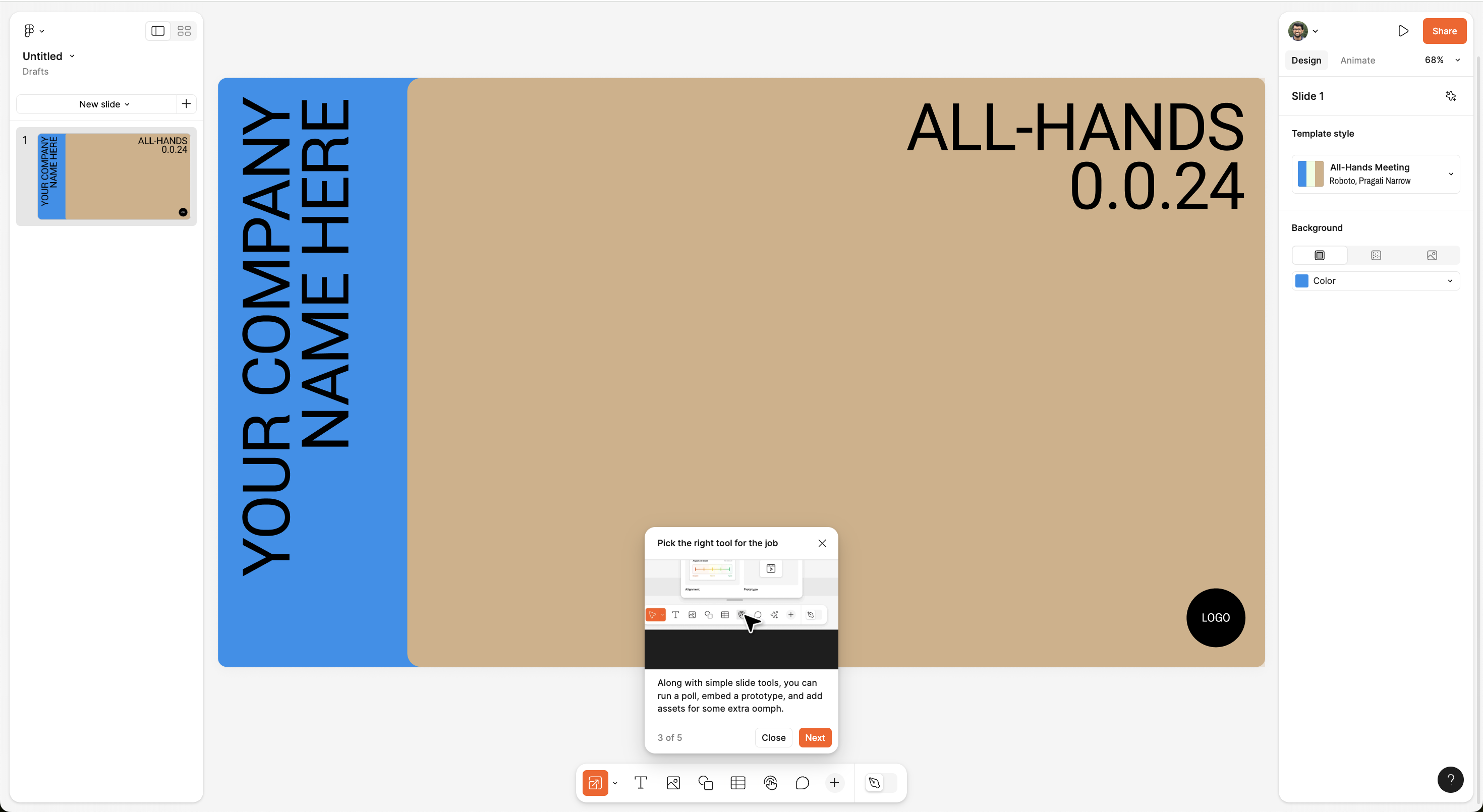
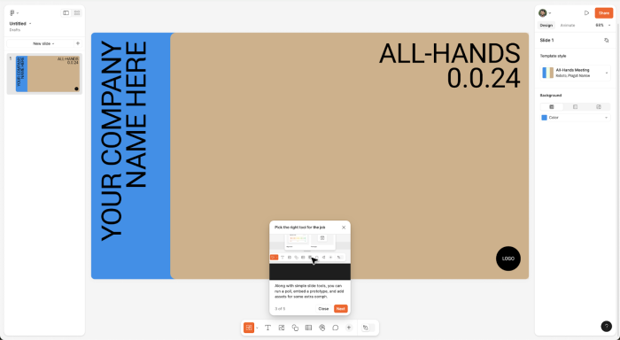
Figma uses tooltip-based walkthroughs to guide users through key features, without requiring prior knowledge.

  • Contextual guidance: The tooltips appear right where actions happen, reinforcing learning while keeping users inside the UI.
  • Step-by-step introduction: The walkthrough starts with template selection, then introduces grid view, slide customization, and tool selection—ensuring users discover core functionalities progressively.
  • Simple UX microcopy : The copy remains casual yet informative—e.g., "Find slides for any situation"—keeping onboarding engaging rather than instructional.
  • Image: Every modal comes up with a relevant image that shows what that feature looks like giving more context.
  • Header: Every header copy starts with an action word that prompts the user to take action and help them see what they can do with that feature.
  • Progress indicator: Showing "Step 1 of 5" helps users understand how long the walkthrough will take, reducing drop-off.
Interactive walkthrough: nudging users to explore

Use of visual hierarchy & UI contrast

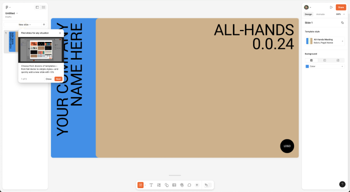
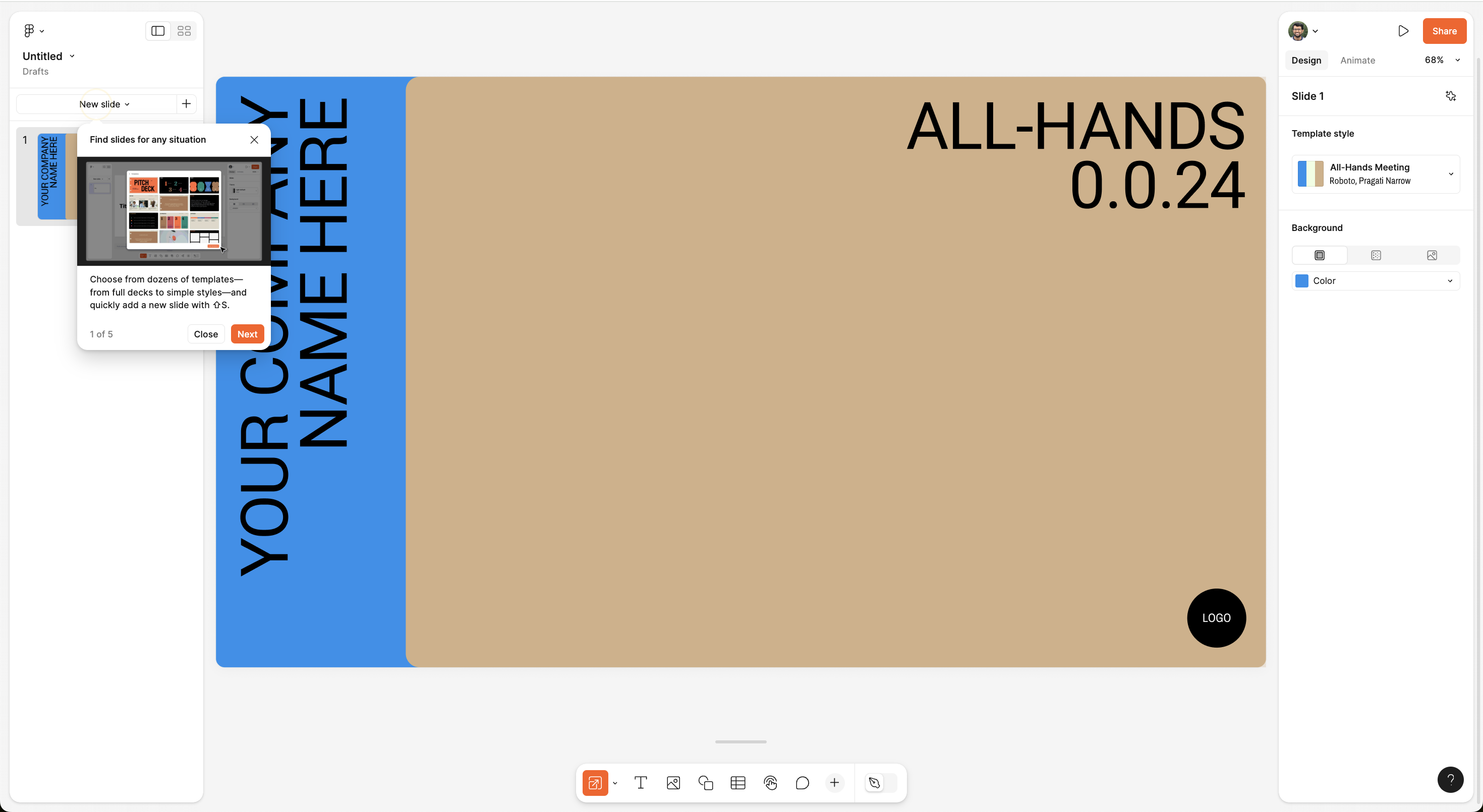
Figma integrates bold tooltips, high-contrast colors, and well-placed CTAs to guide attention without overwhelming.

  • Tooltip placement feels natural: The tooltips guide attention without blocking essential UI elements.
  • Clear differentiation of steps: Users instinctively know which features to explore next, thanks to visually distinct steps.
Use of visual hierarchy & UI contrast

More Launch, & Modal examples

Canva
This Canva whiteboard tour is straightforward yet lively, gently nudging users to start their creative...

Boost product adoption and
reduce churn

Get started free in our sandbox or book a personalized call with our product experts