Back to Launches
Figma
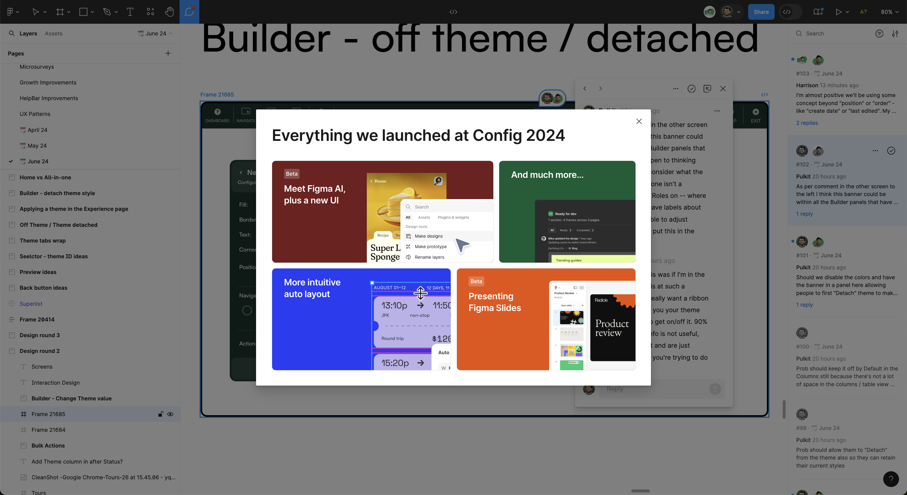
This Figma modal goes big and bold with its feature announcements from Config 2024. It's a visual feast, giving each product update its own color-coded block, which draws your eye and helps quickly identify what’s new. From the much-hyped Figma AI to the slick new UI, the layout feels more like flipping through an interactive magazine than reading through an update. The mix of vibrant colors and straightforward copy makes the content feel exciting and digestible, even if you're just here for a quick overview. It’s a modern, design-centric way to keep users up to speed.
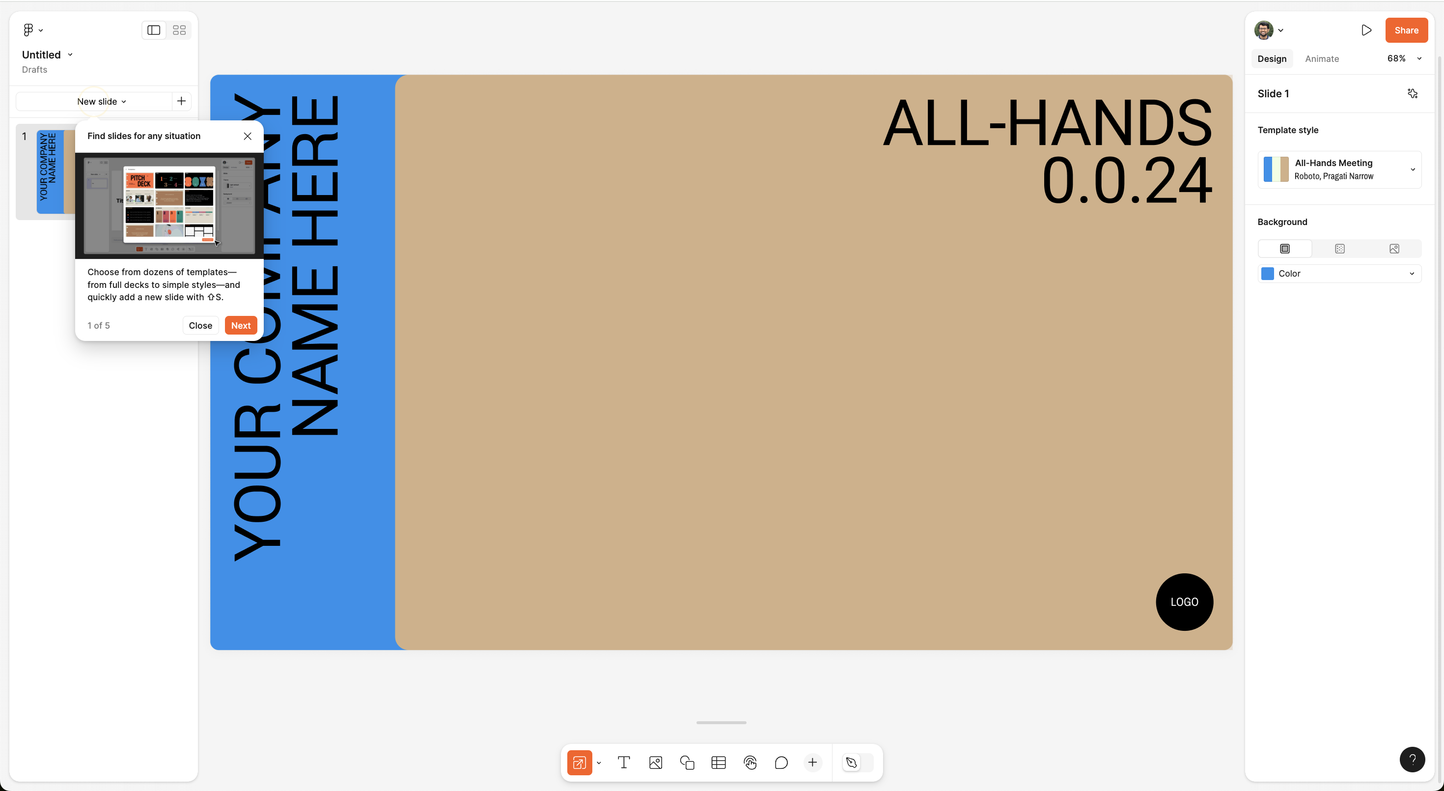
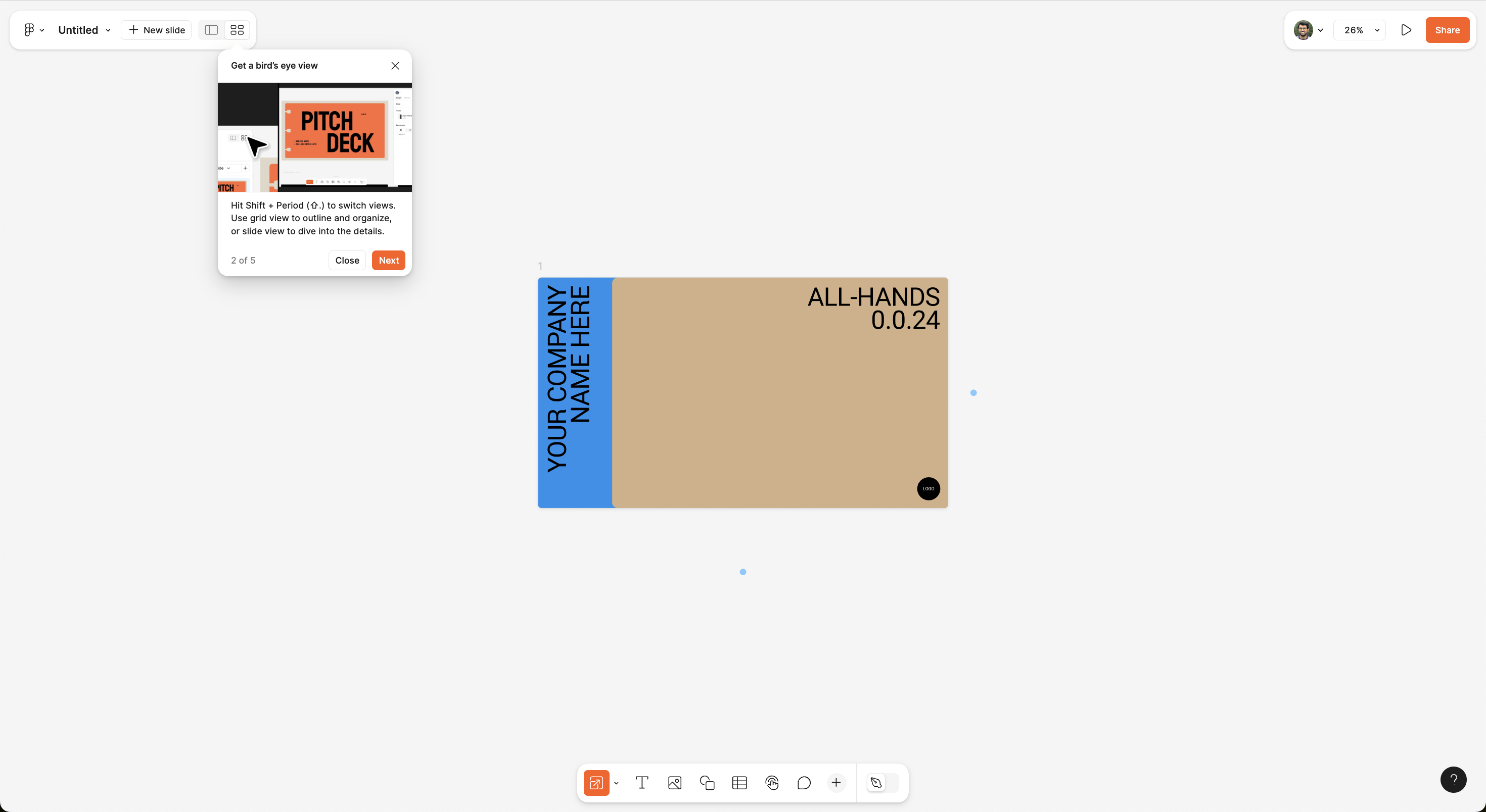
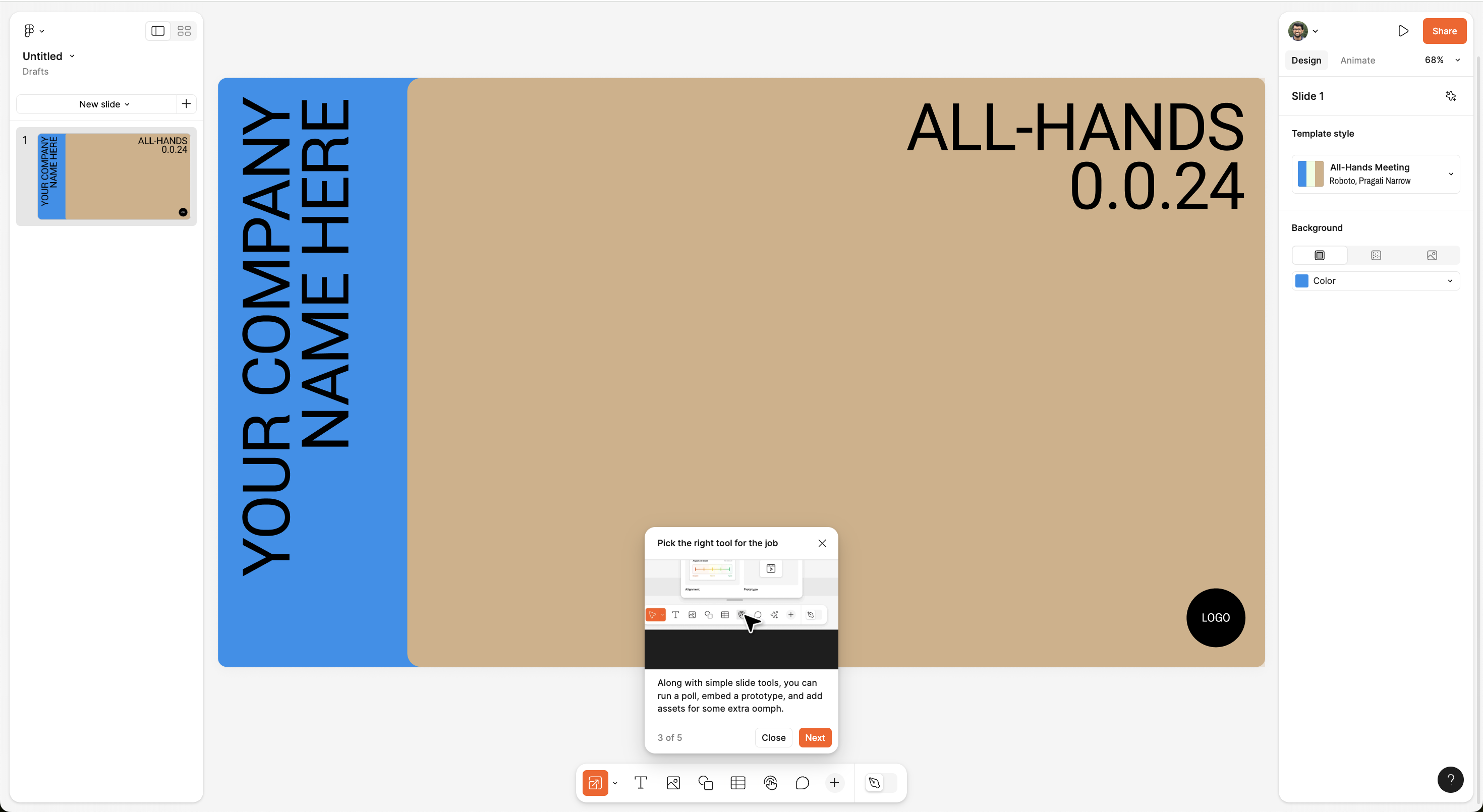
From this tour

A Modal with catchy media that shows a feature update in action and communicates how users can use it.
Canva
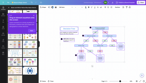
This Canva whiteboard tour is straightforward yet lively, gently nudging users to start their creative...

ChatGPT
ChatGPT just dropped GPT-4 Turbo into the mix—smarter, faster, and now with the ability to understand...
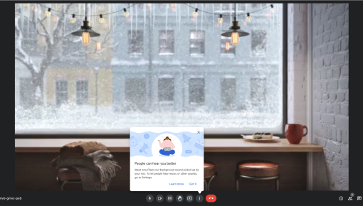
Google Meet's Tooltip
Google Meet’s new update filters out unwanted background noise, making sure your voice shines through...
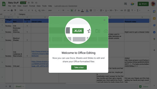
Google Sheets' Office Editing Tour
Google Sheets introduces its Office Editing feature with a helpful modal, allowing users to edit and share...
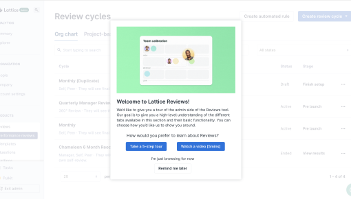
Lattice's Onboarding Tour
Lattice Reviews kicks off with a friendly, “Let’s get you started” vibe, offering a choice between a 5-step...


