


Folk's Onboarding Walkthrough
Ever signed up for a new tool and immediately questioned all your life choices? Nothing kills enthusiasm...
Existing customer? Sign in
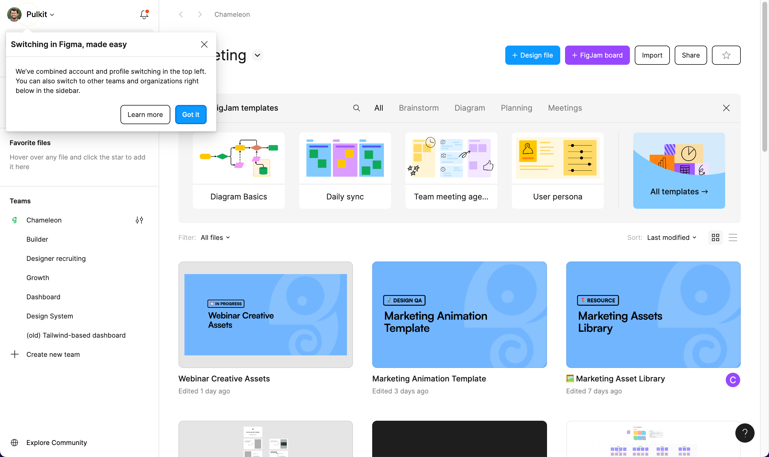
The modal explains how they’ve streamlined switching—now it’s all in the top left and more intuitive than ever. The design is clean, focusing on what’s changed and how it benefits the user, with a clear “Got it” button to get you back to work or a “Learn more” link for deeper details. It’s a smooth, user-friendly update that puts convenience front and center without any unnecessary noise.
More inspiration examples


Get started free in our sandbox or book a personalized call with our product experts