Stripe’s Navigation Update Tooltip
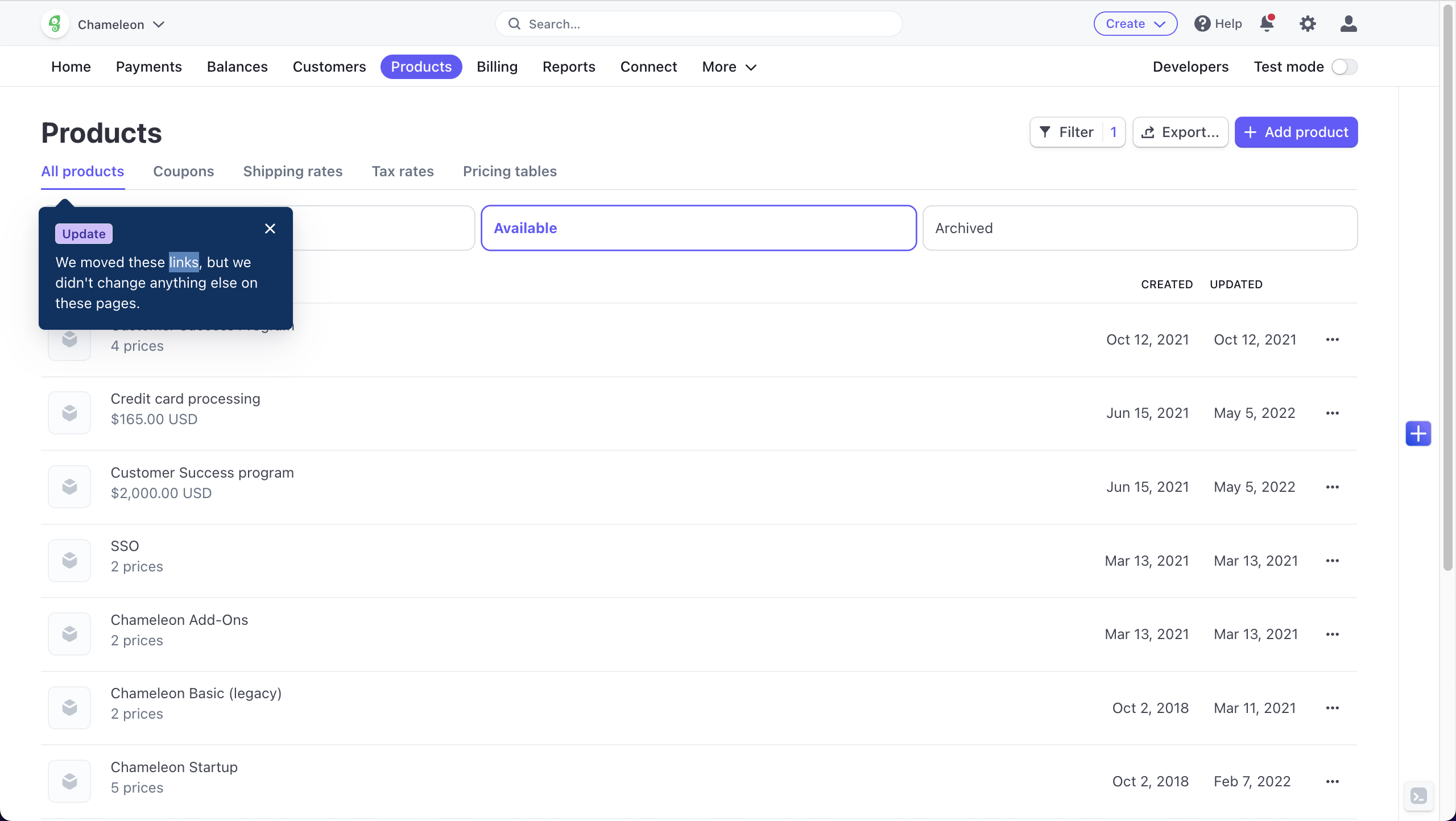
This tooltip in Stripe informs users about a subtle navigation change, highlighting that some links have moved while reassuring them that everything else remains unchanged. The minimalist design and concise message are perfectly aligned with Stripe’s clean UI. The tooltip is brief, informative, and non-disruptive, offering just enough information without overwhelming the user. The use of a friendly tone—“but we didn’t change anything else”—eases any potential concerns users might have about the update, allowing them to continue working without hesitation.

More inspiration examples


Folk's Onboarding Walkthrough

Hotjar's Feedback Collection Widget

Chameleon's Release Notes Demo

Fivetran's Product Demo


