


HelpBar FAQ accordion
An FAQ section built as an accordion with multiple collapsable sections to enable easier content exploration.
Existing customer? Sign in
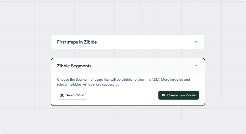
Collapsible menus that enable progressive learning and reveal more details when triggered
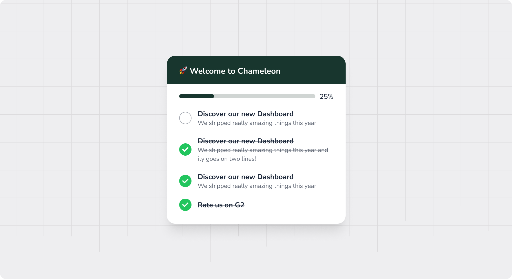
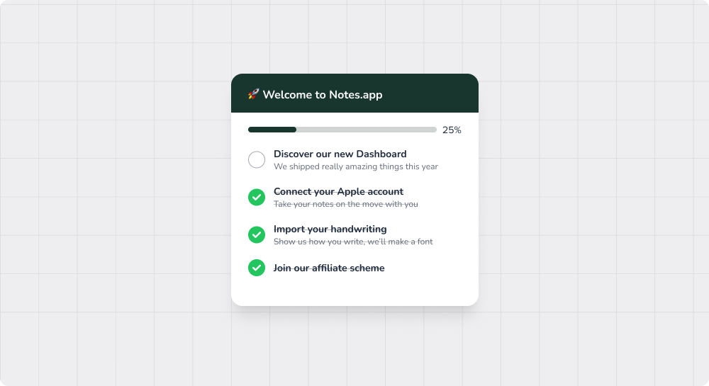
Accordions are UI components that compactly display large amounts of content through expandable and collapsible sections. This can often be used within “Getting Started” pages, providing a sequence of setup or implementation actions.
The Accordion pattern allows many steps to be condensed into overarching “sections” to enable progressive disclosure (and decluttered interfaces) and thereby reduce the cognitive load users face with the numerous steps to take. This makes it more likely for users to engage and complete the steps.
Getting Started: often, products will have a page dedicated to set up and implementation and will use Accordions to organize the steps required
Navigation Menus: Categorizing items space-efficiently and helping group by a higher-level subject
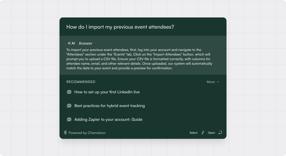
FAQ Sections: Organizing questions and answers in a readable format and allowing the user to focus on one topic at a time
Form Sections: Grouping related form fields to simplify complex forms
Resource Hubs: sometimes Accordions are used within other UI patterns to help further organize and structure the content/information


Get started free in our sandbox or book a personalized call with our product experts