


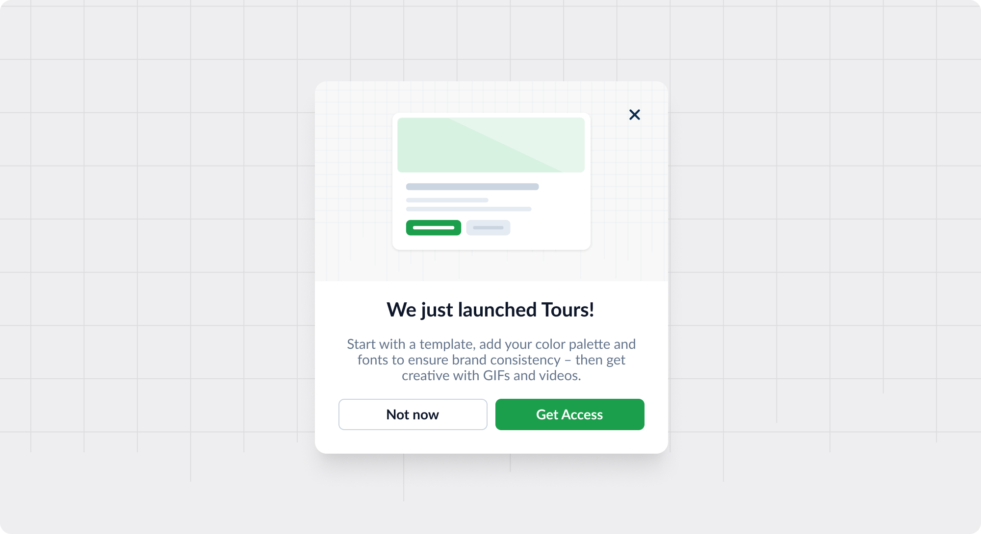
Google Drive Tooltip
Contextual tooltip that helps users discover more subtle features
Existing customer? Sign in
Subtle in-patterns that pack a punch and help your users learn the ropes, triggered by hover or click
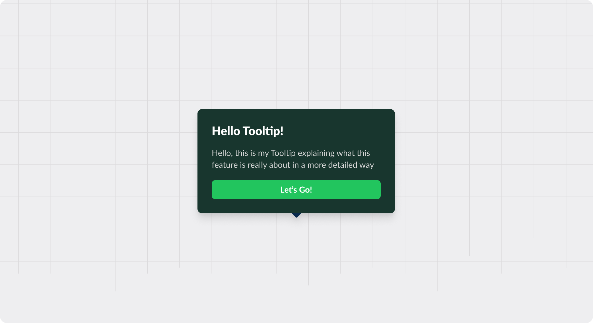
Tooltips are small, informative text boxes that appear when a user hovers over, focuses on, or clicks an element within a user interface (UI). They provide contextual information, additional details, or usage tips—without cluttering the UI.
Often, tooltips contain a “pointer” to reference a specific element on the page and may be opened via an icon (e.g., a question mark or “new” sign) or over text (e.g., a broken underline).
More info: Explaining the function of a button or icon that might not be obvious
Definitions: Providing additional details about text or images that can enhance user understanding
Form fields: Displaying quick tips or guidance for form fields, helping users understand what input is expected


Get started free in our sandbox or book a personalized call with our product experts