


Self-service is key to reducing support costs and helping more users succeed

There is nothing worse than trying out a new product and within the first few minutes finding yourself in a combat war against dozens of pop-ups asking you to “try this”, “do this”, and “buy this” 🙈.
We all aim to help users find success in our product but that requires careful management to avoid overwhelming them with our firehose of excitement about our own functionality.
The best way to drive product adoption is by providing the right kind of help at the right time.
Your product experience should offer a combination of push help and pull help, in other words, provide product guidance where you consider it necessary (push help) and allow users to learn on their own where they feel it necessary (pull help).
In this blog post, we’re going to specifically focus on how you can give your customers the freedom to explore your product and get help when they need it the most with Chameleon.
Make it Easy for Customers to Find Help When They Need It
When users are actively (or passively) looking for answers, it's your job to make their search as easy as possible.
In order to be able to offer the right type of help you need to have a solid understanding of where users are getting stuck, if they need more clarity, and how much assistance will really enable them to adopt your product.
Some examples of where this might happen include when a user:
- First enters your product (think user onboarding)
- Explores a new part of your product (think feature discovery)
- Comes across unfamiliar jargon or taxonomy (think tooltips)
- Attempts a workflow but is unable to succeed as expected (think support requests)
- Finds something familiar has changed (think redesigns)
Below are 3 types of self-serve help you can provide in your product with Chameleon.
Tooltips
Tooltips help users understand unfamiliar or complex parts of your product when they need it the most. When used correctly they are powerful and help keep your UI simple by reducing the noise or the need to explain everything within your interface.
Here are a few places to incorporate tooltips in your product:
When you are using icons in your navigation
Many products are using icons instead of text in their apps, this helps reduce clutter and noise and keeps the interface clean. Alone, these icons can mean different things to different users, but by adding hover tips you are providing a user more context as to what each of these important nav items do.
Over time, users will begin to associate the visual elements in your app with the context you’ve provided and navigating will feel like second nature to them.
When users may not be familiar with certain product terminology
Your users may have different levels of expertise and different backgrounds, which means they may not find everything in your product intuitive.
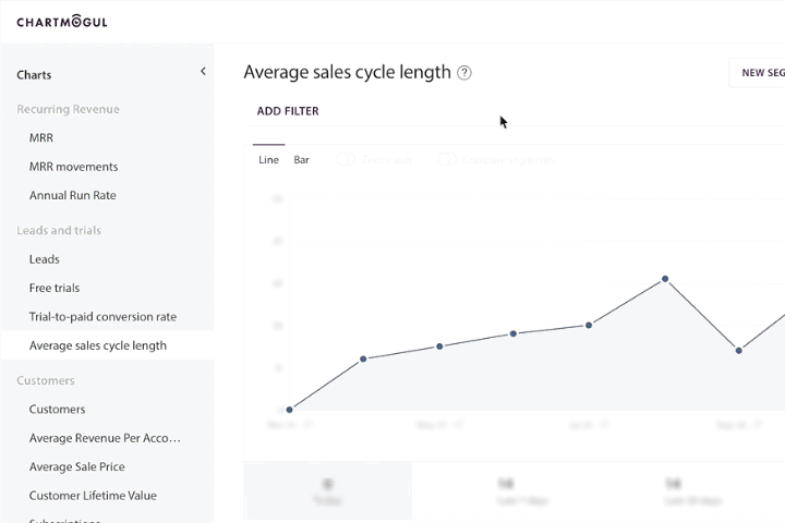
In the image below, ChartMogul, a subscription analytics tool, does a great job defining their more complex metrics using a persistent hover tip. This gives users the opportunity to learn in the product while they are in their existing flow, rather than having them navigate to their help docs searching for an answer. It also allows the user to return to the definition when they may need a refresher or are ready to take the next step.
You can build this in Chameleon, without writing any code or waiting for engineers. You can then update this on the fly as you better learn what resonates.
🛠️How to build a tooltip that appears when hovering over an icon
- Create a new tour step and add your text copy
- In the Triggers menu, select to show step: on-hover and select Custom Icon
- Upload the custom icon users will hover over to see your tooltip content
- Select the element on the page (using our point-and-click tool) where the custom icon will be placed
- Click on Adjust the fine-tune the position of your custom icon
- You can place your tooltip anywhere on the page. To position it adjacent to your custom icon, go to the Focus menu, select the position: Snap to element
- You can select the same element as in step #4 and adjust the position
- Navigate back to the Tour View in the Chameleon Sidebar and open the Tour Delivery section
- Select to show the tour each time so the tooltip is persistent and doesn’t go away after a user sees it once
In less than 2 minutes you can recreate an interactive tooltip that educates users about a key metric or feature in your product.
Provide tips on how to use a specific feature
Having to add more space in your UI to explain how to use a specific feature is kind of a nightmare 😩. Which is why at Chameleon, we use tooltips as a way to explain what a feature does and why you’d want to use it.
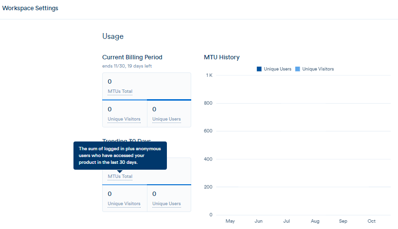
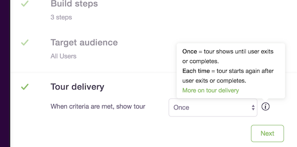
In the example below, we recently released a new feature that allows our users to deliver a product tour once to a user or have it show every time. Our designer, Jess, made sure to incorporate an info icon with a hover tip in the design to ensure users understand and feel confident using the new feature without sacrificing the clean UI. This is what I call a win-win 🙌.
There are many examples of how you can use tooltips to help users better understand how to use your product and drive product adoption. But pretty please, don’t go tooltip crazy.
The best place to incorporate tooltips are where users get stuck, confused, or need added context to help them really adopt a new feature.
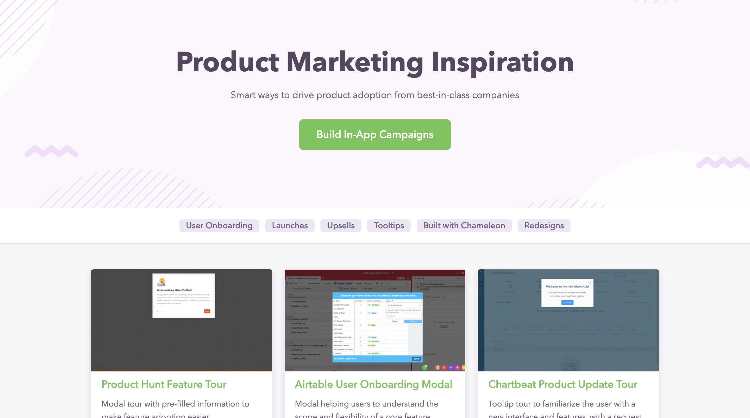
To see how other companies are using tooltips in their product check out our Inspiration Gallery.
On-Demand Product Tutorials
Another way you can offer users self-serve help is by giving them the option to take interactive product tours, at their own pace.
By giving users the option you can educate those that are ready to learn something new while also letting other users take it later when they may have more time or are ready to further engage with your platform.
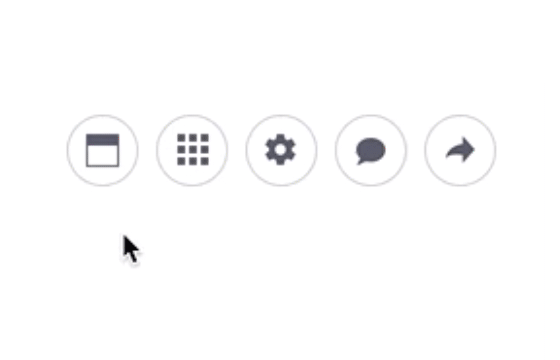
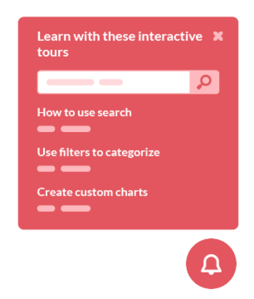
There are a few ways you can incorporate on-demand tutorials into your product. One way is by having a widget or icon in your app that is dedicated to on-demand tours, as seen in the example below by MindMeister, a mind mapping tool.
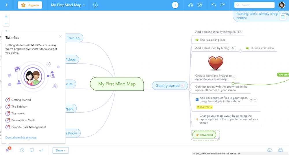
We love the less-is-more approach when it comes down to the number of tours to include. It’s about showing people the key aspects of your product that will give them the quickest understanding of the value your product provides and helps them on their way to becoming successful.
You can build a menu of product tours using Chameleon, without developers!
🛠️How to build on-demand product tours
- Create separate tours for each workflow / help item
- In the Tour Audience section, set these to "Only those with link" -- this will prevent them showing automatically, and instead only display when using their link
- Create a new tour that will be the menu item; with a single step
- In this step, create a list with names of all the tours, and to each, add the relevant permalink from each tour (you can get this in the Additional sharing options section within the tour
- Set the Trigger for this step to be "On click" and either use an existing element in your app, or a custom icon
- Go back to the Tour View and select "every time" under the Tour Delivery section (this will ensure this tour starts repeatedly whenever someone clicks on the element)
- Activate all of your tours
You can also use these tactics, without a menu step, and allow different tours to begin when users click on elements inside your product. For example, you could add a "How does this work?" item in your nav bar which starts a different tour on each page in your application.
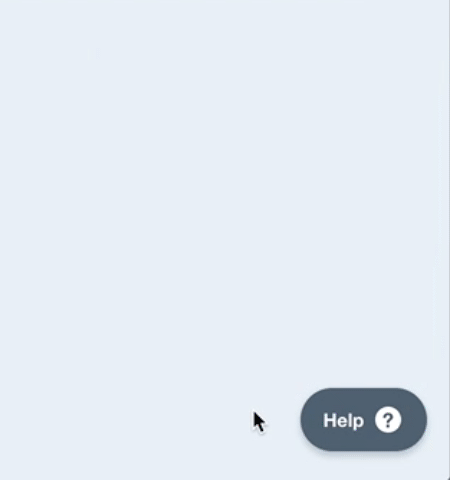
Help Widgets
You probably have recently seen more companies with help widgets, self-serve type widgets in their product. These help widgets usually host many resources from help docs, contacting support, to sharing recent feature release notes.
The self-serve widget makes it very clear where users can go for help and what resources are available at their disposal.
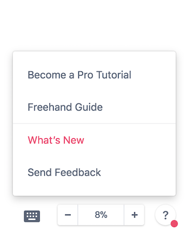
You can deploy a self-serve widget, out of the box, using Chameleon Launchers. A Launcher triggers a menu of tours that users can take to get help with common issues or learn a feature. A tour could be as simple as a tooltip pointing to the right feature, or a full series of modals with video and written content.
By showing customized Launchers based on the feature the user is currently using, you can deploy custom and interactive self-serve support across your whole product, without pushing users off track to an external knowledge base.

Build smarter self-serve help into your product
Getting your users to become successful in your product requires knowing what kind of help to provide and at which moment. Which is why it is important to incorporate both proactive guidance as well as self-serve help through a user’s journey.
There is no magic potion or formula, you have to see what works best for your users, and you won’t know until you actually test it out.
Try adding few of these self-serve help options into your product and see if it helps drive an increase in feature adoption.
Check out above a recent webinar we did on this topic, where we show how Launchers can be used to build self-serve help that deflects support tickets and improves feature adoption.
Product Discovery On-Demand
Enable users to learn the basics, discover new features, and get help in their own time


