


Staring back blankly at a new user isn't very welcoming -- here's what to do instead.

The first page you see after signing up for Instagram is empty. Other profiles are bursting with photos, likes and comments, but your account is full of nothing. 0 posts. 0 followers. 0 following. It's a little disheartening, and makes it harder to start playing with the app.
![]()
To make the transition easier, Instagram has turned this “empty state” into a learning opportunity: where you would normally see your photos, it says “No posts yet — Tap on the camera to share your first photo or video” with an arrow pointing to the camera option.
It provides a clear path and holds your hand as you take your first steps. Instagram turns a moment of nothing into something, increasing motivation and prompting action.
Without motivation and prompts, behavioral scientist BJ Fogg says, users won't act. By making an interface intuitive and providing the right guidance, you will encourage users to engage with your product. If you don't, they'll leave.
Empty states exist in every app: at first sign in, when you clear your inbox, and when there's a connectivity error. For many apps, though, these pages don't tell users how to move from an empty state to a full one.
Each empty state is an opportunity. Instead of leaving it blank, use it constructively—to teach, guide, educate, and prompt.
Nudge Users to Fill Their Empty Dash
Let's take a new fitness app as an example. After signing in, you have to manually input your fitness goals or habits. The fundamental interface to interact with the product is empty. There's a lot of work to be done before you can successfully use this product and get the value you signed up for. This is likely to lead to churn for all but the most motivated users.
Using the empty state to gently teach and onboard users can solve this problem. Break down the next steps for them.
Workmates, an app that centralizes team communication, shows users how to solve problems as they encounter them. When a user navigates to a page that doesn't contain data, like their “Favorites” or “Chats” pages, the app shows a cute animation and provides a link to get them back on track.
![]()
Workmates uses its empty states to convey personality and tone. Also, the call to action is very clear: “Invite People,” “Add Favorites,” and “Start a Chat” are direct and easy-to-follow instructions.
Show Your Product in Its Full Glory
Don't force your users to imagine everything on their own or do a bunch of work before they see your product in its full glory. Instead, fill your empty states to show what using it would actually be like.
Clothing stores use mannequins because you're more likely to buy the outfit if you can easily visualize how it'll look when being worn. You can use the same principle to present the fullest version of your product. The mannequins in your product are dummy examples or default data. With them your user can see your product in action and eventually try it themselves with their own real information.
Trello Onboards Users in its empty states By dogfooding
When you first enter Trello, it looks just like they promised the app would be in all the demos. Your dash features columns, cards, and a menu detailing every action taken. They've cleverly made their empty state onboarding a Trello project, easing customers into the product quickly.
![]()
The far right list, “Stuff to try,” is full of dummy posts that continue showing the user how to utilize the product. When you click on the cards, Trello outlines actions that you can do within the app. The goal of each of these cards is to familiarize you with each feature on the site by having you try them yourself. It's not simply a long list of instructions, it's a dynamic way of onboarding customers.
Fill Up Every Empty Space With Auto-filled Information
The forms on your app are also an opportunity to direct your customers to action. You can preset auto-fill data so there are no empty spaces, not even where users need to input personal information.
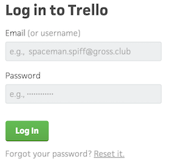
Trello's sendup to the comic *Calvin & Hobbes *is subtle but recognizable. It serves the dual purpose of showing customers what to input and also makes the product memorable.
You should include auto-fill data for all your forms. Riff on your team's favorite shows or cult classic movies by inputting sample data like “Ned Stark” or “dany.dragonborn@redkeep.me” (can you tell that we love Game of Thrones?).
Personalize the Interface for Your Users to Get the Ball Rolling
Onboarding through your empty states is a vital way to encourage customers to use your product right away. And when you personalize your app for customers, you show off the value of your product even faster.
They can see themselves in your app when their profile picture is pre-loaded or their personal information is already in their user bio. They also don't have to waste time inputting all this information, they can jump straight into the app.
Gravatar connects emails and avatars
Gravatar automatically links email addresses and avatars for all its account-holders. By following Gravatar's guide for image requests, you can upload avatars to your users' accounts on your app. This will put your users directly in your app with no effort on their part.
Disqus, the online commenting hub, is just one of the apps configured to use Gravatar. They grab the avatar connected with the email address the user registered with and make it their profile picture when they sign up.
![]()
Having an avatar uploaded instantly makes the app feel more personal from the outset. The above user hasn't posted on Disqus before, but seeing their face next to an empty text box that says “Join the discussion...” makes commenting extremely compelling. It's like they're already halfway there.
Borrow Your User's Company Colors To further personalize your app
When someone makes a product tutorial or onboarding flow with Chameleon, we don't use default colors. Instead, we pull colors from the company website. Users can also input their own hex codes.
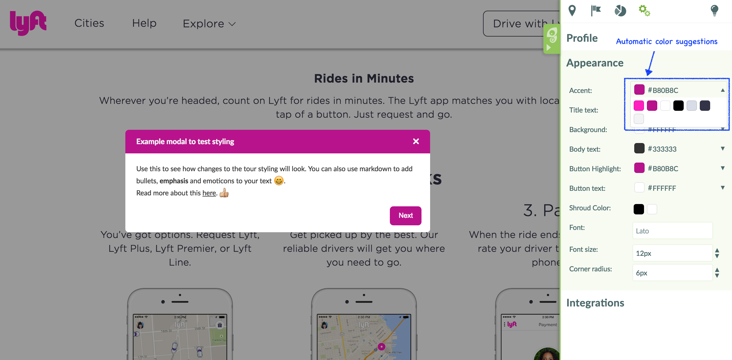
Besides lending familiarity to our app, using our users' company colors helps us translate their business goals straight into our product. They can envision how we fit into their tool belt.
With just an email address you can learn a lot about a customer. Clearbit lets you plug in an email address and spits out information about their company and work history, and experience. You can then use this information to customize their experience within your app and fill your empty states.
Showcase Your Product Through Empty States
Empty states offer you the opportunity to show off your product at its best. By filling up the app with crucial information and further onboarding, you can build engagement with your customers. These states also allow you to show off the personality of your company.
Empty states are the place to show your customers the thoughtfulness of your product and its true potential.
💡 Low hanging fruit: edit the placeholder and default text in all your input fields to be useful -- don't leave empty or repeat information!


