Do you have a web or a mobile app built with React, and do you want to onboard your users with ease and offer a seamless experience? The best way to do it is by creating effective product tours.
There are two paths for this. One is building on your own, and the other is buying a tool that can layer over your existing product and help you deploy tours quickly and easily without coding.
Here, we run you through the different libraries, types, and the pros of each library—followed by why you should choose them and quick setup codes. We’ll also present you with an alternative solution if building in-house is not an option right now.
Library | Type | Pros |
Intro.js | React wrapper for Javascript library | - Popular with large community support - Actively maintained - Free for non-commercial projects |
Shepherd.js | React wrapper for Javascript library | - Robust with good positioning - Many configuration options |
React Joyride | React library | - Great base design template - Actively maintained - Easy to customize |
Reactour | React library | - Good looking tours - Easy to deploy quickly |
Walktour | React library | - Advanced customization options |
React Native Walkthrough Tooltip | React Native library | - Simple solution with decent community - Easy to add tooltips |
Highlight Overlay | React Native library | - Super simple and minimal |
Spotlight Tour | React Native library | - Highly customizable - Engaging spotlight effect |
What is a React product tour library?
A React product tour library is a specialized software package designed to help developers create interactive, step-by-step guides, walkthroughs, or product tours for React-based web applications. These libraries provide pre-built components and functionality to implement product tours easily.
Here's what a React product tour library usually includes:
Step or guide creator: you can tell the library what to show the user in each step (think "show the search bar" or "click this button")
Highlighter: this tool shines a spotlight on the specific parts of the app you want users to focus on
Tips: you can add little messages (like tooltips) to explain what each highlighted part does
Flow guide: you decide the order in which users see the steps and how they move through the tour (like clicking "Next")
Design kit (optional): some libraries let you change the colors, fonts, and even add animations to make the tour match your app's style
By providing clear and concise instructions, these tours can significantly improve user experience product adoption and reduce the learning curve for your application.
Best React product tour libraries or React JS web applications
Make a lasting first impression! Here, we list the eight best React product tour libraries for your web apps.
1. Intro.js
Intro.js is one of the most popular libraries for building JavaScript onboarding tours. It also comes with a React wrapper that allows you to deploy tours for your React application.
Intro.js is free for non-commercial projects, and for commercial use, it requires a one-time fee that starts at $9.99. So you can try it out for free and then decide if it’s what you want to help build product tours.

(Source)
Why choose Intro.js?
Intro.js is the premier JavaScript library for DIY onboarding tours. This means they have unparalleled community support as well as active maintenance and update of its library. There’s a reason why even big companies like Amazon and SAP are using Intro.js.
React Intro. js setup
1. Get Intro.js: install it using npm or yarn
Using npm:
npm install intro.js --save
Using yarn:
yarn add intro.js
2. Styles and components: import Intro.js CSS and components (Steps, Hints) from intro.js-react
Include the Intro.js CSS in your main application stylesheet or a dedicated CSS file:
import 'intro.js/introjs.css';
Import the required components from intro.js-react:
import { Steps, Hints } from 'intro.js-react';
2. Shepherd.js
Shepherd.js is another popular JavaScript library for building product tours. Like Intro.js, you can use the React wrapper to create onboarding flows for your React application.
For its modals, it uses Popper,js which is another open-source library used for rendering tooltips. This is how Shepherd.js enables you to create steps for your tour.

(Source)
Why choose Shepherd.js?
Shepherd.js is a super robust tool thanks to Popper.js, a popular tool with 23.8k stars on GitHub. This makes Shepherd.js a better tour tool than many others. For instance, thanks to Popper, Shepherd.js tours never have steps that end up off-screen or cropped due to an overflow.
React Shepherd. js setup
1. Install the Library: install "react-shepherd" using npm or yarn.
Begin by installing the react-shepherd library using npm or yarn:
npm install react-shepherd --save
2. Import the components: bring in ShepherdTour and useShepherdTour for tour creation
Import the necessary components from react-shepherd in your React component:
import { ShepherdTour, useShepherdTour } from 'react-shepherd';
3. Usage: Use either Provider/Context approach for tour integration
import { Component, useContext } from 'react';
import { ShepherdJourneyProvider, useShepherd } from '@shepherdpro/react';
import newSteps from './steps';
const tourOptions = {
defaultStepOptions: {
cancelIcon: {
enabled: true
}
},
useModalOverlay: true
};
function Button() {
const Shepherd = useShepherd();
const tour = new Shepherd.Tour({
...tourOptions,
steps: newSteps
});
return (
<button className="button dark" onClick={tour.start}>
Start Tour
</button>
);
}
export default function App() {
return (
<div>
<ShepherdJourneyProvider>
<Button />
</ShepherdJourneyProvider>
</div>
);
}
4. Style it (optional): customize the look and feel with tourOptions
Shepherd.js offers various configuration options to customize the look and feel of your tour. You can configure these options by passing a tourOptions object to the ShepherdTour component.
5. Wrap and highlight: wrap elements you want to showcase in the tour
Wrap the elements you want to highlight in the tour with the ShepherdTour component. Pass the defined steps and tourOptions (if applicable) as props.
3. React Joyride
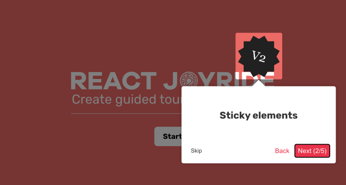
With 5.1k stars on GitHub, React Joyride is one of the most popular libraries for creating product tours on React apps.
The way it works is fairly simple. It enables you to prompt tooltips on selected DOM elements to explain what they are. For positioning and styling of the tooltips, it uses React Floater.

(Source)
Why choose React Joyride?
Thanks to React Floater, Joyride has a great base design template that’s highly customizable, making it a great choice if you have styling requirements.
Plus, the library is actively maintained and continuously updated. The community, including the creator, is also very active in assisting those who have issues along the way.
React Joyride setup
1. Install Joyride: use npm to install the "react-joyride" library
npm i react-joyride
2. Build your tour: define steps with targets and content, then render the Joyride component with your steps
import Joyride from 'react-joyride'
export class App extends React.Component {
state = {
steps: [
{
target: '.my-first-step',
content: 'This is my awesome feature!',
},
{
target: '.my-other-step',
content: 'This another awesome feature!',
},
...
]
};
render () {
const { steps } = this.state;
return (
<div className="app">
<Joyride
steps={steps}
...
/>
...
</div>
);
}
}
Boost product adoption and reduce churn with Chameleon Tours
Use Tours to guide, successfully onboard, support, or celebrate your users' journey, from discovery to mastery
4. Reactour
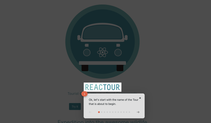
With 3.3k stars on GitHub, Reactour is another popular guided product tour library. Their latest release uses npm scoped package at Reactour.
For product tours, the most relevant packages from Reactour are:
@reactour/tour: The main package for creating a series of steps that highlight parts of your product.
@reactour/mask: A customizable component that allows you to highlight DOM elements or areas.
@reactour/popover: A customizable component that lets you place dialogs.

(Source)
Why choose Reactour?
A great thing about Reactour is that you can make ‘good-looking’ product tours. However, one caveat is that there’s limited styling customization compared to other libraries. If you want to deploy something that looks fairly good, quickly, and without much consideration into looking on-brand, then Reactour could be a great choice for you.
Reactour setup
1. Get Reactour: install the "reactour" library using npm or Yarn
npm i -S reactour
# or
Yarn and reactour
2. Style it up (optional): add "styled-components" for customization (optional step)
npm i -S styled-components@^4.0.0
# or
yarn add styled-components@^4.0.0
3. JavaScript usage: import components, define steps, and render the Tour component
import React from 'react'
import Tour from 'reactour'
class App extends Component {
// ... (class body with your component logic)
render () {
const { steps, isTourOpen } = this.state; // Assuming you have state variables for steps and isTourOpen
return (
<>
{ /* other stuff */}
<Tour
steps={steps}
isOpen={isTourOpen}
onRequestClose={this.closeTour} // Assuming you have a closeTour function
/>
</>
);
}
}
const steps = [
{
selector: '.first-step',
content: 'This is my first Step',
},
// ... (add more steps as needed)
]
5. Walktour
A relatively unknown library compared to other alternatives for React apps, Walktour offers a lot of potential for creating onboarding flows and product tours.
Its features include:
Keyboard navigation
Full CSS selector support
Interaction with highlighted elements
Custom HTML content
Smart positioning
However, you may find it a little more difficult to get support when stuck on issues due to the relative obscurity of the library as well as the small size of its community.

(Source)
Why choose Walktour?
Walktour shines when it comes to advanced customization in building your tour steps. If you’re looking to tinker away, and are confident about figuring things out on your own, Walktour can be a decent go-to.
Walktour setup
1. Grab the library: install the "walktour" library using npm or yarn
npm i walktour
Or
yarn add walktour
2. Bring in the component: import the Walktour component from the installed library
import { Walktour } from 'walktour';
3. Put the tour in action: render the Walktour component, passing your defined tour steps as a prop
<Walktour steps={mySteps} />
Best React product tour libraries for React Native mobile apps
Need to guide users through your React Native mobile app? These React product tour libraries can help you create clear and engaging in-app tours
6. React Native Walkthrough Tooltip
React Native is a framework for building mobile applications using JavaScript. It allows developers to write code once and use it to create apps for both iOS and Android platforms. So, if you’re looking for a product tour library for your React Native mobile app, then React Native Walkthrough Tooltip could be a good option.
This library is an inline wrapper that calls out React Native components with tooltips. When the tooltip appears, Reactive Native renders a copy of the element rather than using the wrapped element on the screen. You can then click the element in the dialog that appears above it.

(Source)
Why choose React Native Walkthrough Tooltip?
If you would like a simple solution to add onboarding tours and walkthroughs to your React Native mobile app, this could be a good option. It has a decently sized community as well, with tens of thousands of downloads each week.
React Native walkthrough tooltip setup
1. Get the library: install "react-native-walkthrough-tooltip" with yarn
yarn add react-native-walkthrough-tooltip
2. Basic usage: wrap your element with Tooltip, define content and behavior
import Tooltip from 'react-native-walkthrough-tooltip';
import { Text, TouchableHighlight, View, StyleSheet } from 'react-native';
const MyComponent = () => {
const [toolTipVisible, setToolTipVisible] = React.useState(false);
const handleClose = () => {
setToolTipVisible(false);
};
return (
<View style={styles.container}>
<Tooltip
isVisible={toolTipVisible}
content={<Text>Check this out!</Text>}
placement="top"
onClose={handleClose}
>
<TouchableHighlight style={styles.touchable} onPress={() => setToolTipVisible(true)}>
<Text>Press me</Text>
</TouchableHighlight>
</Tooltip>
</View>
);
};
const styles = StyleSheet.create({
container: {
flex: 1,
justifyContent: 'center',
alignItems: 'center',
},
touchable: {
backgroundColor: '#ccc',
padding: 10,
borderRadius: 5,
},
});
exportdefaultMyComponent;
You can learn more about React Native walkthrough tooltip on their GitHub.
7. Highlight overlay
As the name suggests, Highlight Overlay is an overlay that highlights elements and tints the rest. You can also create a flow where highlights switch from one element to another. This makes Highlight Overlay especially useful for creating walkthroughs that guide users through different parts of the user interface.

(Source)
Why choose Highlight overlay?
Highlight Overlay is a super simple product tour solution for your React native mobile app. This could be the best library for you if you want a minimal solution—simple, lightweight, and easy to implement without the need for extensive customization.
Highlight overlay setup
1. Install the package: use npm or yarn to add "react-native-highlight-overlay"
# npm
npm install react-native-highlight-overlay
# yarn
yarn add react-native-highlight-overlay
2. Import and wrap: bring in components and wrap your app's root with HighlightableElementProvider
import {
HighlightableElement,
HighlightableElementProvider,
HighlightOverlay,
} from "react-native-highlight-overlay";
// Remember to wrap the ROOT of your app in HighlightableElementProvider
Check out Highlight overlay on GitHub to see if this is the right solution for you.
8. Spotlight tour
This is a highly customizable React native tour library with a signature spotlight effect. It shines a light on the element you’d like to highlight and enables you to render a tooltip that explains the element.

(Source)
Why choose Spotlight tour?
This onboarding tour library for React native mobile apps is very customizable. The spotlight animation is also super smooth. Try Spotlight tour if you’re looking to wow your users with an engaging product tour.
Spotlight tour setup
1. Grab the library: install "react-spotlight-tour" using npm
npm install react-spotlight-tour
2. Import the tools: bring in useState, SpotlightTour, useSpotlight, and Spotlight for tour creation
import { useState } from 'react';
import { SpotlightTour, useSpotlight } from 'react-spotlight-tour';
import Spotlight from 'react-spotlight-tour/spotlight';
function StatusUpdateInput() {
const spotlightRef = useSpotlight('Update your status');
// ... (Your component logic here)
return (
<div ref={spotlightRef}>
<textarea />
<button>Update status</button>
</div>
);
}
function HomePage() {
Check out Spotlight tour on GitHub for more info
How to select the right React onboarding tour library for your team
Here are a few key factors to consider to find the perfect fit for your development team's needs and project goals:
Ease of integration: look for libraries that seamlessly integrate with React applications. Libraries like React Joyride and Reactour are designed specifically for React, making them easier to implement without extensive configuration.
Customization options: some libraries provide more flexibility in styling and behavior, allowing you to tailor the tour experience to match your application's design and functionality
Feature set: identify your project's specific needs. Do you require simple tooltips or a multi-step tour with branching logic and interactive elements? Some libraries are great for basic tours, while others offer advanced features for more complex product led onboarding.
Community & support: a large and active community can be invaluable for troubleshooting and finding answers. Consider libraries with good documentation, active forums, and helpful, human support options.
Performance: assess the library's impact on your application's performance. Lightweight options like Walktour may be preferable if you're concerned about adding unnecessary bulk to your project.
Maintenance and updates: look at the library's update frequency and the responsiveness of its maintainers. An actively maintained library will likely stay compatible with the latest React versions and address potential bugs or security issues.
Mobile responsiveness: if your application is used on mobile devices, ensure the library you choose works well on smaller screens and supports touch interactions
License and cost: check the licensing terms of the library. While many are open-source and free to use, some may have commercial licenses or usage restrictions that could affect your project.
Should I build-in house product tours or find a SaaS solution?
To summarize briefly, here is a comparison of building versus buying.

Building depends on whether you have dev resources available for product tours. Keep in mind that you’ll not only need to build your product tours, but deploy and maintain them too.
If your dev resources are restricted, getting a SaaS tool might be a better solution. With dedicated product adoption software, you can deploy quickly and customize your experiences with a simple no-code builder.
Plus, if you have an existing tech stack that you need to integrate with, product adoption software makes more sense rather than trying to do everything yourself.
Build React tours quickly and easily with Chameleon
At the end of the day, you still have to commit considerable dev resources when you use an open-source onboarding library. Despite the lack of fees paid, going DIY might cost you much more, especially if you have other pressing product issues that demand your dev resources.
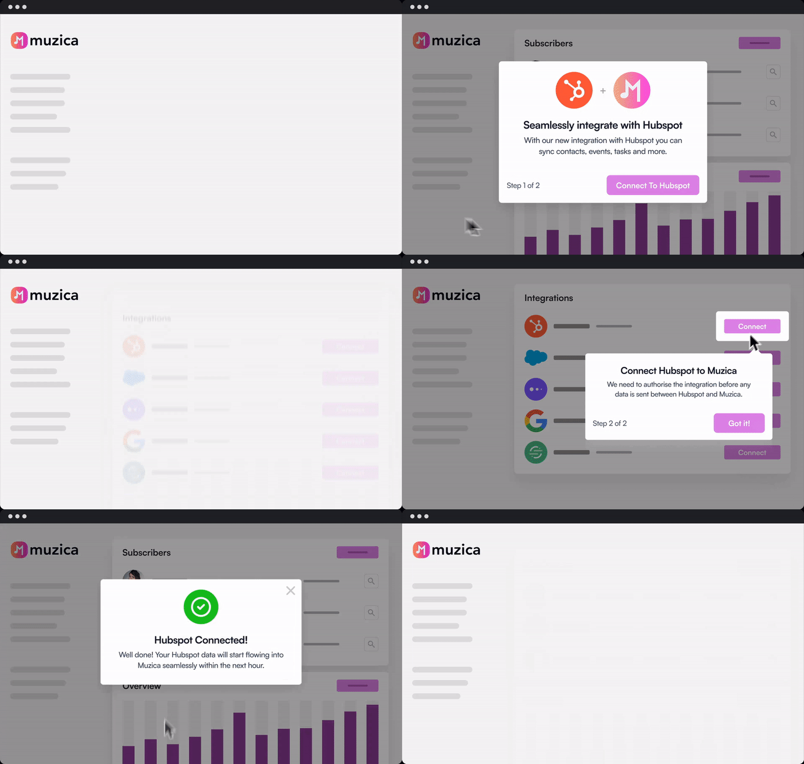
How about a no-code tool that can quickly deploy 😉? Chameleon provides an intuitive product tour builder for your React JS app. With it, you can create complex and targeted onboarding flows – and so much more.
👉 Check out this interactive demo on building a Welcome Tour with Chameleon.
Chameleon also offers many more features such as:
Fully customizable styling
Deep integrations with other tools
Native A/B testing of product tours
If you don’t have any dev resources to commit, a dedicated product adoption platform like Chameleon is truly the way to go since you’ll have a versatile toolset. With Tours, Tooltips, Launchers, and Microsurveys, you’ll be able to boost product/feature adoption, reduce churn, increase retention, and drive more conversions in addition to many other benefits for your product’s growth.

Deploy React Tours in Minutes
Save dev resources and easily build product tours for your React app


