SaaS onboarding is the process of introducing people to your product efficiently, concisely, and in a way that sets them up for success. SaaS onboarding is totally different from traditional face-to-face (F2F) client onboarding, or service onboarding, as it often relies on technology and automation in order for the SaaS businesses to keep resource expenses low and growth high and manageable.
However, there’s a big problem with it.
Just as your SaaS users are all different, it’s your job to tailor your own onboarding experience to each individual user, so that new customers can find value in your SaaS product in a way that’s unique to their job-to-be-done.
In this article, we’ll unpick the ins and outs of SaaS onboarding, inspire you with some of the best SaaS onboarding examples, and guide you through building a self-service onboarding experience your users will adore. Allons-y!
What is onboarding for SaaS?
SaaS onboarding is how a product actively guides users to find new value in your product.
Why is onboarding important in SaaS?
It reduces churn and increases user retention.
What are the stages of SaaS onboarding?
1. Preview user -> first-time user: when prospective users understand your core value proposition and try your product.
2. First-time user -> committed user: when the initial experience leads to discovering value in your product.
3. Committed user -> power user: when committed users become habitual users
How do I onboard a new customer in SaaS?
Clearly define "aha!" moments for each user profile
Map the steps users need to get there
Gather user feedback with in-app surveys
Optimize the path to the "aha!" moments
How can I improve my SaaS onboarding?
Reduce friction in the signup stage
Leverage multiple channels
Use data-driven insights to test and iterate
Create a clear user onboarding process
Keep your onboarding flows simple
What is SaaS onboarding?
SaaS onboarding is the process of introducing someone to your product for the first time. Your goal is to help a new user understand, navigate, and be successful with your product.
SaaS onboarding can come in three different ways:
Low-touch onboarding: is a popular choice of SaaS onboarding for low-ticket SaaS products. This type of onboarding relies on tech and automation triggered from key user lifecycle events to guide users through a new product or feature. You’ll see a lot of this type of onboarding in this article.
High-touch onboarding: is the go-to for high-ticket accounts that require a more complicated integration process. This type of onboarding is famous at agencies and other service providers. It is often delivered by an account manager or customer success manager.
Self-serve onboarding: similar to low-touch but not the same. Self-serve gives users the ability to learn and dive into onboarding materials on their terms. This means there are no pop-ups or launchers, but there are clear (and optional) knowledge bases or help widgets for users to onboard themselves.
Formula for an effective SaaS user onboarding
You want your users to find success in using your product. Therefore the goal of product onboarding should be to encourage users to take the necessary actions in your product that will result in success.
If we think about user onboarding best practices in terms of this actionable framework, the formula looks like this by hitting these three marks, you are guiding users to success with your product.
Product onboarding = right content, right channel, right time
How to create a compelling onboarding process
For your SaaS customer onboarding to be successful, new users must act on initiating their onboarding journey, which may involve some nudging. So, how do we push users toward action? We can use BJ Fogg’s behavior model to help, which states that people need three elements to be compelled to action:
Motivation
Ability
Triggers
We can then apply this model to product usage, which translates to:
Strong value proposition
Intuitive interface
Timely prompts

A clear value proposition is hopefully why your customers are using your product in the first place. How do you consolidate an intuitive interface with the need for timely prompts?
We’ll call this “dynamic UX,” which means UX that is delivered intelligently and responsively based on the data associated with that user or account.
Mapping the customer onboarding journey
In a quest for better user onboarding, we need to understand user behavior throughout the onboarding process. We can use lifecycle segmentation to mark key milestones of product success.

Advancing each stage in the customer lifecycle requires that you guide them to value discovery with user onboarding.
Preview user → first-time user
The customer journey starts with prospective users “previewing” your product. Usually, their initial exposure and impression come from marketing materials (i.e. landing pages, blog posts, social media), through which users learn about the value they can get from the product.
To compel preview users to become first-time users, they need to understand your core value proposition and use cases clearly.
First-time user → committed user
Once they’ve used your product, the next test is whether or not their initial experience lives up to the marketing message. This is where you onboard users and make your potential customers realize that there is indeed value in your product.
Therefore, turning a first-time user into a committed user is about understanding what they expect from your product and aligning those expectations with appropriate education and calls to action, leading to customer success.
This is why dynamic UX is so powerful; you can serve hyper-focused in-product experiences that present relevant information when your users need it, minimizing noise and avoiding distracting and invasive popups that do more to frustrate users than educate them.
Once users know how to use your app, they develop habits around it.
Committed user → power user
The difference between a committed user and a power user is customer love. Power users are habitual users who understand your product well, but it’s not just about how much they use it—it’s about the quality of your relationship with them.
Cultivating customer love and true loyalty/evangelicism involves giving them a reason to care about your product. This isn’t something that can be easily summed up. Still, it involves community-building, responding and interacting with users on various platforms, and going the extra mile to prove that you genuinely care about and are invested in their success.
Understanding how these transitions happen is the key to creating effective customer onboarding processes.
9 Best SaaS onboarding examples to inspire your process
Now, let's look at some of the best SaaS onboarding examples that truly nail the customer onboarding process. We'll go through each onboarding example in detail to explain what's so great about it, and what it achieves.
1. Customer.io (preview user → first-time user)
The live demo is usually the first step when you want to guide users to value. But pushing demo prompts can be quite irritating if it's too intrusive.

In this SaaS onboarding example, Customer.io aims to prompt users for a live demo with a simple side-pop modal. It doesn't get in the way of the user's navigation, and it is straightforward, wasting no words at all.
Key takeaways:
Keep prompts encouraging first-time users as unobtrusive as possible. Above all else, focus on building a positive brand sentiment.
Avoid intense colors often associated with sales: red, orange, yellow, for example—unless in line with your brand palette
Be conscious of the language you’re using: rather than “Book a demo,” Customer.io uses “Save my seat”—playing on Cialdini’s persuasion tactic of scarcity while keeping things light-hearted
Include a clear way to click out of your prompt to allow a preview user to do their job at hand
2. Mixmax (preview user → first-time user)
If you have a product that could benefit from network effects like, let's say, a meeting scheduler, every user event could bring many other new users. For instance, whenever users receive meeting invitations with Mixmax, each of those users presents an opportunity to begin a signup process.

After users accept the calendar invitation via Mixmax, it pops up a signup modal, with a firm reminder that it is free, as well as copy that communicates Mixmax's value.
Key takeaways:
Address the preview user’s pain points within your prompt to remind them of the benefit to using your product
Consider a freemium plan or free trial to entice the user further
Give users a straightforward way to click out of your modal, be it clicking outside of the modal window or via an in-modal button/copy
3. Voxox (first-time user → committed user)
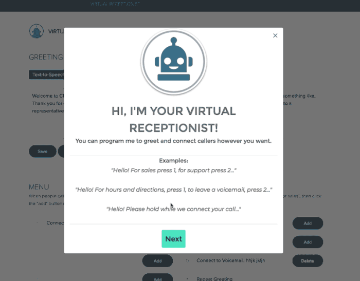
Voxox built their product onboarding tour (shown here) using Chameleon. The new UX resulted in a 20% boost to user activation, after seeing sharp drop-offs previously; they also achieved a 50% reduction in customer churn.

This tour is well-designed because it’s short, to the point, and focused on clearly communicating a single feature’s purpose. Once that goal has been achieved, it guides the user to the next action.
Key takeaways:
If it works for your brand voice and ICP, consider gamifying your onboarding for a first-time user. Or, at least, be playful with the tour copy.
Use clear examples to inspire your user’s product discovery journey
By introducing your product with a modal overlay on the product’s core UI, you subtly introduce the user to their interface rather than overwhelming them
4. Zendesk (first-time user → committed user)
To drive new user activation, you need to be able to guide users to value. Otherwise, customers churn away from your product 😢 (to put it very simply).
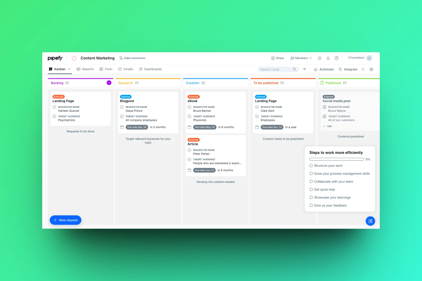
This is where an onboarding checklist comes in handy, through which you can introduce key features and reduce time to value for new customers. For this reason, we’re featuring Zendesk as one of the best SaaS onboarding examples to learn from.

Zendesk's onboarding checklist gives new users a shortcut to follow and makes onboarding less confusing.
Plus, by gamifying it by showing completion by percentage, Zendesk motivates users to follow the onboarding flow.
Key takeaways:
Consider a progress bar to manage users' expectations for the time or number of steps remaining on their onboarding. Our benchmark report found that 4-step tours have the highest completion rates.
Let users know the tour is personalized for them
Onboarding tours should be optional. Let users know they can always come back to complete them later on.
5. Clockshark (first-time user → committed user)
Here, Clockshark built a video modal for its SaaS onboarding process that demonstrates how to use its time sheet features. Videos tend to be much better for user engagement and can educate users effectively when used within the user onboarding process.

Plus, Clockshark personalizes the experience by addressing the user by their name 🤩
Key takeaways:
Use short videos where possible in your onboarding tours
Don’t be afraid to use emojis and formatting to elevate your copy
Ensure videos have subtitles!
6. FullStory (first-time user → committed user)
Let's dig into how FullStory (a digital experience analytics platform) begins its SaaS user onboarding experience.

Information is collected in a simple persona-based user survey. This helps FullStory understand the goals and probable use cases of each new user so they can deliver a more relevant user onboarding experience.
Key takeaways:
Take the time to get to know a first-time user so you can further personalize their low-touch onboarding experience
Use bold fonts to draw the eye to the most important information on the page—or the info you want the user to read first
Consider a progress bar to manage a user’s expectations better
7. Baremetrics (first-time user → committed user)
For many freemium or free trial products, you may have users who have already had a positive onboarding experience and clearly see your product's value but haven't converted yet. In such cases, a gentle nudge can drive users to grab a premium plan.

In this trial upgrade prompt, Baremetrics reminds the user with a nice, unintrusive bottom banner how many days are left in the trial and then offers a discount as an incentive for conversion.
Key takeaways:
Use a standout color across a small modal to draw attention but not cause friction
Consider two options when moving a user to a paid plan: the option to upgrade directly or request a demo if they need further convincing
Manage expectations on a free trial but let the user know how long they have left
8. SendGrid (committed user → power user)
One way to empower your users is to involve them more in the feature development process. This could involve inviting users into a beta or running exclusive pilot tests to gather feedback. Such involvement encourages users to be more expressive champions of your product.

Here, SendGrid has a section within its product where it runs feature experiments. It openly invites users to test new features with a tooltip.
Key takeaways:
Consider a dedicated section of your product to encourage committed users to power users
Give users the option to learn more about a potential new feature or get started with the prototype right away
Don’t be afraid to play up the exclusivity of this access in order to let users know you appreciate their input
9. Help Scout (committed user → power user)
On Twitter, Help Scout champions their users by publicly celebrating customer success. Clearly, Help Scout customers aren't shy about sharing their love for the platform.

In this example, Help Scout builds a deeper relationship with their customer with one-to-one words of affirmation.
Cultivating true evangelists should be a long-term goal of SaaS user onboarding, and self-serve help doesn't always suffice - high-touch activities like this help make it happen.
Key takeaways:
Use social listening tools never to miss a brand mention, good or bad. These tools are also great for creating brand sentiment reports which can further support other marketing efforts.
Take the time to get to know your committed users. Learn their names, what they do, and the pain points they’re solving with your product.
Stay timely: social media is fast, and you’ll need to keep up. Make sure your social media efforts are consistent, and let your users know they’re your priority!
How to plan an effective self-serve onboarding experience
While it’s true that SaaS onboarding is best thought of as a continuous process, fixed, concrete milestones are still important. You should be meticulous about plotting the steps users must take to get to their “aha!” moments.
Similarly, the first 90 days of your SaaS onboarding process are crucial (this is just an arbitrary number, but the point is, first impressions count).
To plan and implement an effective product onboarding experience, you can use this four-step process:
Clearly define “aha!” moments for each user profile
Map steps users need to get there
Test your hypothesis with microsurveys
Optimize the path to “aha!”
Clearly define “aha!” moments for each user profile
Don’t ignore the most basic step of the SaaS onboarding process—to identify your customers’ goals. Neither should you assume that training customers on every feature of your product is the goal.
You might not be able to articulate the “aha!” moment today clearly, but you can start by generating and testing a few hypotheses. Our best SaaS onboarding examples all worked towards the Aha! Moment.
Start by identifying the core value proposition of your product (for example, you might consider the most used feature or features that have received the most positive feedback).
"Aha!" moments will differ by persona and should be clearly defined and measurable.
Map the steps users need to get there
Once you're confident, map out the steps users need to get there and how long this typically takes.
This doesn’t need to be complex; in fact, simple is better. What’s important is that you understand user behavior and can gauge how long and how straightforward the path for each user will be.
Gather user feedback continuously with Microsurveys
On average only 4% of dissatisfied users take the time and effort to get in touch with a business (which means that there are ~26 other unhappy people for every person that complains).
This is why continuous feedback is necessary; to collect feedback throughout the entire product and user lifecycle, not just part of an early design phase.
We’re already seeing a shift to this kind of responsive feedback gathering; just take this example of ChartMogul triggering NPS surveys at key user lifecycle events:

During onboarding, continuous feedback via Microsurveys can be leveraged to understand the goals and motivations of different user personas.
💡 Shortcut increased user activation by 8% from one Chameleon Microsurvey experiment. Here's how they did it.
Optimize the path to “aha!”
Once you’re confident with your hypotheses and have gathered some feedback with Microsurveys, consider the following 2 questions:
Is this the right path? Are there steps that are not necessary on this path? Which steps lead to the greatest fall-off? What would be the shortest path to wow?
Do users know how to get there? Is there a clear direction on what to do next (and why)? What do users need (motivation, ability, triggers) to get to the next step?
5 SaaS Onboarding Best Practices
1. Reduce friction in the signup stage
Keep the signup stage as seamless as possible. Eliminate unnecessary points of potential friction (like asking for unnecessary information) and ultimately lower the barrier to signups as much as possible.
Other ways you can reduce product onboarding friction:
Get rid of trivial form-field validation (like requiring at least one lower-case character in a password or username)
Use social signup buttons (i.e. using your Google or Facebook profile to sign up)
2. Leverage multiple channels
There are three main user onboarding channels, which you should use in combination to motivate, engage, and educate your users:
Emails (great for transactional messages and re-engagement)
In-app messaging (great for delivering context-specific messages to active users)
Product tours (a versatile channel that includes modals, tooltips, hotspots, notification bars, etc.)
If you’re not confident you can build these solutions in-house, check out one of these tools (or go with Chameleon 😎).
3. Use data-driven insight to test and iterate with agility
Set-and-forget is not the best way to think about your SaaS onboarding process. You can’t just build an onboarding solution once and revisit it 6 months down the line.
Rather, think of it as a feature that needs fine-tuning for the best results. Since you have (hopefully) defined clear goals for onboarding, it makes sense that you now have to measure and test variations.
Don’t be overwhelmed; you can set your goals, sketch out rough flows, and identify points of engagement in about a day. You need to be lean and focus on completing a first draft to start testing and iterating. Perfect is the enemy of continuous improvement.
4. Create a process for product onboarding
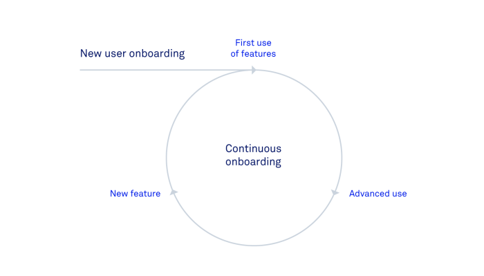
User onboarding is something you’ll be doing time and time again, so it makes sense to create a clear process that can be assessed and improved upon.
Having a straightforward process can also help your onboarding to be more robust and flexible because you’ll have a precise reference point for how and when to introduce new features into the scope of customer education.
This diagram nicely illustrates the cyclic model of new user onboarding:

5. Keep your onboarding flows simple
A common cause of customer churn is being overwhelmed by unfamiliar information, so much so that it becomes more logical for them to look for a simpler solution. You’ll notice that some of the best SaaS onboarding examples are the simplest.
Making things skippable and giving users the option to return to complex flows at a later point will also help reduce churn and frustration.
Build SaaS user onboarding experiences fast
There are many no-code or low-code solutions that help you offload work from your engineering team. Intercom or Customer.io for emails, Mixpanel or Heap for analytics, Zendesk or oLark for live chat, Readme.io or Help Scout for documentation; the list goes on.
If you’re interested, you can see the full stack of user onboarding tools we use at Chameleon. We have the deepest product adoption tools that can be used to create user onboarding experiences that are targeted and contextual.
And, if you’re interested in designing and building targeted and personalized in-product flows, you can get started today with Chameleon. After a one-time setup, you can do all of this with zero technical knowledge - no need for onboarding to sit in an engineering backlog anymore 🎉
SaaS onboarding FAQ
-
To improve your SaaS onboarding, you should focus on personalization and clarity throughout the user’s journey. Identify key "aha!" moments tailored to individual user profiles, ensuring these experiences resonate with their unique objectives and challenges. Streamlining the signup process is crucial for reducing barriers to entry. Employ a variety of communication channels, including emails and in-app messaging, to maintain engagement and provide relevant information at optimal times. Leverage data-driven insights for continuous improvement, regularly testing and refining your strategy to better align with user feedback. Simplify the onboarding flows to avoid overwhelming users, making complex processes optional to facilitate a more manageable learning curve. By adopting these strategies, you not only facilitate a smoother onboarding process but also significantly enhance user engagement and retention, ultimately leading to a more successful product adoption.
-
An effective SaaS onboarding process has a flexible path to success, beginning even before sign-up with content that showcases the product's value. Upon signup, users receive personalized guidance through step-by-step tutorials or product tours, highlighting key "aha!" moments related to their specific goals. The user journey features milestones and gamification elements to boost engagement, while ongoing feedback through surveys or prompts ensures the experience remains tailored and effective. This process will use many channels (e.g. in-app, email, help docs) for extra support and resources, keeping users engaged. In essence, successful onboarding is personalized, interactive, and dynamically refined based on user feedback, swiftly demonstrating product value and fostering long-term product adoption.
Create delightful SaaS user onboarding with Chameleon
Launch product tours, embedded callouts, checklists, surveys and more! Chameleon is the deepest product adoption platform for features and customization. Take it for a 30-day free trial!


