Crossbeam's Redesign Modal
Talk about a glow-up! ✨ Crossbeam rolls out its revamped navigation with a fun and friendly modal that feels more like a chat with a coworker than a product update. Complete with a feel-good GIF, this announcement is packed with personality while keeping things informative. The message is clear: they’ve listened to user feedback and made changes to improve your workflow. The “goodies” list breaks down the updates in simple, digestible bites, and the CTA (“Tour Your New Nav”) is hard to resist. It’s product communication with a side of good vibes!

More inspiration examples

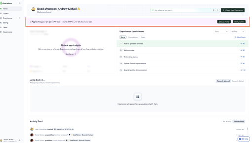
Chameleon's Usage Limit Warning Banner
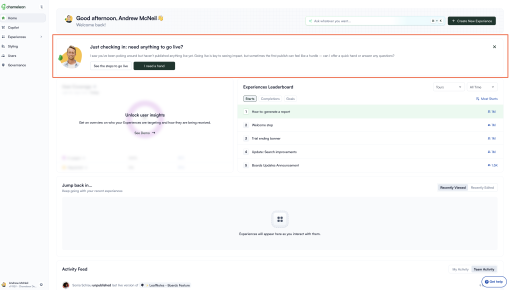
Chameleon's New User Activation Banner
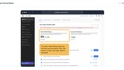
Coalition's Product Demo
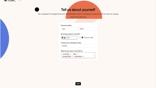
Folk's Onboarding Walkthrough


