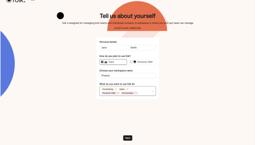
Folk's Onboarding Walkthrough
Ever signed up for a new tool and immediately questioned all your life choices? Nothing kills enthusiasm...
Existing customer? Sign in
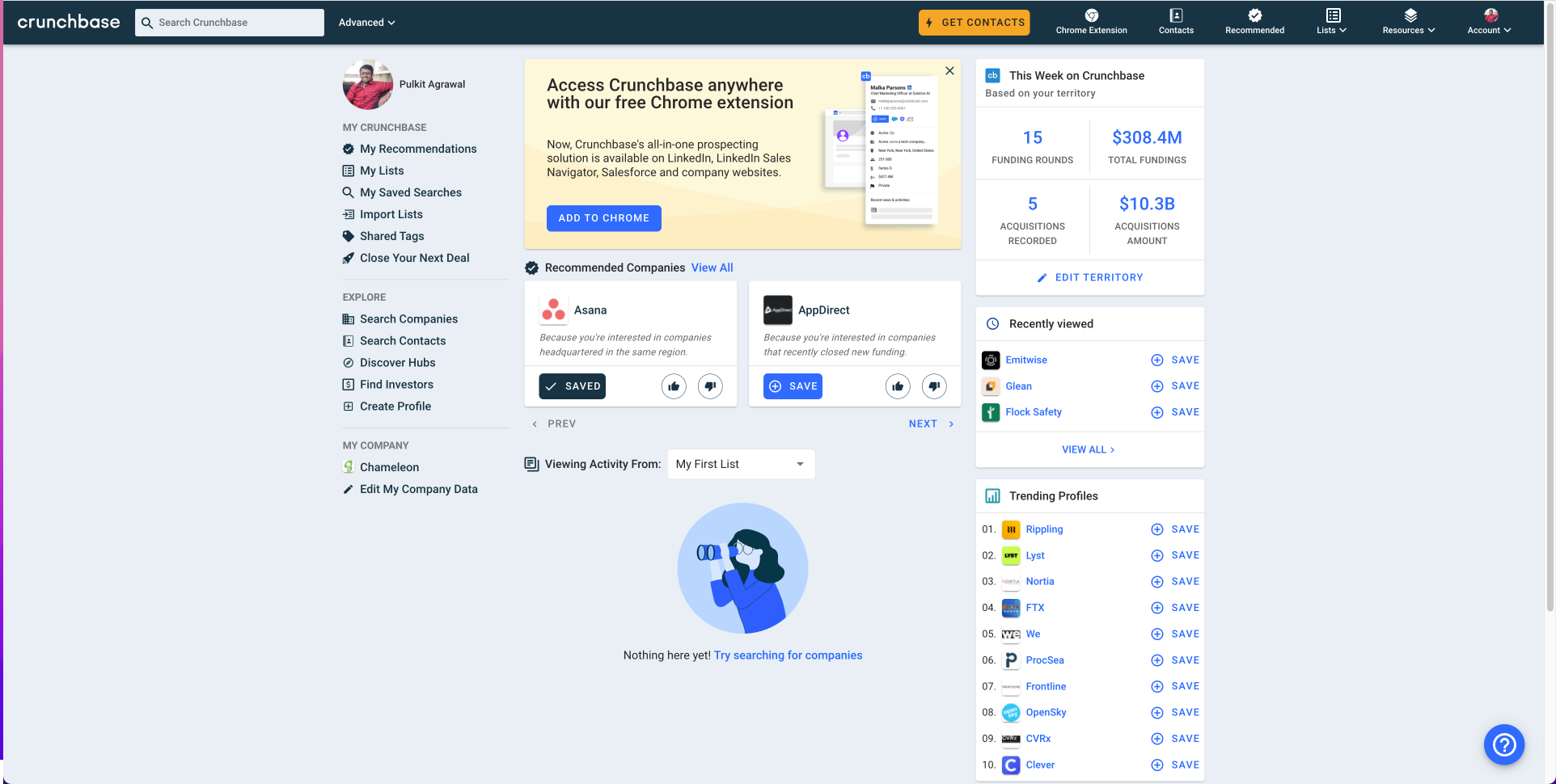
The message is clear: now you can use Crunchbase directly on LinkedIn, Salesforce, and more—without hopping between tabs. The design is neat and unobtrusive, sitting right at the top with a big, bold CTA that’s hard to miss. It’s the kind of feature promo that’s direct, helpful, and keeps you moving without breaking your workflow. One click, and you’re set up!

More inspiration examples


Get started free in our sandbox or book a personalized call with our product experts