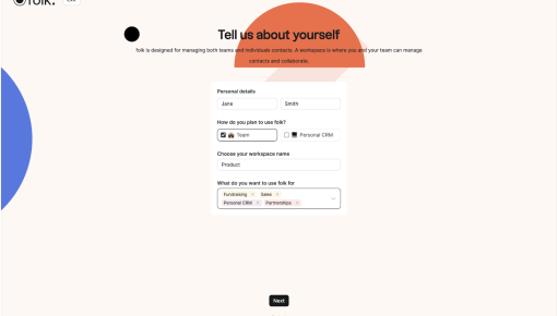
Folk's Onboarding Walkthrough
Ever signed up for a new tool and immediately questioned all your life choices? Nothing kills enthusiasm...
Existing customer? Sign in
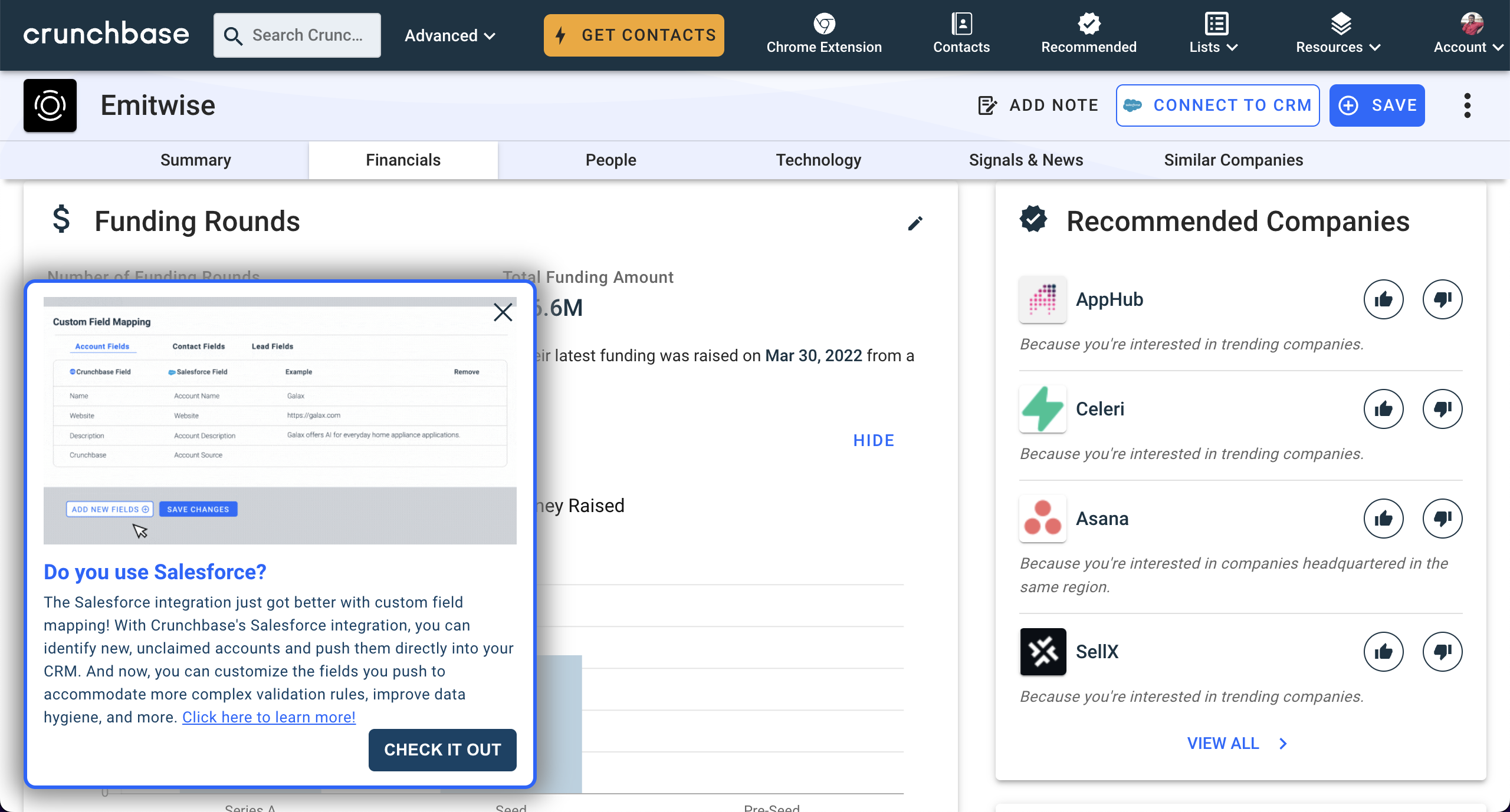
This snappy modal does a great job of showing you exactly what’s new and why you should care. The clean design highlights the key updates without drowning you in details, and the “Check it out” button practically begs to be clicked. It’s the kind of quick, informative nudge that makes you feel like you’re staying ahead of the curve without the heavy lift. Plus, the clear examples in the preview make it obvious how this feature can be a game-changer for your CRM flow.

More inspiration examples


Get started free in our sandbox or book a personalized call with our product experts