


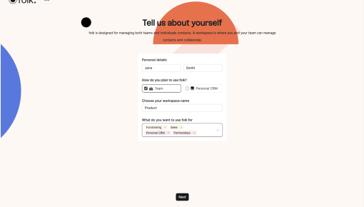
Folk's Onboarding Walkthrough
Ever signed up for a new tool and immediately questioned all your life choices? Nothing kills enthusiasm...
Existing customer? Sign in
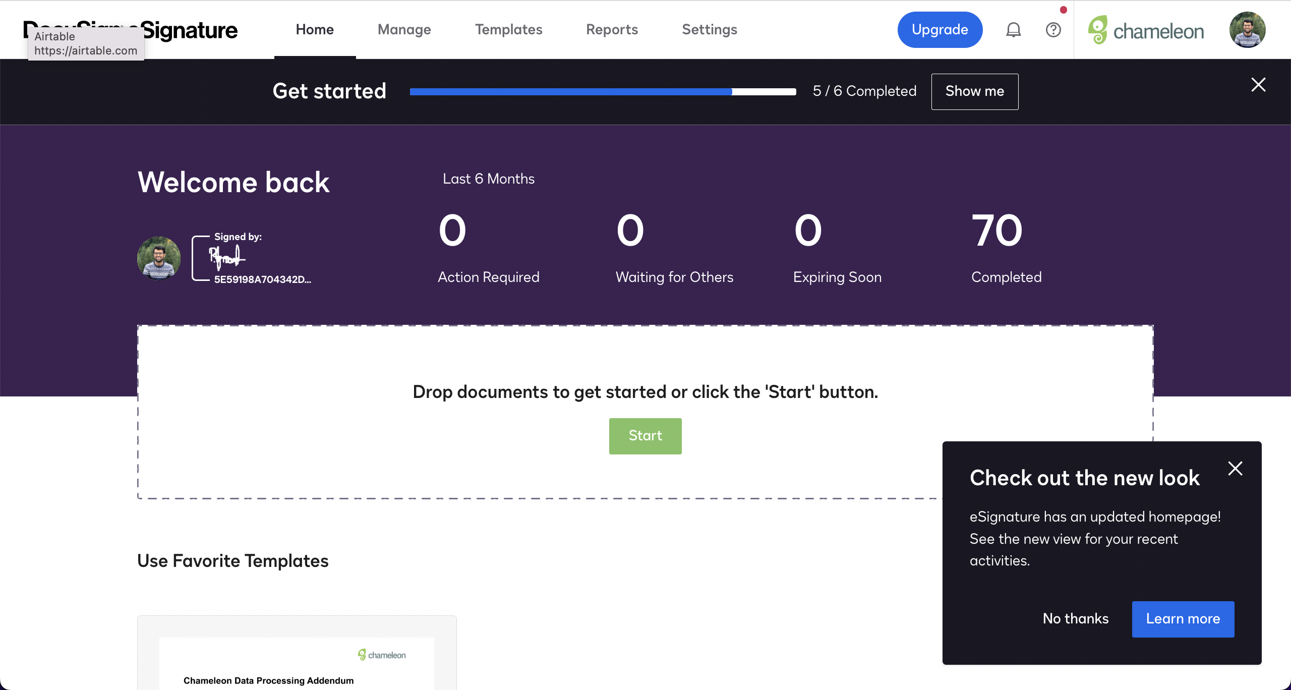
DocuSign’s updated homepage gets a shout-out with this sleek, no-nonsense modal. The message is short and sweet—letting you know there’s a new view for your recent activities. Whether you’re curious or just want to keep things moving, you’ve got options: “Learn more” if you’re in the mood to explore, or “No thanks” if you’re not ready for change just yet. It’s quick, it’s clear, and it respects your time—exactly how a redesign announcement should be.
More inspiration examples


Get started free in our sandbox or book a personalized call with our product experts