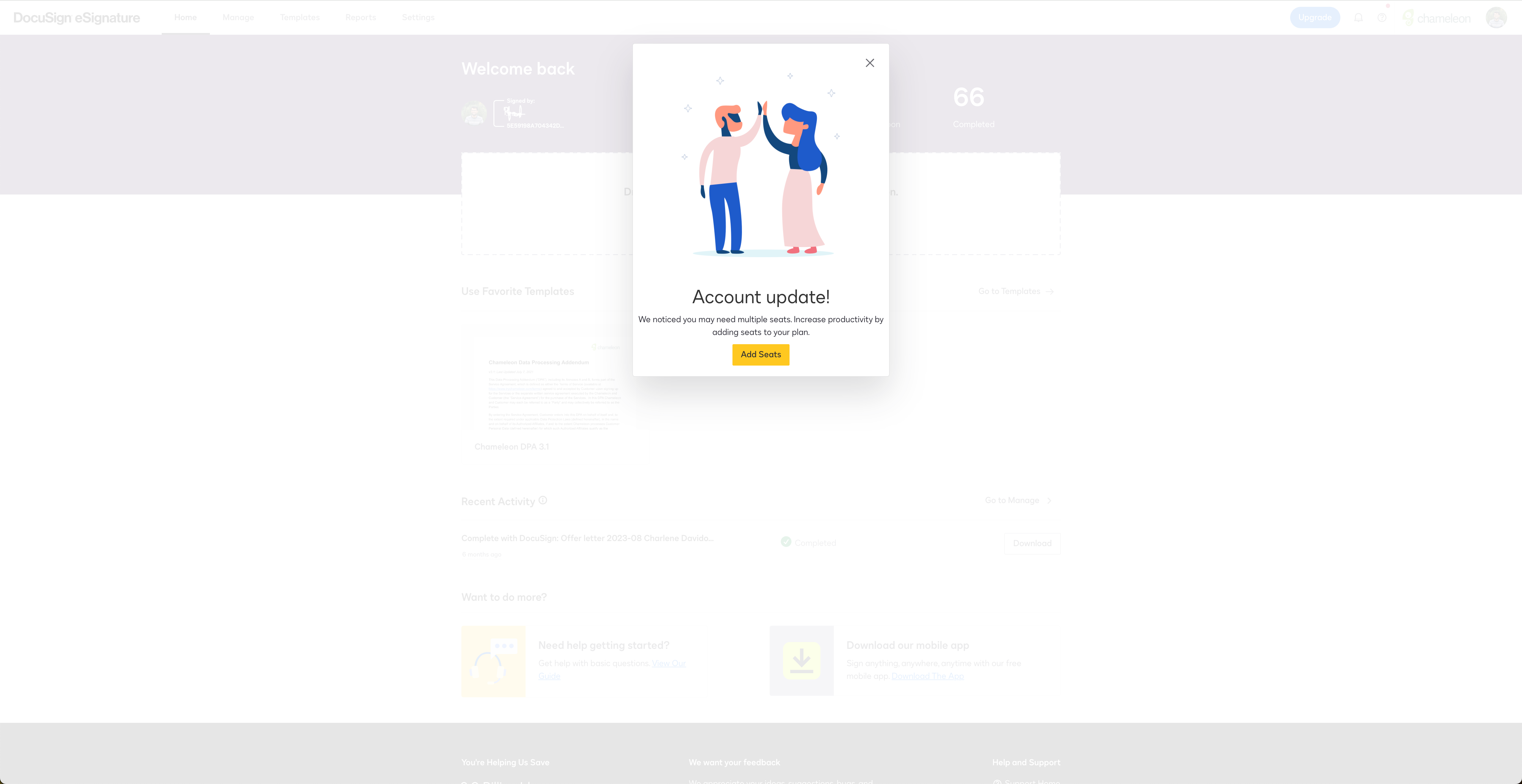
DocuSign's Upsell Modal
This upsell is smartly timed and targeted. It appears when users are already engaged, suggesting more seats to boost productivity. The messaging is value-focused—tying the upsell to user growth and success—while the cheerful design keeps it light. The single, clear CTA (“Add Seats”) makes it easy to take action, reducing friction. It’s a great example of how to drive expansion in a PLG motion without feeling pushy.
More inspiration examples

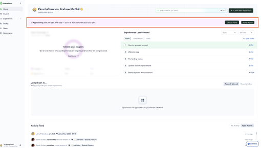
Chameleon's Usage Limit Warning Banner
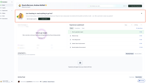
Chameleon's New User Activation Banner
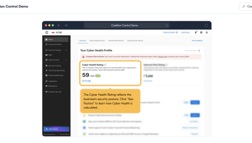
Coalition's Product Demo
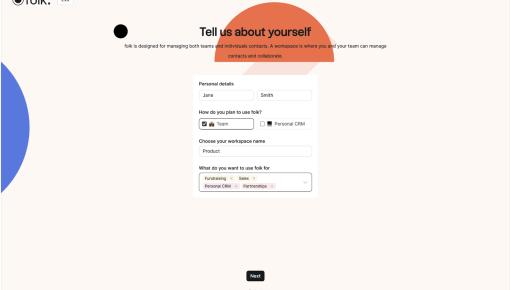
Folk's Onboarding Walkthrough


