Banners
Up top, down low, or in-line, banners are high-value but flexible, announcements

What are in-app banners?
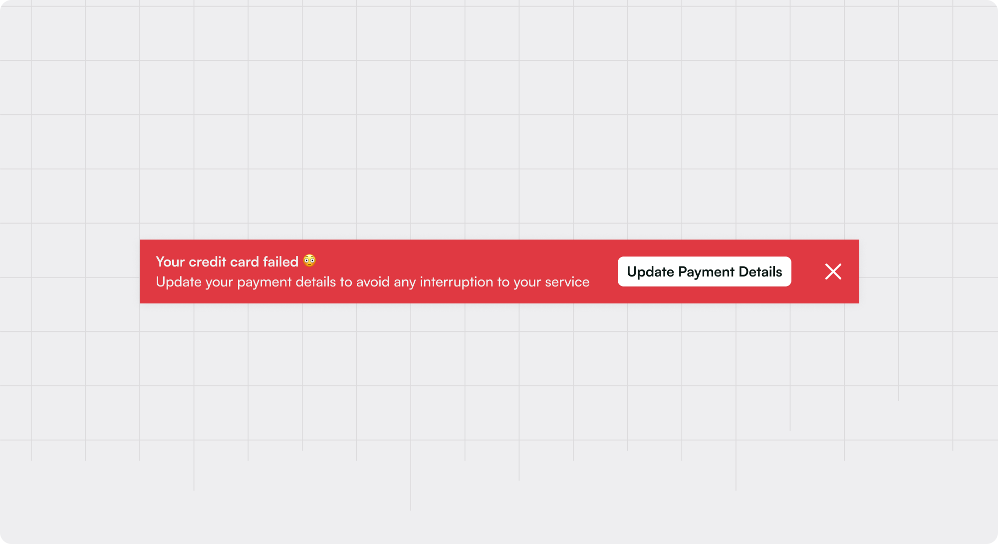
Banners are UI patterns designed to be placed at the top of a user’s screen, commonly full-width, and often above any other content on the page. In some cases, banner messages can be embedded within the page content or may appear at the bottom. Almost always, banners will contain text and a CTA (to take action or dismiss), but in other cases, they may also contain an icon, additional CTAs, a dismiss cross, and/or a background image.
In-line banners provide a highly visible yet unobtrusive way to deliver announcements, convey time-sensitive information, share critical updates, and prompt users to act. Their real-estate-friendly nature ensures they do not overly distract or detract from the user's primary tasks.
Common use cases for banners
Announcements: Ideal for promoting new features, events, or notifications.
Status updates: Informing users about critical information related to their ability to use the app, e.g. upcoming maintenance or known product issues.
Account alerts: Providing notifications broadly applicable to the user (regardless of the page or specific view) about key dates (e.g. trial expiry or upcoming renewal) or actions required (e.g. permissions or installation)
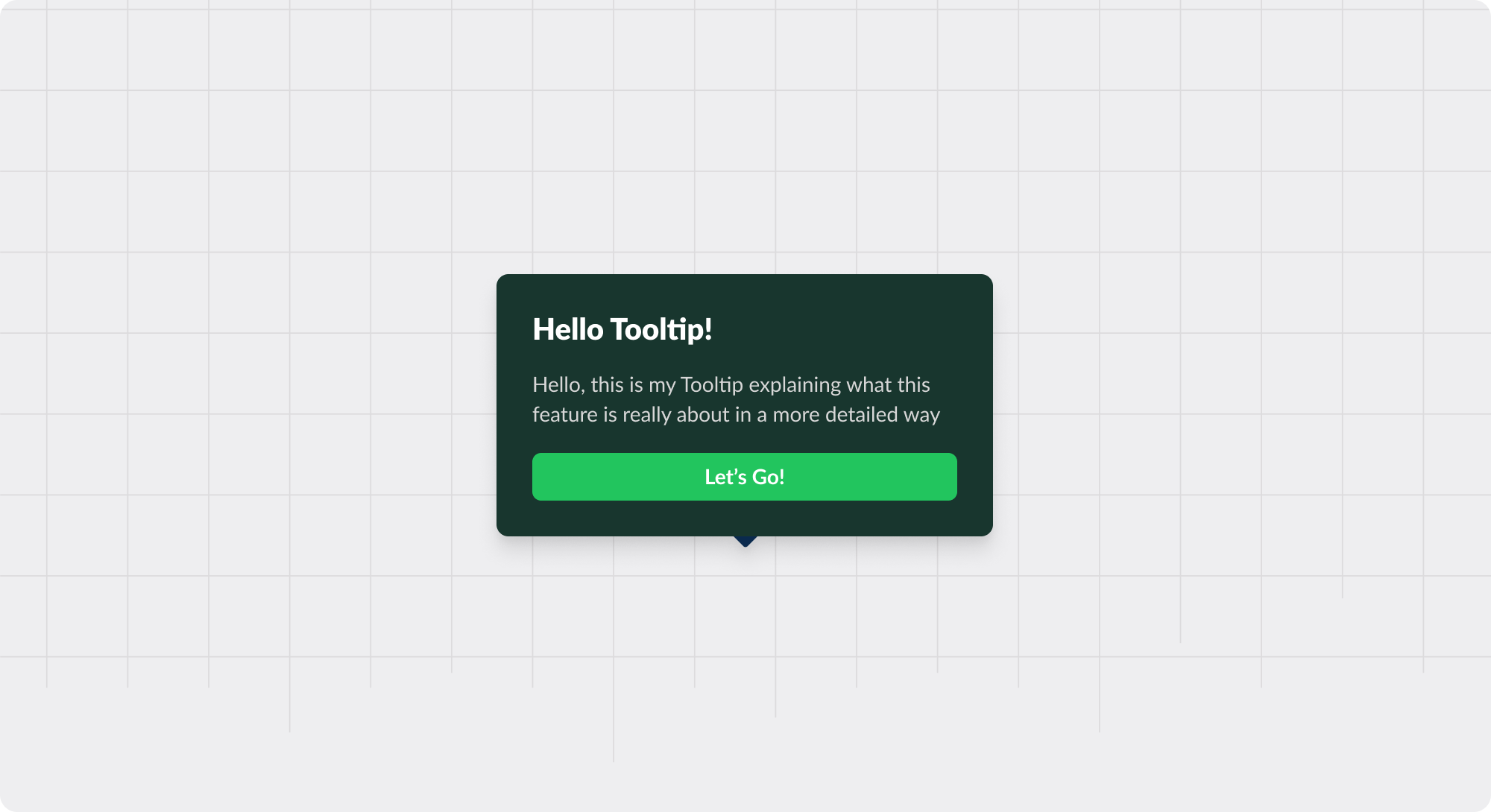
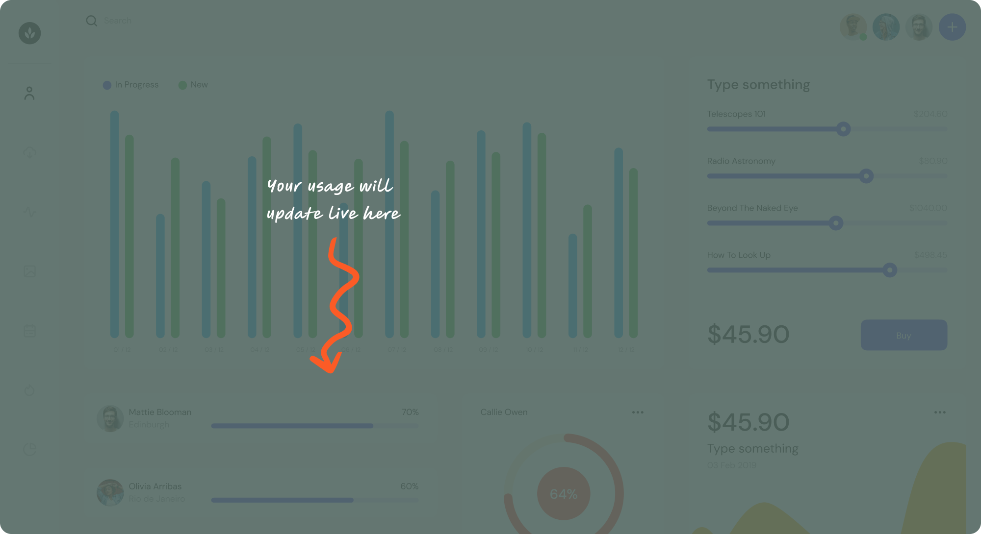
Feature adoption: Embedded Banners can be a great launching point for users to start a walkthrough or learn more about the functionality or features of a specific page
Best practices for banners
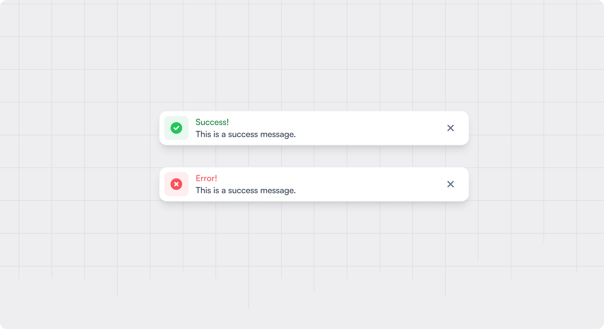
- 1 Have a clear and consistent visual theme for banners, e.g. red for critical notifications, yellow for warning states, etc.
- 2 Where possible, avoid covering the existing UI or page to reduce the need for a user to make a decision about engaging with the banner at that moment.
- 3 If making a banner dismissible, decide whether a user should be able to access that information again elsewhere or when the banner will re-appear.
- 4 Avoid layering multiple banners vertically; you can stack them on top of each other (see Carousel), but multiple banners displaying at once reduces the importance of each and leads to users ignoring all.
Examples of great banners


Wistia Upsell Banner

Segment Notification Banner
Recommended reading 🤓

Why Your Cookie Banner Isn’t Because of GDPR & How to Ensure Data Privacy Compliance

How to Avoid Overwhelming Users with Too Many In-App Messages

In-App Marketing 101: Best Practices, Top Tools, and Examples


