


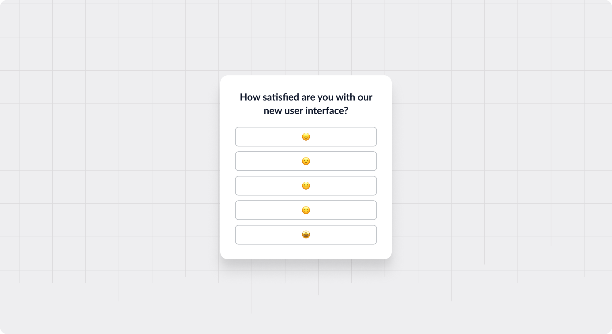
Hotjar Lightbox Modal
Lightbox explaining how to install Hotjar and encouraging users to do so
Existing customer? Sign in
Shine a light on specific parts of your app to focus users' attention on one area.
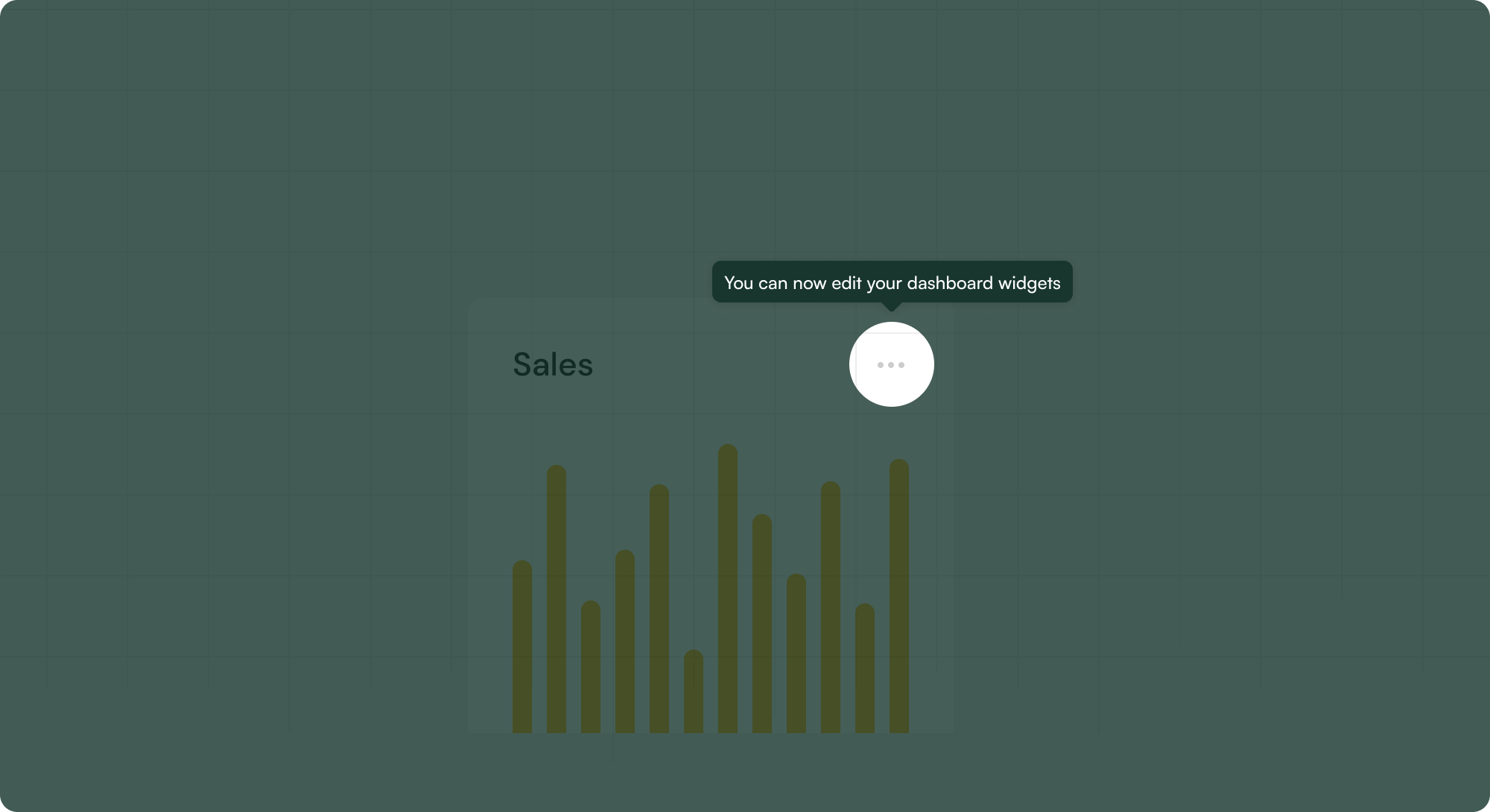
A lightbox or "highlight" in-app pattern focuses user attention on a specific element or content piece by dimming the rest of the interface. It's commonly used when viewing “full-screen” or expanded media content (e.g., videos), especially within Modals.
Still, it can also be used in product tours to highlight core navigational items or CTAs. This can help focus a user and remove distractions, but ideally only in scenarios where the user has opted into the focused object.
Viewing Media: Providing a focused view and distraction-free viewing experience for videos, GIFs, images, prototypes, interactive demos, etc.
Announcing New Features or Changes: Drawing attention to specific UI components, especially when the change is not obvious
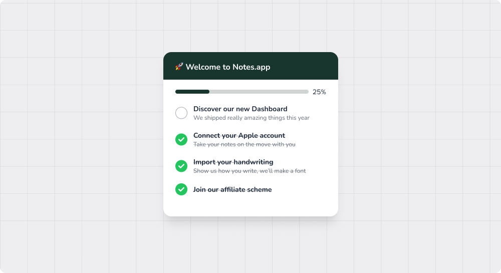
Onboarding Walkthroughs: Guiding new users through the app’s features by highlighting sections sequentially.
Requiring Inputs: Encouraging or forcing users to complete a form or enter data by removing the ability to engage with other UI parts.


Get started free in our sandbox or book a personalized call with our product experts