Create a system that drives deeper engagement as users progress
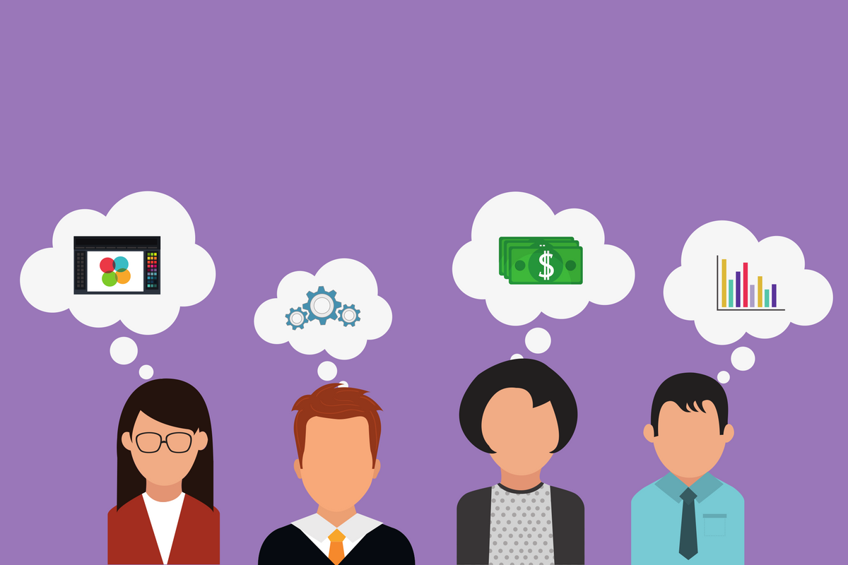
Making a customer’s journey inside your product feel like it was crafted just for them is the key to creating an addicting user experience. It’s how you’ll turn a first time visitor into a loyal customer.
Every time a customer interacts with your product, they should be impressed with how personalized it feels; it’s what consumers have come to expect:
"63% of consumers expect brands to use their purchase history to provide them with personalized experiences." - think with Google
Personalization can, and should, come in many forms. Whether you give your user recommendations based on their past behaviors, or coordinate their feeds based on their social activity, personalization will ultimately help them find what they’re looking for faster and keep them coming back for more.
Conversation is the Ultimate Personalization Tool
The popularity of conversational applications is on the rise because they help companies efficiently personalize a user’s experience with their product. They’re the solution that enables brands to craft specific and contextual responses to user’s actions and preferences.
A product's interface and messaging should be relevant and contextual to a user to help them quickly discover your product's value. One of the easiest places to start is in your messaging, which can easily be done by personalizing copy to make the interactions more engaging.
When it comes to talking to your users, it's best to personalize the product experience based on where they are in the journey.
The three main stages of a user's journey to focus on are:
-
Activation: when a user experiences your product for the first time.
-
Retention: the first couple times a user engages with the product and finds value.
-
Re-engagement: when a user has started to drift away and engages with the product less frequently.
Each of these is equally important in establishing and increasing the lifetime value of a customer. Getting a customer who just signed up to become a power user is critical for creating a loyal customer base.
For each stage, we’ll identify why you should be personalizing your interactions, provide communication tool suggestions, and share an example of a company that has succeeded in creating an engaging, user-focused, communications strategy.
Activation Stage
User onboarding is your first shot at a killer first impression, which is something that you can never win back. Seriously, 24% of users abandon an app after one use.
The messages that you send users when they are installing and navigating your app for the first time set the tone, so set it right!
When you are onboarding users, it's important to quickly drive them to your product's Aha moment, to understand the value your product provides. However, not all users are the same and may not use your product in the same way.
If you have different user types and personas using your product, you'll want to consider how your product's value proposition or Aha moments may differ for these users.
For example, admin and non-admin users will most likely care about different product functionality. Take Asana as an example, a productivity tool, where the admin user might be more focused on setting up various teams, privacy settings, billing, and inviting team members, while non-admin users, would want to create project tasks, check tasks assigned to them, and add comments.
If your product has clearly defined features and paths for different user types, then the user onboarding product tour should reflect this. The only way you’ll be able to know which variation a user should see is if you collect this key information when they first sign up.
What channels could you use to deliver your perfect user onboarding message?
- User onboarding emails - highlight most valuable features and share tips and best practices
- Product tours - create contextual guidance based on user's actions or persona
💡 Tip: make your tour optional. If your user is in a rush when they onboard, allow them to save the grand tour for another time when they want to explore what you have to offer.
Example: Cineplex Mobile
Cineplex gives new users a quick tour of the core functionalities of the app to get them set up for their first session.
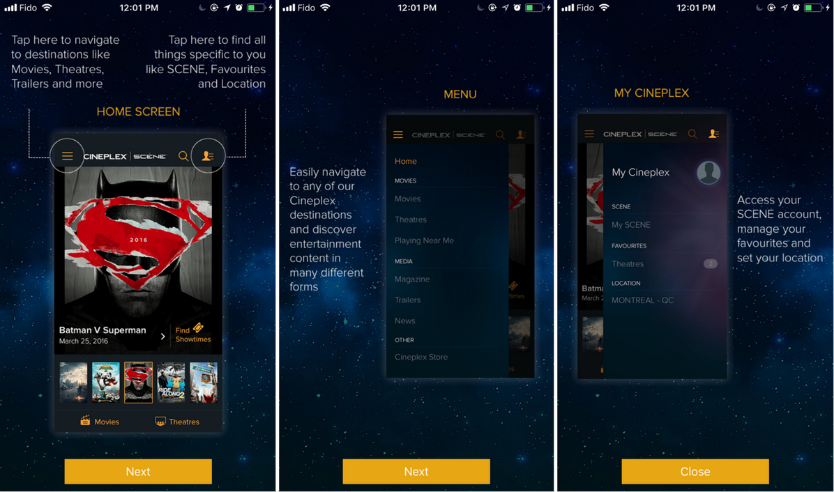
Cineplex’s app goals are:
-
Engage users with content that will make them want to go see a movie
-
Easily find movie times and listings at Cineplex theatres
-
Encourage users to actively use the scene rewards program
By showing off features in the app tour that would help users find such information, Cineplex makes its users capable of finding value in its digital services.
Retention Stage
Once a user has successfully achieved your product’s “Aha!” moment for the first time, whether that means they made a purchase, subscribed to a feed or posted a photo - you have to ensure they build the habits that keep them coming back for more value.
Personalization at this stage lets your users know that you are paying attention to their actions in your product. Timing here is important because it will help you catch and convert them when they are (hopefully!) most excited about using your platform.
What Channels could you use to communicate this message?
- Message inbox - If you have a message inbox for your users, send suggestions, tips and confirmation messages relevant to their clicks, transactions and journeys.
- Push notifications - Send a congratulatory message when your user has made their first transaction or encourage them to move on to the next step if they’ve left part way through.
- Chat Bot - A popular tool used on websites and in apps to chat with users, chatbots are a great way to personally help your visitors find the content and answers that they are looking for.
Example: Ritual
Once a user places an order, the food ordering app sends them a push notification to remind them that they will receive bonus rewards points if they visit the same restaurant again.
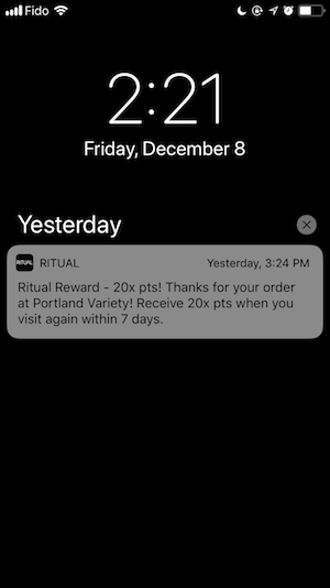
The more frequently the user visits that restaurant, the more points they earn! This type of personalization encourages the user to make a ritual out of this visit, and will make them more likely to go back next time they’re looking to grab a bite.
Re-Engagement Stage
If a user has stopped engaging with your product, that is arguably the most important time to be sending a personalized messages to win them back. A shocking 75% of Users Uninstall An App Within 90 Days of download, and you need to make sure you periodically, and personally, check in with users before they churn.
If the user hasn’t been active for awhile, you need to send them a message somewhere outside of it that will help bring them back in.
The best way to personalize this type of engagement is by letting them know that you miss them and showing them some content or a new feature that may be of interest, which you should determine based on settings, past activity, or even popularity amongst their friends. Do whatever needs to be done to get them excited and sorry that they’ve been neglecting you.
Best channels for re-engaging your users:
- Email - the key to a successful re-engagement email is a catchy subject line they can’t resist!
- Push notifications - use past behavior to tailor the message and remind users why they loved your app in the first place.
💡 Tip: If you’re really looking to make a splash and standout, try sending a rich push notification - one that includes an image, video, GIF or audio file. Few apps send rich pushes, so they’re really effective at capturing users’ attention and standing out from the noise of the hundreds of other monthly pushes they receive.
Example: Pinkberry
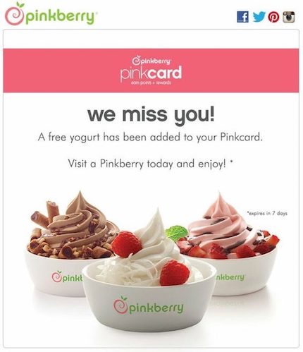
To win dormant loyalty card customers back, Pinkberry sends a coupon for a free Frozen Yogurt. Appeal to them using the items or content that they used to love before they started to go radio silent on you.
Tool Box
For each of the personalization methods mentioned throughout the article, there is a tool that can help you deliver your messages. There are many out there, but these are some of our favorites.
Emails: Mailchimp, Customer.io, HubSpot
Product Tours: Chameleon
Chatbots: Drift, Intercom, Engati
Push Notifications: Taplytics
Check out our Taplytics Labs experiment for insights on how the top companies are using push notifications - what time are they sending them? How long are the pushes? Did they include images?
Conclusion
If you care about your users, so put in the effort to show them! Like a nice handwritten card, a personalized message is a pleasant surprise that will help you develop relationships with your valued customers. Time to get up close and personal!
We recommend you this article about the Google UX notifications last update, with a lot of great information.
About the Author:
Aaron is the CEO and Co-Founder of Taplytics (YC W14). Taplytics is a Y-Combinator backed platform that helps brands build delightful experiences that span seamlessly across web, TV and Mobile apps. Taplytics helps brands engage with users, personalize their journeys across platforms, and test which variation of the experience customers love the most.
