Without a strategic and effective user onboarding process, here's what typically happens:
You invest heavily in user acquisition
Successfully acquire new customers
Lose those customers shortly after
Repeat the cycle
Ouch—that's a waste of resources! Yet, it's a common mistake to treat building a great product and encouraging user adoption as separate endeavors (spoiler alert: they're not).
This is where user onboarding plays a crucial role. It serves as the bridge your new users need to cross to transform into highly engaged customers.
So, how can you ensure your user onboarding is effective? By following the 12 best practices, we're about to reveal.
But first, let's align on the basics.
What is user onboarding? A definition to beat them all
User onboarding is the system of actively guiding users to find new value in your product.
It’s “a system”: onboarding can show up in many ways—product tours, help docs, email sequences, checklists, in-app tutorials, tooltips, training courses, or walkthrough videos. Most products use a mix of these tools to create a complete onboarding experience.
It’s about “actively guiding toward new value”: onboarding should make users feel like they’re winning at every step, nudging them forward until your product becomes essential to their day. (Yes, the goal is for them to wonder how they ever lived without it!)
This journey from sign-up to full adoption looks like this:

Note: While we show it as a neat, step-by-step path, onboarding rarely ever moves in a linear, straight line. Users tend to jump ahead, loop back to earlier steps, or even unfortunately drop off. The key is ensuring enough checkpoints to re-engage them when needed.
💡 Want practical tips on setting these up? Our Shift Left Guide shows you how to build proactive checkpoints, use timely nudges, and create a smoother onboarding experience that guides users naturally from start to finish
And speaking of keeping users on track, let’s explore the 12 best user onboarding practices that boost engagement and retention.
11 User onboarding best practices to keep users engaged
Churn is rightfully known as the SaaS killer! 😨 Luckily, it's what we're here to help with. Here are 12 user onboarding best practices that will make your customers want to stay forever.
1. Do your research and understand user needs
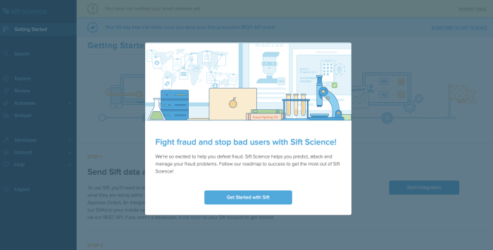
To highlight and guide users to what they need, you need first to know what they need. In the example above, Sift Science has identified its ideal user's two biggest motivations: fighting fraud and stopping bad users. This onboarding modal reassures users they're in the right place and reminds them of the product's value.
Suppose you don't know the big “why” for your potential and existing customers, then you can't offer meaningful onboarding to them. Depending on your goal, you can choose different research methods to understand users—from interviews and focus groups to usability testing and in-product surveys.
To really grasp what users gain from your product and craft a user onboarding experience that resonates, here’s what you need to uncover:
Who your users are: What's their role and level? (Think of a marketing manager obsessed with campaign success, a product manager focused on roadmap delivery, or a sales executive on a mission to crush quarterly targets)
What they want: What gets them out of bed in the morning? (Marketing managers dream of lead volume and conversion rates, product managers crave faster feature releases, and sales teams are all about closing deals by quarter's end)
What pain points your product solves: What's driving them up the wall? (A marketing team drowning in fragmented data, product managers swamped with feature requests, or a customer support team battling manual workflows)
What tasks they need to complete: How can they quickly hit the jackpot? (Setting up a campaign in a jiffy, visualizing product feedback without the spreadsheet agony, or automating those pesky routine customer inquiries)
What would stop them from using your product: What makes them run for the hills? (A clunky onboarding experience, lack of integrations with their current tools, or a pricing structure that gives them a headache)
Why users churn: What's tripping them up? (A perplexing UI blocking their first "aha" moment, sluggish customer support, or features that don’t quite live up to the hype)
Once you've got a grasp on these critical (but easy to overlook) details, you can begin to treat the user onboarding process like a jigsaw puzzle rather than a guessing game.
2. Remove barriers to the "aha!" moment

For a platform that thrives on user content, an empty account equals an unsuccessful user. As we see in the example above, Wistia lowers the barrier to entry by giving users three easy options to get started.
“Aha! I totally get it. I need this.” This's what you want your users to think as quickly as possible. The "aha!" moment is when users internalize the value of your product and become willing to spend money on it.
Tips for removing barriers and getting users to real value more quickly:
Don’t require account creation before users can try the product: forcing users to create an account before exploring the product can drive them away. Consider offering a guest mode or free preview so users can see the value without committing upfront.
Ask only for the most relevant information: long sign-up forms asking for job titles or company size can frustrate users. Stick to essentials like email and name—anything else can come later.
Tailor onboarding flows to different user personas: users have different needs, and a one-size-fits-all onboarding doesn’t cut it—segment users based on their role or goals, offering personalized onboarding paths that feel relevant to them.
Use your marketing site to trigger the “aha!” moment (if there’s no free trial): if a free trial isn’t an option, showcase your product’s value on your website. Testimonials, GIFs of key features in action, and case studies can help users grasp the product’s potential.
Identify friction points in the sign-up process: long sign-up processes, slow email verifications, or missing social login options can make users abandon your product before they even start. Test your sign-up flow for these common pain points.
Smooth the transition to the first in-app action: confusing interfaces, hidden features, or lengthy setup processes can prevent users from experiencing value quickly. Use guided tours, progress indicators, and quick-start tasks to help them get to their first success fast.
In-app feedback works best when tied to the user’s current experience. According to our benchmark report, multi-button surveys see an impressive 40.2% average completion rate, while 59.7% of users leave additional comments when asked.
The goal is to identify and eliminate friction at every step—whether during sign-up or in-app actions.
Each slight improvement brings users closer to the "aha!" moment, where they see real value and become engaged, paying customers. Find the friction and remove it!
🦎Tip: Want to see onboarding done right? Check out our curated onboarding examples and discover what makes users stick around!
3. Keep your onboarding flows on-brand

On-brand onboarding is essential because it builds familiarity and trust. When users see a consistent brand experience, it reassures them they’re in the right place and reduces friction—keeping them engaged from the start.
Playbuzz nails this with bold colors, playful copy, and pop culture references in its onboarding emails. This kind of branding helps users connect emotionally with the product, making exploring and engaging easier.
As Richard Branson puts it, “Branding demands commitment; commitment to continual re-invention; striking chords with people to stir their emotions; and commitment to imagination.” Without this emotional connection, users can lose interest and churn.
Your onboarding flows—product tours, walkthroughs, tooltips, or help menus—must blend seamlessly into your product’s look and feel. At the same time, they should stand out just enough to catch the user’s eye and guide them toward the correct information.
4. Design a multichannel onboarding experience

Google knows that onboarding isn’t a one-and-done deal. It connects with users wherever they are—email inboxes, apps, YouTube, forums—so they’re never left hanging. This multichannel approach pulls users deeper into the product ecosystem, ensuring they get value right from the start.
How Google does it:
Targeted onboarding through Google Analytics, Ads, and Workspace
Educational videos and courses through YouTube and Digital Garage
24/7 support through forums and Help Centers
Cross-platform onboarding via mobile and desktop sync
Google’s multichannel strategy ensures that users don’t hit dead ends. Whether it's an email, a tooltip, or a video, every touchpoint gives them just enough help to move forward. When users feel supported and empowered, they’re more likely to stick around. This layered approach also stops churn in its tracks by making it nearly impossible for users to get stuck.
🎥 Webinar: How to launch engaging in-product experiences
Learn how to craft optimal in-product experiences throughout the user journey to increase activation, adoption, and retention.
5. Tailor the experience to each users’ journey

HubSpot stands out with its objective-based onboarding strategy, which is designed to align each user's journey with their unique business goals. The platform uses personalized questionnaires.
These questionnaires collect insights about the user’s role, industry, and priorities. Based on the responses, HubSpot tailors the onboarding path, ensuring users only see the tools and features most relevant to their needs.
For example, if a marketing team is onboarding, HubSpot will focus on features like email campaigns, CRM customization, and social media publishing. Meanwhile, a sales-focused user may get guidance on lead scoring and setting up automated follow-up sequences. This segmentation reduces friction and helps users achieve early wins by engaging with features that deliver immediate value.
HubSpot’s onboarding also includes integrated training through the HubSpot Academy, offering self-paced lessons and certifications to deepen product understanding and build user confidence.
6. Measure success and treat user onboarding like an ongoing project
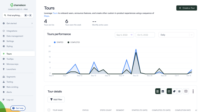
Measuring your onboarding success is essential to understand what clicks with users and where they get stuck. Chameleon makes this process easier by tracking how users interact with product tours, walkthroughs, and surveys. This gives product teams the data they need to improve each step of the user journey.
Spot engagement drop-offs early: analytics reveal where users abandon tours or walkthroughs. With this insight, teams can adjust those steps to keep users moving forward, ensuring the onboarding experience doesn’t hit a dead end.
Get real-time feedback with micro-surveys: capturing user feedback. At the same time, they interact with specific features, allowing teams to understand what’s working and what’s not without relying on post-session surveys. The key is collecting feedback at the right moment when it’s most relevant to the user.
Tailor onboarding flows to user behavior: grouping users by their actions or roles makes it easier to deliver relevant onboarding content. First-time users might need basic guidance, while experienced users benefit more from feature-focused tips. Personalization helps reduce friction and keeps users engaged.
Refine through A/B testing: testing different versions of walkthroughs or tooltips helps teams understand what resonates best. This iterative process ensures each version improves over time, enhancing user engagement step by step.
Analytics make onboarding smarter by turning every interaction into a learning opportunity. Instead of guessing what users need, teams use real-time data to fine-tune the onboarding process, ensuring users experience value quickly and stay engaged.
7. Don’t overwhelm new users

When users interact with a product for the first time, presenting too much information all at once can lead to cognitive load—the mental effort required to process and retain information. Users get frustrated, make mistakes, or leave altogether if this load becomes too heavy.
Cognitive load theory (CLT) highlights that chunking information—breaking it into smaller, digestible pieces—makes it easier for users to process and act on what they learn. Products that manage cognitive load well reveal relevant information progressively, providing only what’s needed at each step and adding more details over time.
Zendesk does a good job of giving users just the perfect dash of info to get started. They then gradually add tooltips and tours to keep onboarding users once they’re more settled.
This gives users the freedom to explore on their own using basic knowledge. Zendesk then triggers guidance based on specific in-product actions—so users learn about the product as and when they need to, not all at once.
8. Keep users on track with task lists

Task lists help users stay focused and organized, one step at a time. Evernote does this brilliantly by embedding tasks right into notes. Instead of juggling between apps, users can keep their action items, ideas, and meeting notes in one place. Whether a project checklist or a quick reminder to buy milk, Evernote keeps things simple and manageable.
Tasks inside Evernote come with reminders, flags, and deadlines to keep everything on track. If something needs repeating, you can even set recurring tasks. Changes sync automatically, so everything stays updated across devices whether you add a task in the desktop app or on your phone.
Using task-based onboarding, Evernote helps users focus on what matters most from day one. It’s about giving users just enough to stay productive without piling on complexity. The little wins along the way—like checking off that first task—build momentum, keeping users motivated to dive deeper into the product.
9. Lead users to easy wins early on

Canva knows that onboarding isn’t about dumping features on users—it’s about getting them hooked with quick, easy wins that build momentum. Right after signing up, Canva gets users to their first success quickly. Whether it’s creating a simple Instagram post or tweaking a business card template, Canva’s onboarding helps users feel productive right away.
Canva asks new users what they’re here to do—design for social media, marketing, or personal projects—and serves up templates and tools that fit those needs. This makes the whole experience feel relevant and approachable, eliminating the “Where do I even start?” feeling many new users have.

The best part? Canva celebrates milestones along the way. After completing their first few designs, users get friendly notifications or prompts. These little moments of recognition boost confidence and make users want to keep going.
The magic of Canva’s onboarding is that it feels effortless. Users don’t even realize they’re being onboarded—they’re just having fun and getting things done. And before they know it, users aren’t just dabbling—they’re hooked.
10. Show users their progress

Progress indicators tap into powerful psychological principles to keep users engaged and motivated throughout onboarding. FullStory demonstrates this well by visually breaking the setup into three steps.
Progress bars work because they leverage the Zeigarnik Effect—a psychological phenomenon where incomplete tasks linger in our minds, urging us to complete them. When users see a visible indicator of their progress, like "Step 1 of 3," it sparks the brain’s need to finish what was started. This itch for completion motivates users to continue until all steps are completed.
FullStory’s use of milestones also aligns with the Endowed Progress Effect—where showing even a tiny head start boosts motivation. For example, if a task feels partially completed (like having filled in basic account details), users are more likely to feel that the rest is achievable, giving them the momentum to finish the entire process.
11. Let your users opt out from onboarding

Allowing users to skip or opt out of onboarding is crucial to respecting their autonomy. Not every user needs step-by-step guidance—some prefer to explore independently. This flexibility ensures that onboarding fits individual preferences and reduces friction, creating a smoother experience.
Google implements this well by offering subtle, optional onboarding flows. For example, users can skip walkthroughs and tutorials in some Google products if they feel comfortable. This opt-out strategy allows users to revisit onboarding elements later, engaging with the guidance only when they find it helpful. This approach respects the user’s time and ensures that onboarding never becomes an obstacle.
It ensures that the onboarding flow doesn’t disrupt or annoy users but instead serves as a helpful tool that users can use whenever it feels most valuable to them.
8 User onboarding UX patterns to use
Here are 8 tried-and-tested UX onboarding patterns used by top companies to help users confidently hit the ground running.
1. Welcome messages
Welcome messages give users clear directions on how to begin using your product. They help users put their best foot forward and ensure they’re in the right hands.
YouTube Studio Beta uses a clean, inviting welcome modal to onboard users. It combines a visual of progress with a simple message: “Help us build a better experience.” It encourages users to try out the new features and provide feedback, making them feel involved in the process without getting into the technical details.

Another great example is Quartzy, a lab management platform. The platform goes for a more personal touch. They know their users have different workflows, so their welcome page is all about making things feel tailored. Their welcome modal reads:
“Welcome to your lab!”
That one line reassures users that the product is designed just for them, setting the tone for a more personalized experience.

2. Interactive walkthroughs
Instead of leaving users in the lurch to figure things out interactive walkthroughs help them navigate key features step by step. It’s hands-on learning—perfect for keeping users engaged and helping them feel confident.
Take a closer look at our interactive walkthrough below 👇
3. Checklists
Checklists help users tackle complex tasks by breaking them into simple, actionable steps. When users know exactly what to do next, they’re more likely to stay engaged and complete the process without frustration.
Pipefy makes great use of this with an onboarding checklist that loads from a small, nonintrusive launcher in the corner. Each step is clear and easy to follow, and a progress bar shows how close the user is to completion, keeping them motivated.

4. Tooltips
Tooltips offer quick, bite-sized tips to guide users through a product without interrupting their flow. Gusto uses a smart tooltip to encourage users to invite friends and get bonuses. It’s a subtle but effective nudge that helps users discover the referral program and boosts product virality. Simple, clear, and right where it needs to be.

5. Tooltips with hover-based hints
In Airtable’s onboarding, tooltips pop up when users explore different views and features—like “Grid view,” “Timeline,” or “Kanban.” Each tooltip concisely explains what the feature does and how it can be useful, making it easier for new users to get started.
This type of tooltip is called a progressive tooltip. It reveals information only when the user hovers or interacts with a specific element. Instead of overwhelming users with tutorials upfront, Airtable uses these tooltips to introduce features bit by bit, exactly when the user needs them.
It allows users to learn by doing. They strike the right balance between autonomy and support, giving users just enough to guide them without forcing them through unnecessary steps

6. Banners
Whether it’s announcing a new feature, a product update, or a limited-time offer, banners ensure users don’t miss key messages while they’re busy navigating the product.
Canva knows how to do this right. For their latest product launch, they used an in-line banner omnipresent across the platform rather than a one-time modal that could disrupt the user experience. It's a smart, low-key way to say, "Hey, we’ve got something cool for you!" Plus, it has confetti. It’s difficult not to get excited.

7. Surveys
Surveys help you collect feedback directly from users, giving your product teams the insights they need to improve features, fix pain points, and align products with user needs.
But what makes a great survey? According to our 2024 Benchmark Report, not all surveys perform equally. Multi-button surveys (offering a few quick-response options) saw a 27.2% completion rate, outperforming longer survey formats like CSAT and NPS. At the same time, traditional NPS surveys dropped to just 10% completion.
The best surveys keep it short and sweet, gathering insights without slowing users down. Take Figma’s microsurvey for example. It has two questions. First, users rate how easy it is to find files, and then, if they’re feeling generous, they can add specific suggestions.
It’s perfect because it respects users’ time, gets the data you need, and leaves room for deeper insights if they have more to say. It’s feedback without the hassle, and users appreciate that.

8. Resource centers
Resource centers are the hub for all things help-related in a product. They’re designed to keep users moving forward by providing easy access to guides, FAQs, and other support materials without having to leave the app.
Chameleon's Resource Center is always there when you need it—literally. It sits quietly in the bottom-right corner, ready to offer help without getting in the way. It leads users to access guides, FAQs, and other support resources at any moment.
Attract, engage, and retain users with stellar user onboarding
Remember, user onboarding is the glue that holds everything together. Without it, your promise and your offering can quickly fall apart. When you commit to smart, intuitive onboarding, you’re not just showing users how things work—you’re making sure they stick around for the long haul.
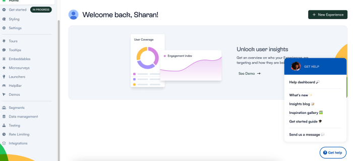
With Chameleon, you can build effective, code-free onboarding flows quickly. You gain access to a full suite of tools starting at just $279 per month that help guide users every step of the way.

Create impactful welcome flows with Chameleon
Get started free and build a welcome page that inspires users to take their next steps


