Dovetail's Onboarding Modal
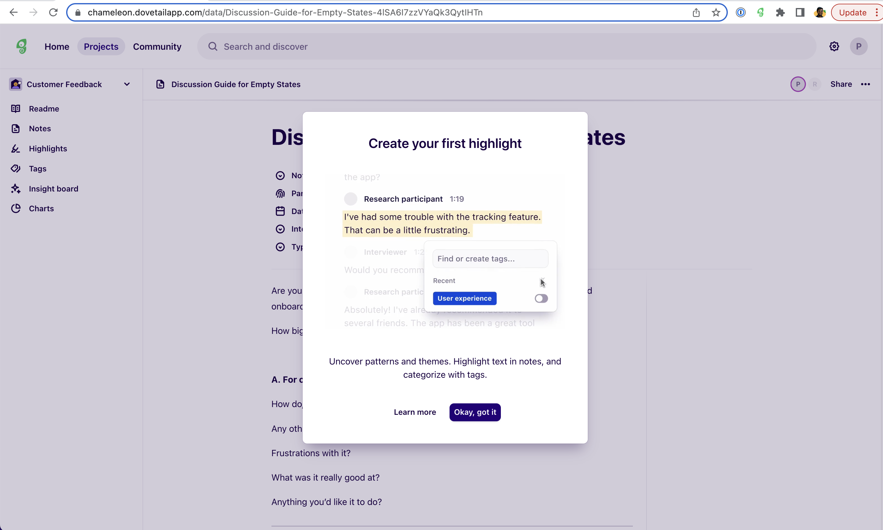
This onboarding modal is a great example of in-context guidance. It pops up just when you’re diving into your notes, showing you how to create your first highlight and tag insights like a champ. The messaging is super clear: highlight, tag, done. The clean design and straightforward CTA (“Okay, got it”) make it easy to follow along without getting lost. It’s the perfect blend of quick tips and practical steps, helping you unlock value right when you need it—no fluff, just helpful stuff.
More inspiration examples

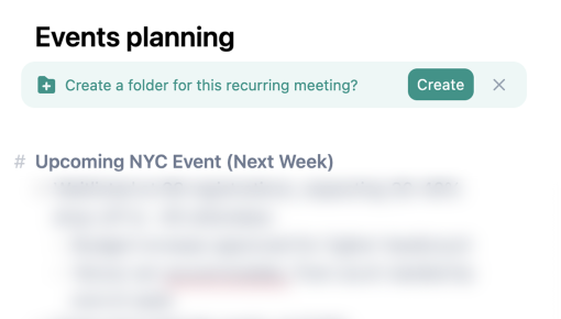
Granola's Meeting Folder Embedded Banner
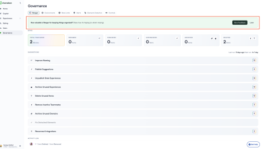
Chameleon's Feature Feedback Embedded Banner
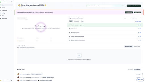
Chameleon's Usage Limit Warning Banner
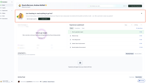
Chameleon's New User Activation Banner
