


10 Bad UX examples: What to avoid and how to remedy them
Bad UX design is enough to send your users packing. Learn from these bad UX examples to understand what not to do when designing your product.
Read blog post


Existing customer? Sign in
Concise overlay helpers that explain functionalities or help users get oriented
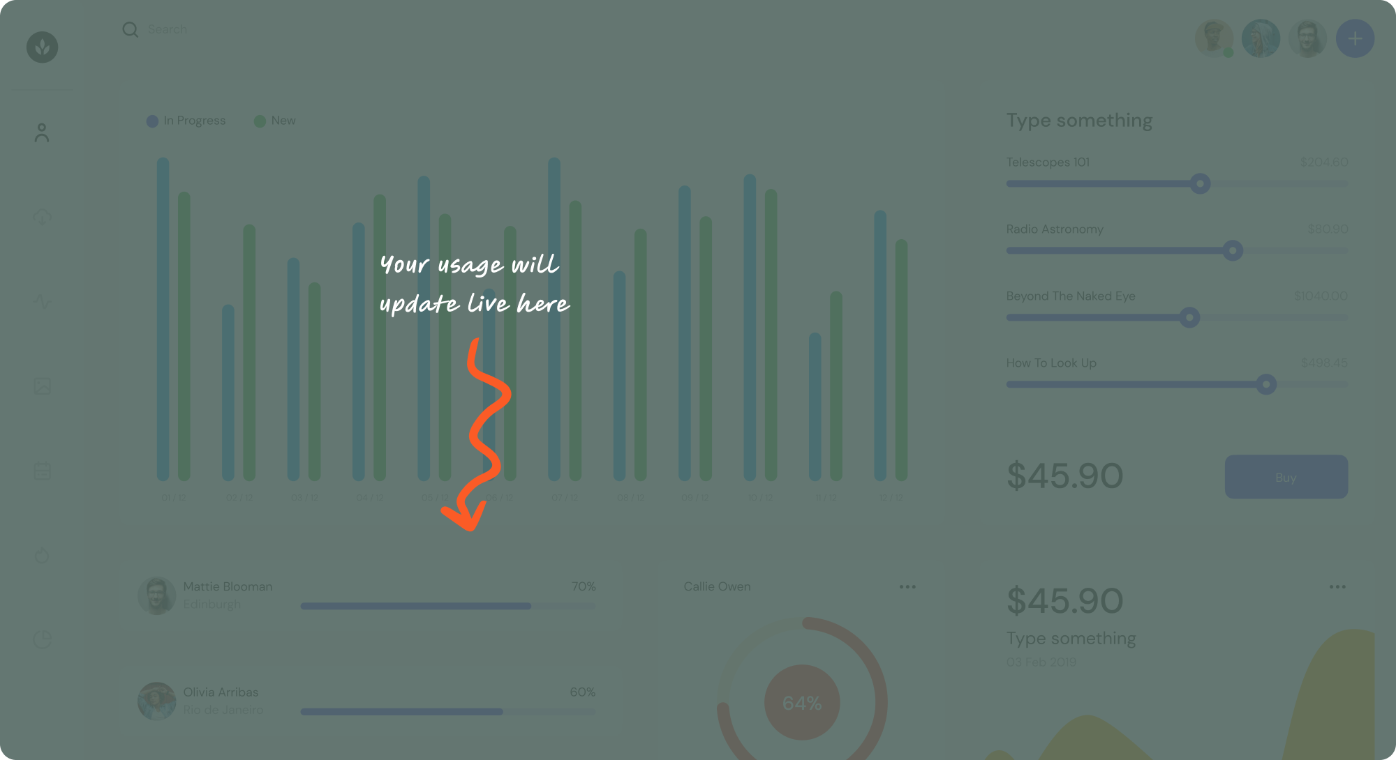
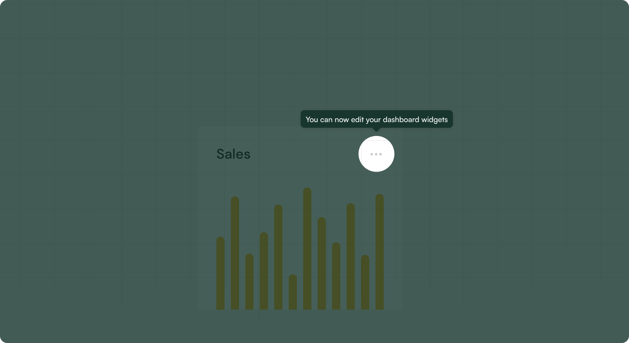
Coachmarks are transient UI guides that highlight features or functionalities that are new or important to the user. They are typically used in onboarding or introducing updates. Coachmarks often darken the underlying app to bring focus to the annotations and encourage the user to understand the content without knowing the specifics of the UI below.
Navigation Overview: indicating to users the breadth of features and navigation, especially in atypical hierarchies or page structures, or if there are a disparate set of features for users to be aware of
User Onboarding: highlighting key features that new users should pay attention to or engage with first
UI changes: helping users understand components or menus that may have been relocated or adjusted as part of a re-design or UI change


Get started free in our sandbox or book a personalized call with our product experts
