Toast Notifications
Quick, informative messages to confirm actions or alert users with no interruptions to their flow

What are in-app toast notifications?
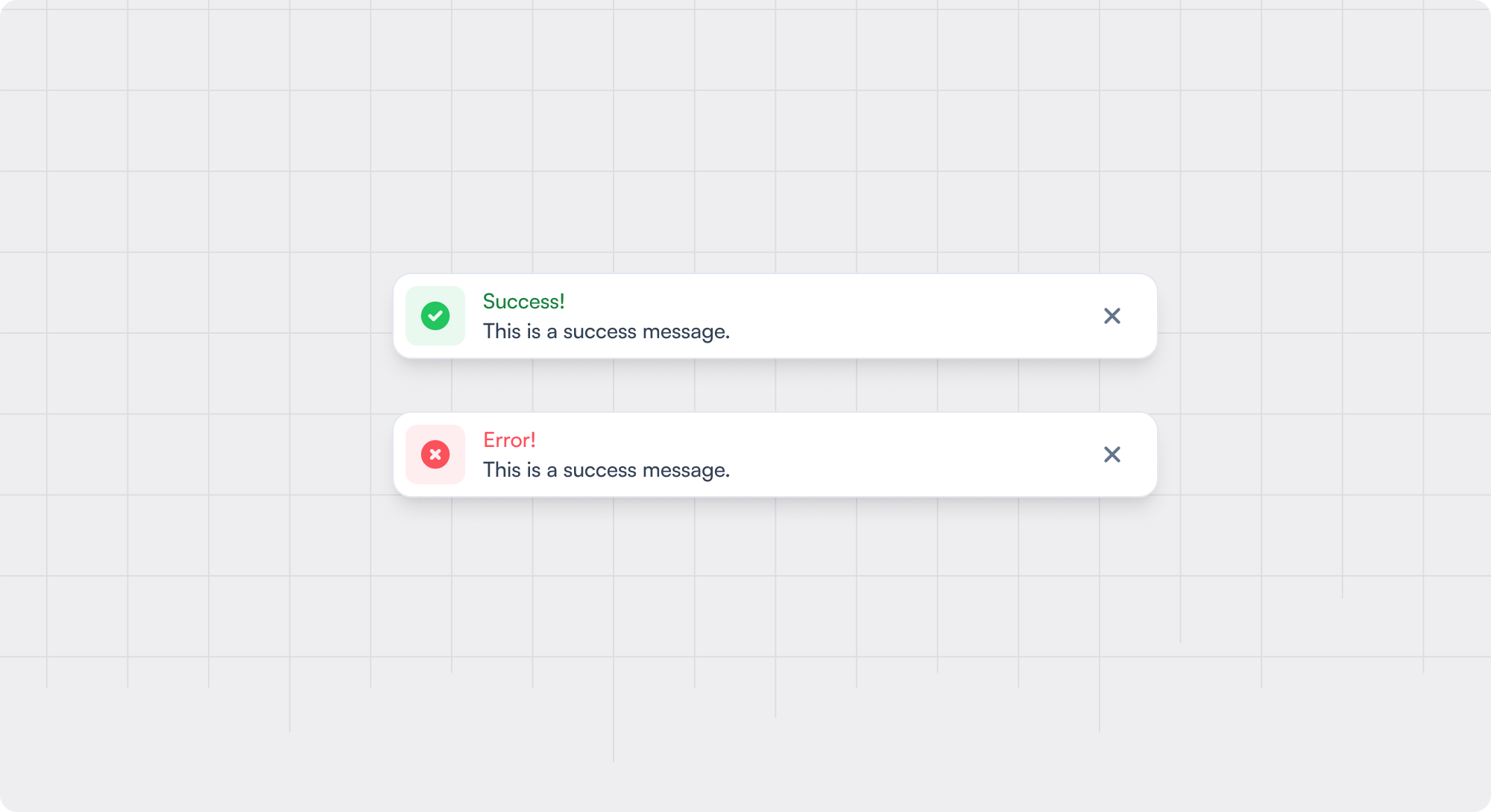
Toast notifications are small, nonintrusive messages that appear temporarily at the edge of a user interface to provide feedback, confirm actions, or alert users to updates without interrupting their workflow. They often slide into view (from top/right, etc.) and auto-dismiss after a few seconds, although users may also have the option to dismiss them manually.
Common use cases for toast notifications
Feedback on Actions: Confirm that a user's action (e.g., saving a file or sending a message) was successful
Alerts: Notifying users of new messages, updates, or errors
Progress Updates: Indicating the status of a background process (e.g., upload progress)
Reminders: Briefly remind users of tasks or events
Best practices for toast notifications
- 1 Keep the content short and succinct; users should be able to scan and understand the message within a few seconds.
- 2 Use a consistent and simple color scheme (e.g. traffic light) to help users understand the importance of the Toast Notification
- 3 Don't auto-dismiss messages that the user will need to reference later; instead, allow the user to dismiss them when ready.
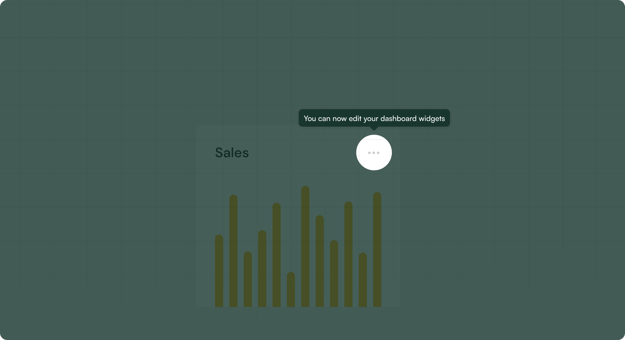
- 4 Consider including a CTA or link to enable users to learn more and use the opportunity to increase discovery and depth for a feature. This can also include a best practice tip to support their usage of your product.
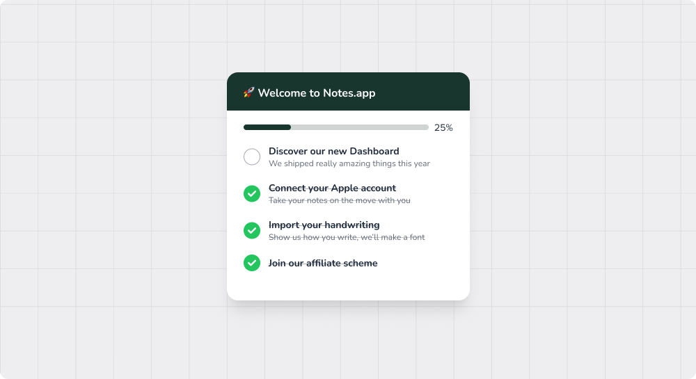
- 5 Be wary of workflows that may generate lots of toast notifications in sequence and the UX of receiving multiple (how they would appear stacked etc.).
Examples of great toast notifications

Recommended reading 🤓

In-app notifications: A complete guide for product marketers

How to Detect and Fix Bad UX Before it Kills Your Product

User Friction in Product Design: Replacing Bad Friction with Good Friction


